Are you looking for a nonprofit website design for inspiration? In this digital era, there’s a need for an online presence to attract donors and volunteers. Your website should tell more about your organization.
A nonprofit website should attract, engage and compel the target audience to take a specific action like donating. Therefore, you need to have a website that is easy to access, optimized for search engines, and is easy to navigate.
You do not want the visitors to your website to bounce off immediately they click on your site.
But, what exactly should you do to achieve such a website for your nonprofit organization?
Before you design a website, there are several factors that you need to consider. First, do you have the skills to create a website? If not, you can hire a web design agency to do the design for you.
The beauty of using an agency over a freelancer is that it can host the site for you. This way, you do not have to pay for both hosting and design. It saves you money and guarantees quality.
If you choose to create the website, will you design it from scratch or use a website builder. For example, WordPress, Wix, Squarespace, and Weebly are software you can use for your design.
WordPress is open-source software with both premium and free templates for building a website.
In addition to the templates, you can also use plugins.
A nonprofit website should have up-to-date information and visuals. What do you need to have such a website?
Design Elements For a Nonprofit Website
No matter the type of website, it should attract, engage and convert the target audience. Conversion is like donating, subscribing, volunteering, or even fundraising.
The design elements that you have to follow are:
1. Goals
What do you need to achieve with the nonprofit website? Having a goal helps you to come up with a website that meets your expectation. For instance, do you want volunteers and donors to create accounts?
Do you have a target audience? How should people have access to information about your organization? Goals help you to design a website that is specific to your needs.
2. Attract
If you are using a website builder, your nonprofit website should attract users to be part of your organization. Sounds difficult? The answer is no. A website should reflect your organization’s activities.
Have an easy-to-follow layout, call-to-action buttons, and images.
You can also use social media to attract and engage with your followers. You can embed the social media posts to your website or promote your site using social platforms.
3. Engage
With an online platform like a website, you are able to engage with your audience. Gone are the day when you needed physical engagement with your audience.
To reach people who are miles away, you need a website to help you with this. Have relevant pages like donate, join, event, About Us, calendar, events, etc.
Your homepage should have actionable content, visuals, and buttons. For instance, you can have a video that showcases what your nonprofit organization is all about.
Members can as well create an account and be part of your community. With WordPress plugins, you can have a membership section to share information about ideas and projects.
4. Website optimization
Optimization or SEO is making sure that the website is visible and ranks on search engines. There are so many nonprofit websites on the internet today. How do you make sure that yours will stand out?
It is worth noting that optimization is not for search engines like Google and Safari only. You should also optimize the website for your users.
Have a simple-to-follow website, use visuals, include keywords, and also use simple language. Avoid using too much jargon and abbreviations.
Also, make use of the white space. Most people do not read through texts. Whitespace breaks the monotony and makes the web pages attractive and easy to skim through.
With this information in mind, let’s look at some of the nonprofit websites for design inspiration.
Let’s dive in!
45 Best Nonprofit Website Design For Inspiration in 2021
Having a professional website for your organization can increase the rate of conversion. It has the ability to reach an audience that could have been hard to reach. Remember, online is where your audience is.
Check out the list below for nonprofit web design and charity websites:
1. Sterling Charity Donation
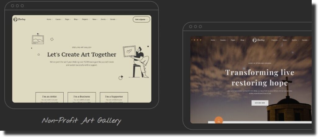
Sterling Charity Donation is a charity and donation WordPress theme from Aheto Plugin. For your nonprofit website, you can purchase the theme and customize it to meet your organization’s needs.
It is responsive, integrates with WooCommerce, has pre-made layouts and user-friendly visuals. But, you can always use your images and videos to reflect your brand. The web design theme is compatible with premium plugins like Google maps and Elementor.
2. Vestry Church
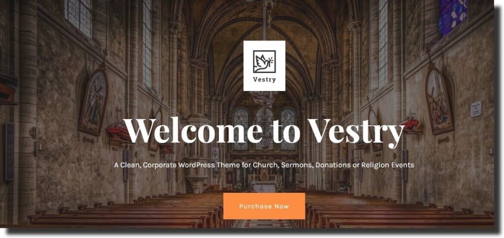
Vestry Church is another WordPress theme from Aheto Plugin, that you can use to design a nonprofit website. However, it is for church and religious events. Therefore, you can use it for your church website design. Similar to most themes, it is mobile responsive.
This means that your website will be accessible using mobile phones and tablet devices. It has all the pages that you need to create a professional-looking church website. It is compatible with premium plugins like Woocommerce, donation plugin, and events calendar.
3. Literacy Inc Nonprofit Website
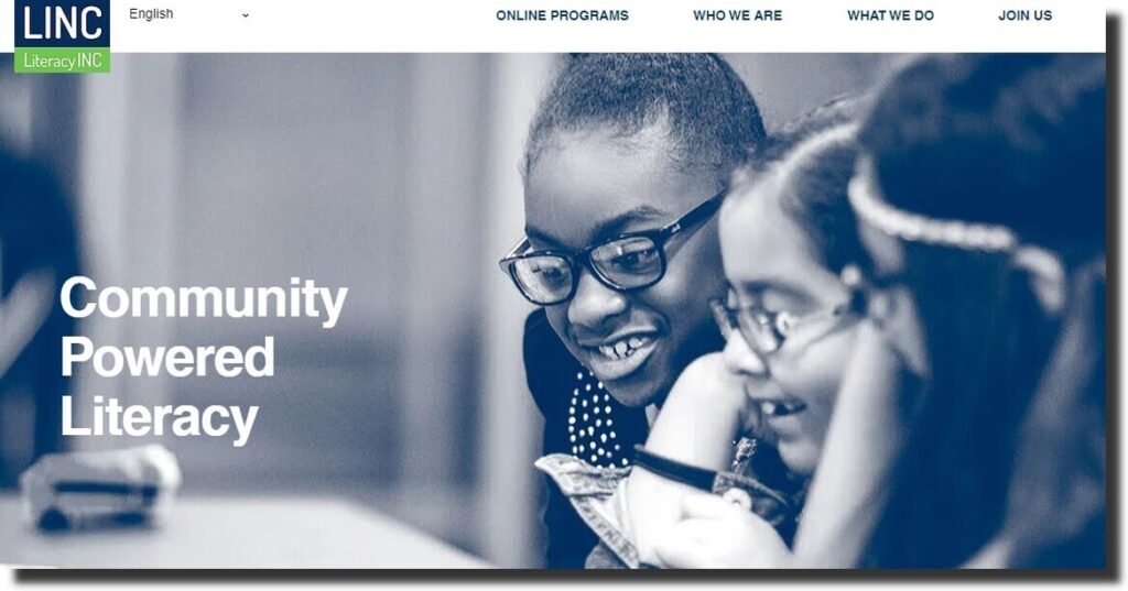
Literacy Inc is an organization that aims at providing learning opportunities for children. From the homepage, the website has clickable icons of awards and certifications. It helps build trust and attract potential donors.
On scrolling to the lower section of the page, the organization uses statistics to give more information about what they do. There is also a map at the bottom section to give direction. The website is easy to navigate and has a menu with sub-menu items.
4. AMA Foundation Nonprofit Website
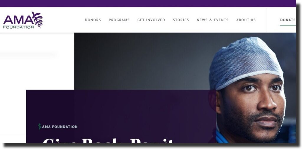
The first thing you will notice after clicking the website is that it’s in the medical field. The image on the homepage is of a physician and has a tagline.
There is also a donate button for visitors to use. Upon scrolling down, the site has different sections with clickable links. For anyone who wants to find out more, there is a stories section. Additionally, members can choose to get involved in different ways.
5. Dreams Have No Boundaries
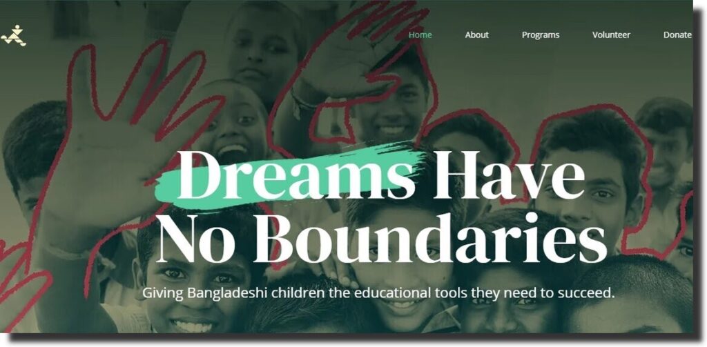
The organization aims to offer better education to children in Bangladeshi. It is easy to understand the purpose of the website. There is the use of images, colors, fonts, and statistics.
There is a section with testimonials from the students. The footer section has the contact information, and visitors can also signup for newsletters.
6. Memphis Zoo
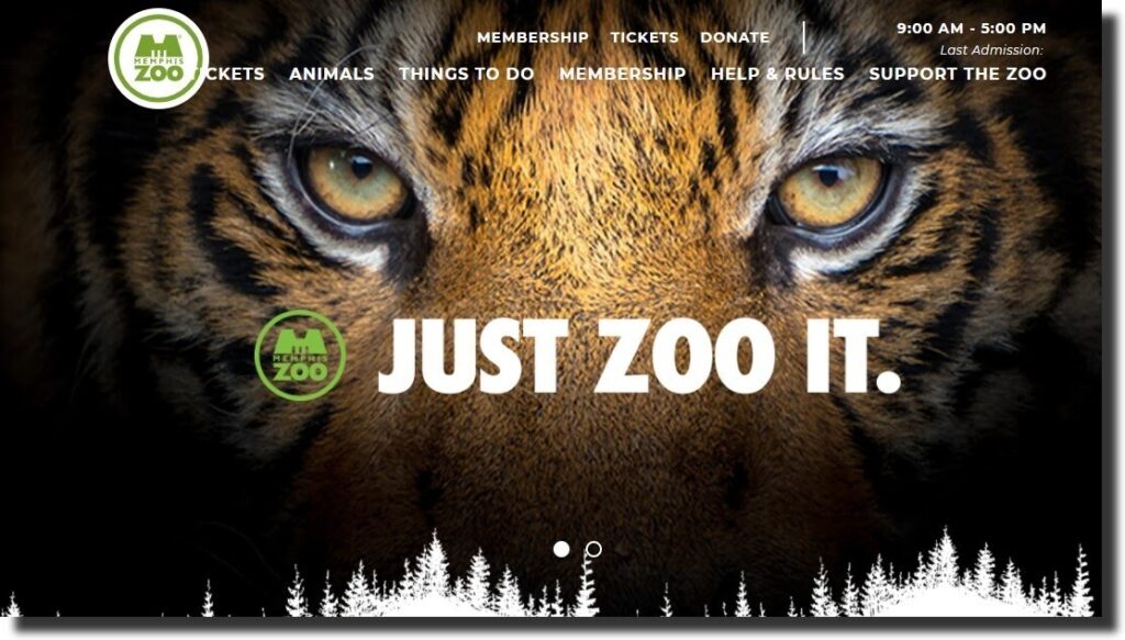
From the name, it is easy to tell that the site is about animals. First, the nonprofit website is easy to relate to as it uses animals and natural colors. The background image is of animals and a red notification flier.
It has a weather forecast on the top menu. Members and visitors can make their donations or signup for membership accounts. The whitespace makes the website attractive and easy to scroll.
7. Opportunity International Nonprofit Website
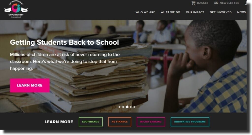
The organization is about helping families living in poverty and giving quality education accessible to children. The website uses parallax scrolling with different buttons on each image.
Besides having a donate button, members and visitors can also use the basket page. From here, one can choose a specific goal to proceed with. There is also a blog section with the latest news of the organization.
8. Children International Nonprofit Website
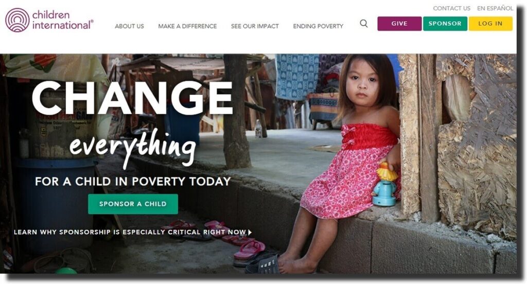
The website uses English or Espanol languages. The organization helps children living in poverty. The site has a help bot where users can access the FAQs, start a live chat or give feedback.
There is a video on how to sponsor a child and a form to fill before sponsoring the child. The website uses images, videos, and colors to capture the user’s attention. Each of the buttons has different colors.
9. Mustard Seed Communities
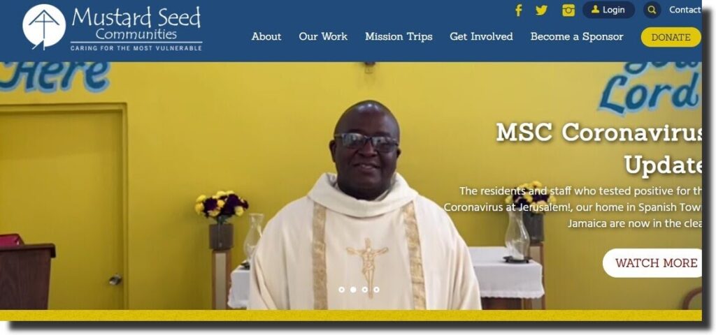
Based on the tagline, the organization helps the most vulnerable people. The website blends in color and font to attract the users of the site.
There is the use of favicons, images, and buttons. On scrolling to the bottom of the homepage, the website embeds social media posts of the organization. There is a review as well as a Guidestar to build the visitor’s trust.
10. Ascend Nonprofit Website
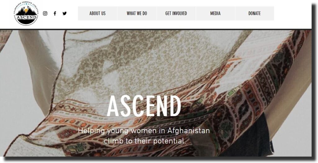
Ascend is a nonprofit organization that helps women reach their full potential in Afghanistan. The website has a chatbot for members to offer their assistance.
It has a blog section with the latest information about the organization. As you hover over the main menu, it displays the sub-items making it easy to navigate.
11. ASPCA
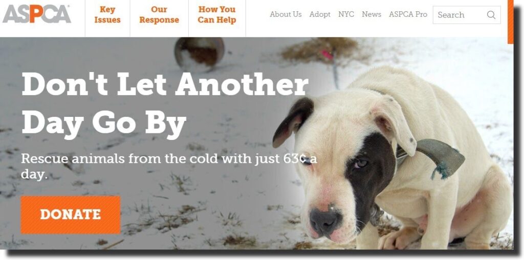
The American Society for the Prevention of Cruelty to Animals is a nonprofit organization that believes that animals should be protected by law and entitled to love.
Besides the images on the website, it is easy to notice the static donate button. The website is easy to navigate with a simple menu. There is a blog section and social media icons at the footer.
12. Centro Community Nonprofit Website
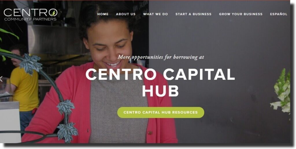
Centro Community helps individuals flourish their business ideas. The background images use parallax scrolling. The large fonts have clickable buttons to direct the user to a specific page.
The nonprofit website is mobile responsive. Users can download a mobile app for convenience. Available in different languages, there is a Centro business planning app that has an all-in-one education program.
15. Charity Water
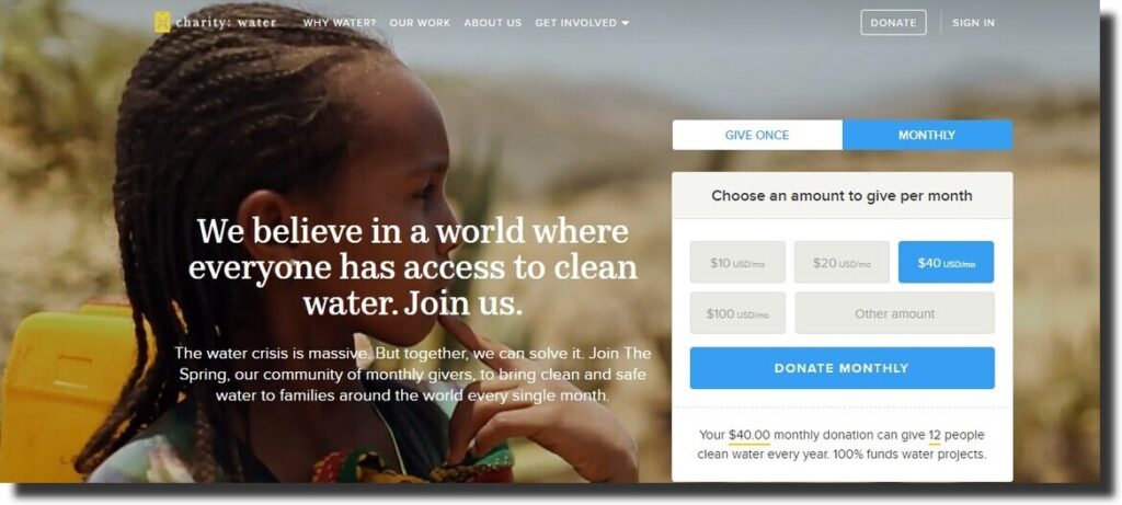
The organization focuses on providing clean and safe water to communities. The Charity water website has a background video with a series of images and clean water running from a tap.
There is a secure donation plan where members can choose a convenient contribution method. From the statistics section, you can find out more about the organization’s contribution. The website blends in color, font, and images to bring the best out of each page.
14. Red Cross Nonprofit Website
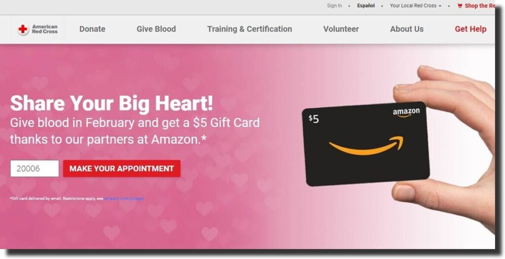
Red Cross is one of the most popular organizations in the world. It has a user-friendly architecture. It is easy to navigate. On hovering over the main menu, it opens a list of items for the user to view.
The donate button has clickable links, and it has more information than just giving. It has different sections with specific colors and images. It makes use of relevant favicons with links for additional content.
15. Habitat for humanity
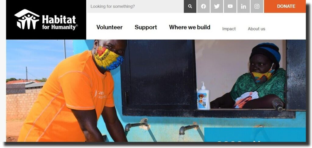
From the logo of the organization, you can tell that the organization provides shelter to people. The website is simple to navigate with the main menu, social icons, and a donate button at the top.
There is a search button to help you quickly access what you are looking for. There is a podcast that has content around the housing crisis. The blog section has the latest news and information from the organization.
16. Know your rights camp
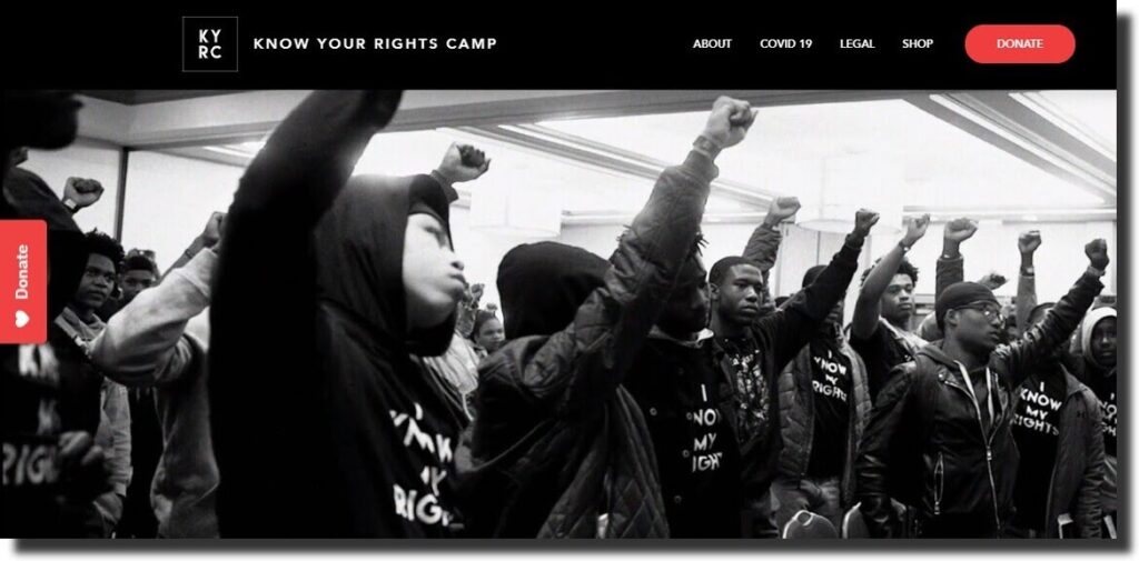
Besides the background video on the homepage, the first thing you will notice from the website is the mission statement. The animated abbreviations add to the beauty of the website.
The donate button is easy to notice. It has a red background color with an animated love icon. Visitors can find out more information about the camps. The magazine’s section has different images, colors and maintains the font.
17. Culture of Solidarity
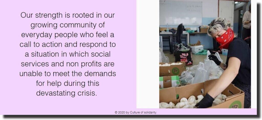
The organization is about helping those affected by the Covid 19 pandemic. It caters to the most vulnerable by meeting their basic needs. The website has a navigation menu on the side.
The background image is relevant to the role of the organization. It also gives more information in text on how visitors can offer assistance. On scrolling to the bottom section of the website, the clickable links help users take a specific action.
18. Acumen Nonprofit Website
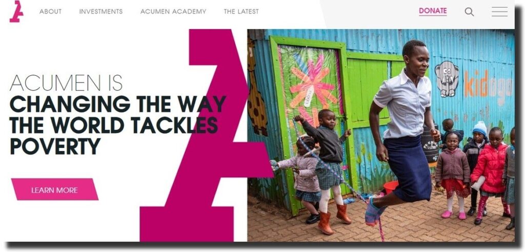
Acumen organization is about changing how the world handles poverty. The website maintains the color throughout the website. The whitespace makes it easy to follow the content and attract the user’s attention.
The logo of the website is an abbreviation of the first letter. It’s a half ‘A’ that is used in most sections of the site. The About us page has the vision of the organization. It also gives more information about Acumen.
19. UNHCR
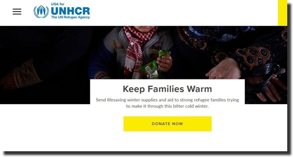
UNHCR gives hope and empowers refugees. The website is easy to use and navigate. There is a big yellow button with the donate text. It maintains the organization’s colors.
The whitespace captures the user’s attention. On scrolling to the bottom section, there is information on how you can offer assistance. For donation, donors can give their contribution every month.
20. St. Jude Children’s Research Hospital
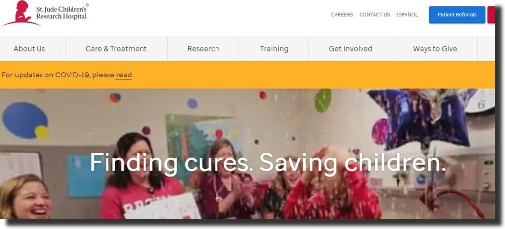
St. Jude’s website has a background video with the hospital environment, children, and doctors. It has a straightforward main menu and a search button.
The footer section of the website has contact information and social media icons. To attract visitors and build trust, the organization showcases the reviews and awards they have received. For non-English users, you can translate the site into Espanol.
21. WomenStrong International
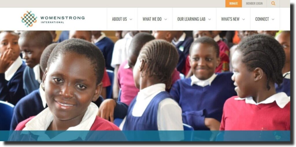
WomenStrong International is an organization that shares women-driven solutions. The ‘About us’ section has its values and mission. It has a portal where visitors can create an account and become members.
The main menu has a dropdown list with clickable links. The website has favicons, images, and uses different fonts.
22. Not For Sale
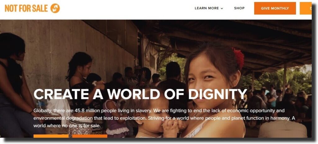
Not For Sale is an organization that fights human slavery and exploitation. The website has background videos on the homepage. The whitespace makes it easy to scroll through the website.
There is a mission statement that states the values of the organization. The buttons maintain a similar color and have clickable links for additional information. Members can subscribe to the newsletter to stay up-to-date with the organization’s activities.
23. The Royal Conservancy
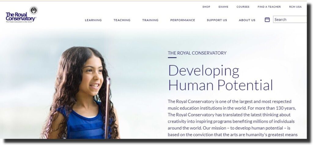
The Royal Conservancy website has its mission statement on the homepage. As you hover over the images on the alumni section, it displays their titles and awards.
The website has a main menu with subitems. The footer has the organization’s logo, social media icons, and clickable links.
24. Mary’s meal
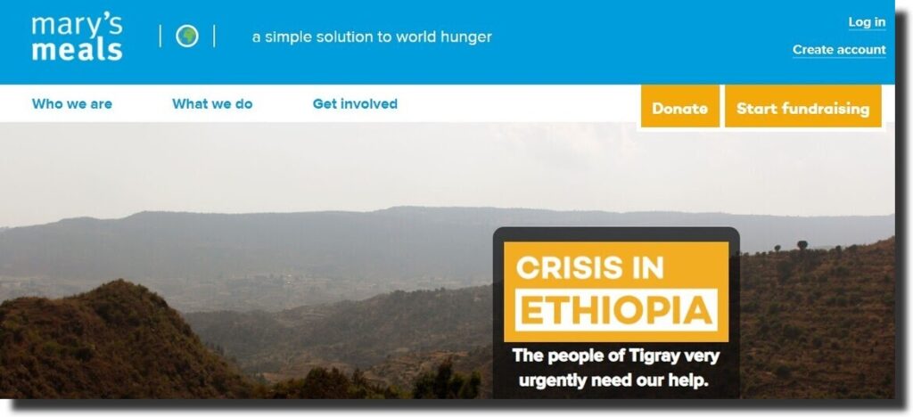
Mary’s Meal organization provides a solution to world hunger. The homepage has a link to its vision statement. Visitors can forward their donations or start fundraising.
The blog section has more information regarding the organization. The website is attractive in general and simple enough to navigate. From the main menu, users can access more information using the links.
25. World Wildlife Nonprofit Website
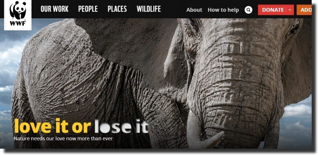
Wildlife is a huge part of nature. The background video draws attention to beautiful images of nature and wild animals. The animated text is easy to read and appealing to the eye.
The top part has the man menu, search bar, and buttons. As the user scrolls down the website, the background image changes depending on the section. The social media icons of the organization are in the footer section.
26. International Rescue Committee
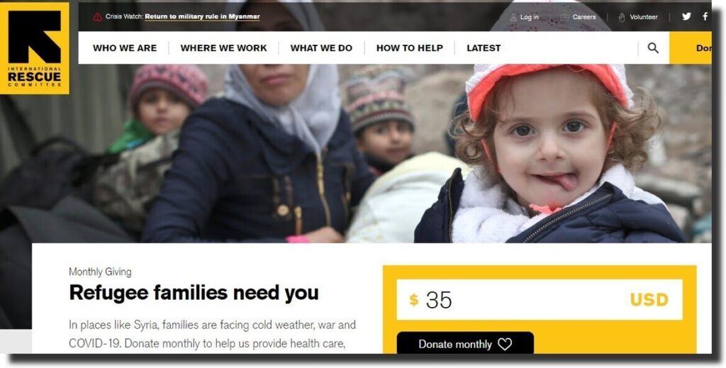
The International Rescue Committee responds to the humanitarian crisis. The website is easy to navigate with subitems in the main menu. It has images that relate to the objective of the site.
There is a section with testimonials. On scrolling further the website, there are quick links and social media icons. Members can subscribe to the newsletters and forward their donations. In addition, anyone is free to volunteer for the cause.
27. National Parks Conservation Association
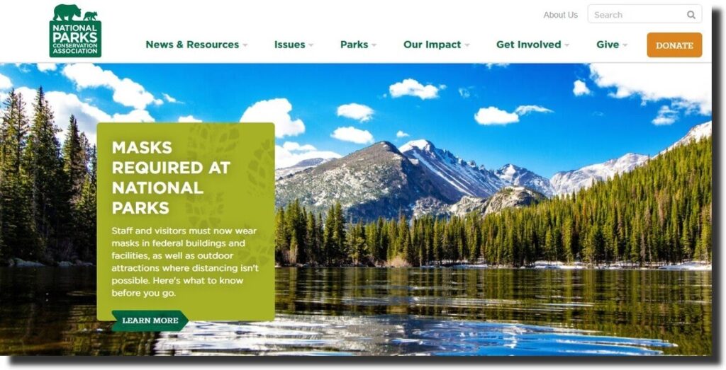
The purpose of a nonprofit website is to give more information about an organization. The National Parks Conservation Association is about protecting and preserving the parks. The website has high-quality images of animals and nature.
There is a notification and mission statement on the homepage of the website. The resources section has a press release, blog post, and magazine. Visitors can get involved with the organization and also give their donations.
28. Fistula Foundation
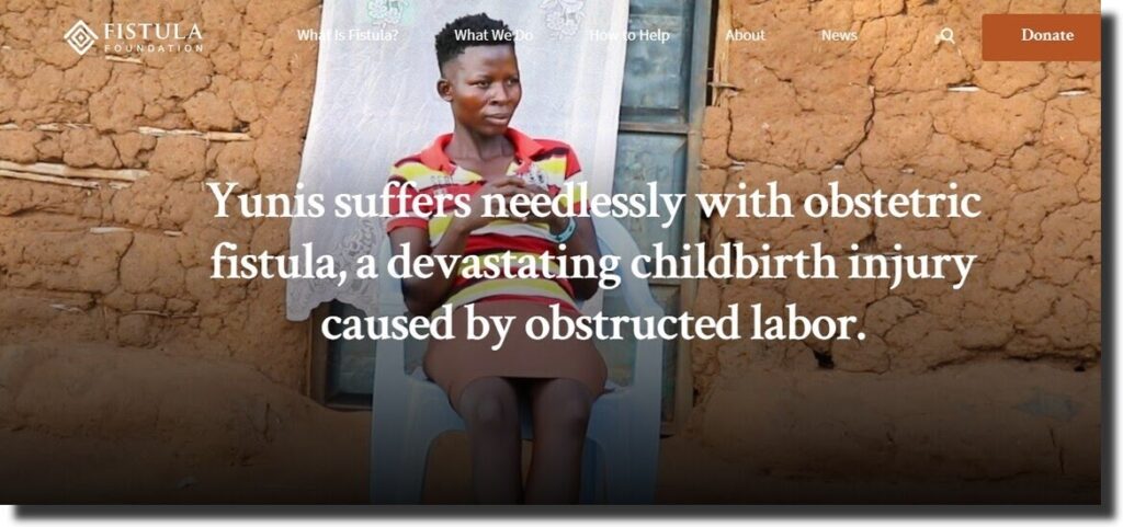
Fistula Foundation partners with the best doctors to provide fistula surgery to women. The website has quality images and videos. The website is simple to use and navigate.
Members and visitors can donate monthly or daily. The footer section has the charity rating and social media profiles to connect. There is a graphical representation of how the organization has fought fistula.
29. World Housing
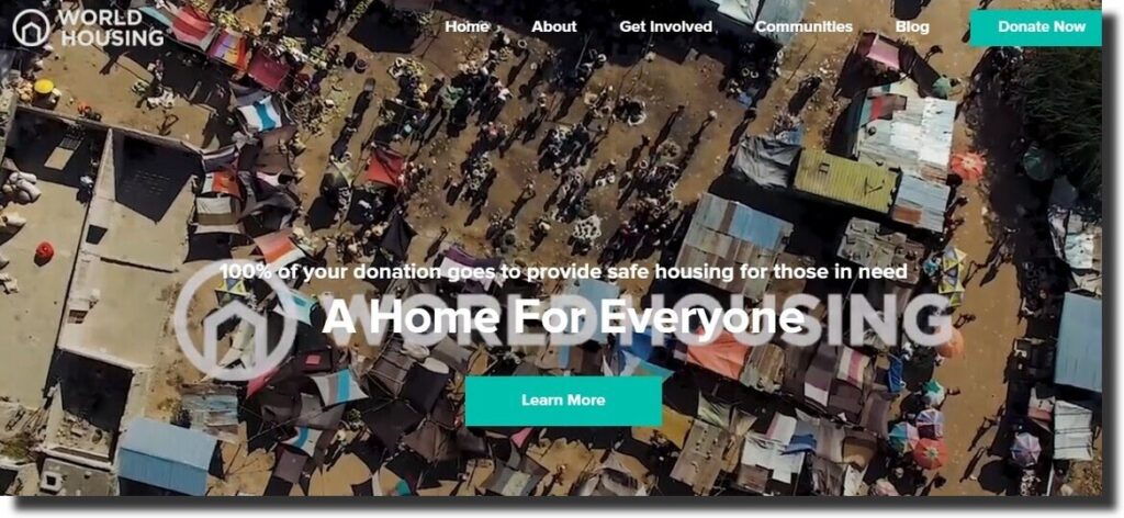
World housing offers safe housing for those in need. The nonprofit website has a background video with a series of activities. It has a simple layout that is easy to follow. There is an FAQ section that answers the questions about the organization.
The colors and images blend well. It has a blog section where users can access more information. From the website, volunteers, visitors, and donors can find out more about the progress. Users can also get involved as business or real estate partners.
30. Convoy of Hope
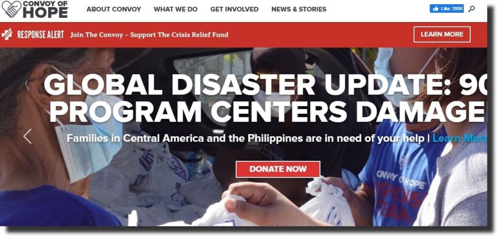
Convoy of Hope is a nonprofit organization that feeds children, disaster response, and community outreach. Its website has different background images. The site uses large fonts and a red donate button that is hard to ignore.
From the nonprofit website, you can find out more about the impact of the organization. Donors can join and be part of the organization. The site is easy to navigate. From the footer, users can access their contact information, social profiles, and address.
31. Case Foundation Nonprofit Website
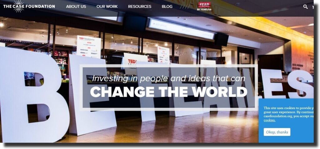
Case Foundation is an organization that invests in people’s ideas. The website maintains the colors and fonts in the website. The resource section is divided into different sections.
It has a simple-to-navigate main menu and social icons. The website embeds posts from social media platforms. It is beautiful to scroll and keeps the user engaged. To stay connected, members can subscribe to the newsletters based on their interests.
32. BuildOn Nonprofit Website
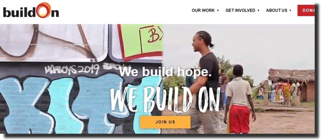
BuildOn is dedicated to ending poverty and illiteracy. The website has an easy-to-follow architecture and high-quality visuals. The homepage has a background video and the mission statement of the organization.
Members can be part of BuildOn by submitting their names and email. It has a simple main menu with clickable subitems. The website is easy to navigate and makes use of quality visuals throughout the website. All the buttons maintain a red background color and white font. The consistency makes the website attractive and appealing.
33. Human Rescue Alliance
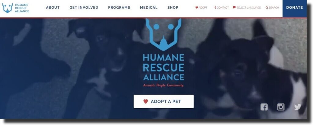
Human Rescue Alliance is an organization that advocates for change to create a peaceful environment where animals can survive. The first thing you will notice about the website is that it deals with animals.
The logo, visuals, and favicons reflect the animals in the organization. There is a lot of whitespaces to capture the attention of the reader. The animated images attract the user to continue scrolling. From the ‘adopt me ‘ button at the footer section, adopters can hover over the button to learn more about the animal.
34. Thirst Relief
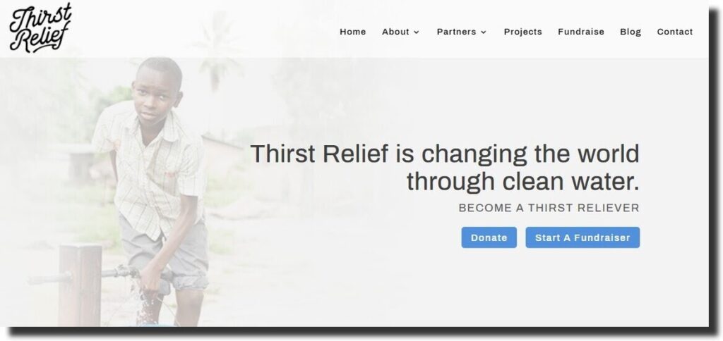
Thirst Relief changes a life by providing clean water. Users can offer their support by giving donating or starting a fundraiser. From the website, visitors can join the organization’s Instagram account by clicking on the link.
The mission statement is on the homepage of the website. The footer has the contact information, social media icons, signup button, and quick links.
35. Cancer Research Foundation
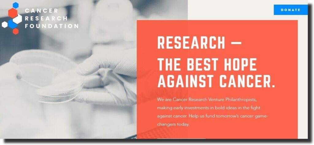
The foundation aims at raisings funds to support cancer science research. Instead of the usual main menu, users can click on the three horizontal lines to access the menu list.
The images on the website relate to the cause of the foundation. The Instagram feed is embedded on the site. From the menu, users can access the podcast, programs or get involved with the organization.
36. OVO Foundation
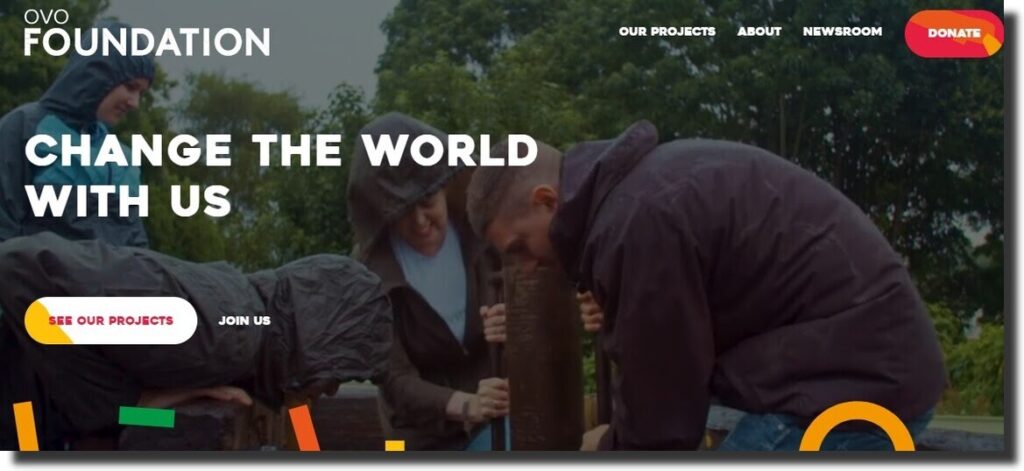
OVO Foundation has a colorful and attractive website. The animated graphics motivate the reader to continue scrolling. There is a background video and images of people who are busy with the project.
The donate button is visible to the eyes of the user. It is easy to navigate and use. The newsroom section has more information on the projects of the organization.
37. Nashville Zoo
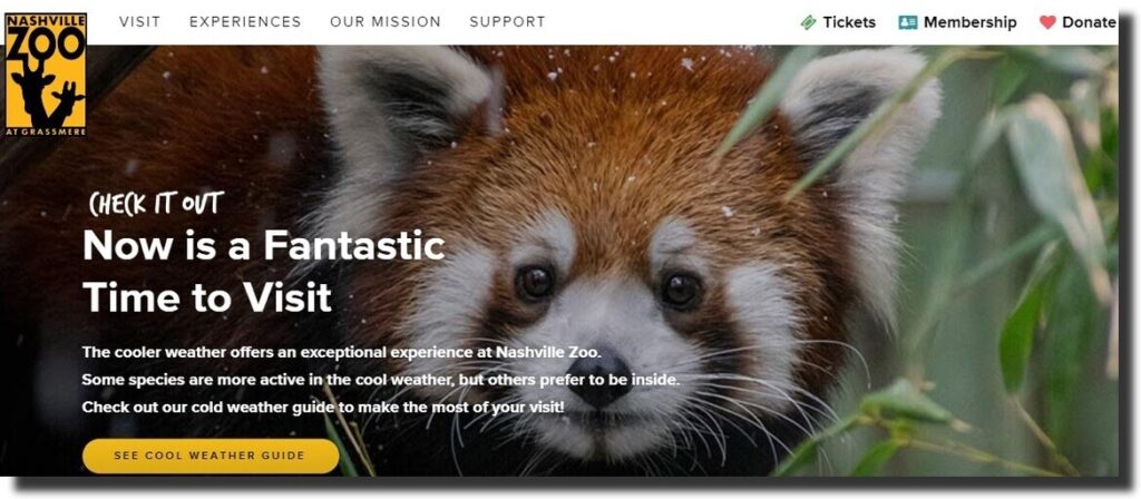
The first thing that comes to mind about a zoo is animals. The website has beautiful images of wild animals like giraffes. To visit, users have to make a reservation using the link on the site.
Before the reservation, you can check the weather guide to make the best out of the trip. From the homepage, visitors can check the directions and time from here. The events section helps members to plan for the activities ahead.
38. Greenwave Nonprofit Website
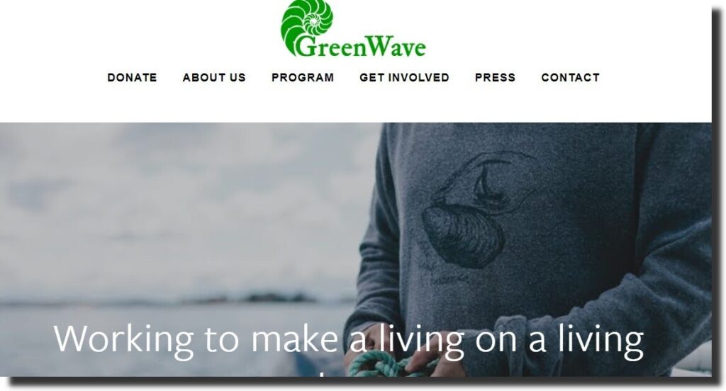
The website has a popup to remind users to subscribe to their newsletter. The image carousel gives more information on what the organization does.
On scrolling to the bottom section, there is a testimonial from the people who have benefited from Greenwave. The footer has social media icons and a button for users to subscribe to the newsletter.
39. Jackie Robinson Foundation
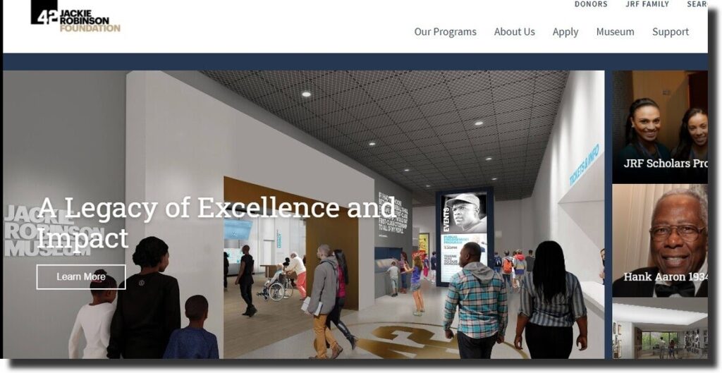
A nonprofit website should be simple and attractive to keep scrolling. Jackie Robinson’s website is easy to navigate with clickable links and buttons.
The main menu is static as the user scrolls through the website. For the audience that prefers watching a video instead of reading, there is a Youtube video to watch. The website has a blog section, gallery, and social media profiles for users to connect.
40. HeForShe Nonprofit Website
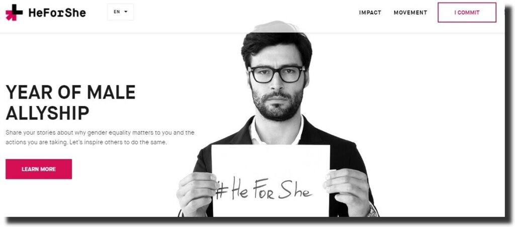
HeForShe is a movement that upholds gender equality. Visitors can get involved by clicking on the ‘I Commit’ button and also selecting the country of origin.
The background image promotes the goals and objectives of this movement. Members can follow up on tweets from the website and share them on various platforms.
41. Special Olympics
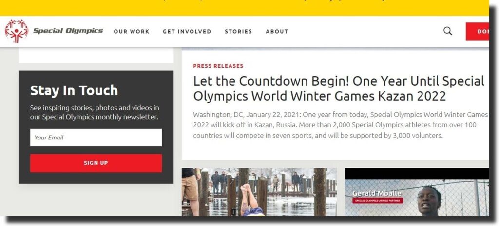
Special Olympics is about providing training and athletic competition to adults and children with intellectual disabilities. The website displays images in a carousel with different content and buttons on each.
Visitors can find out more about the organization from the ‘About Us’ page. The website features its partners and high-quality images.
42. Care Nonprofit Website
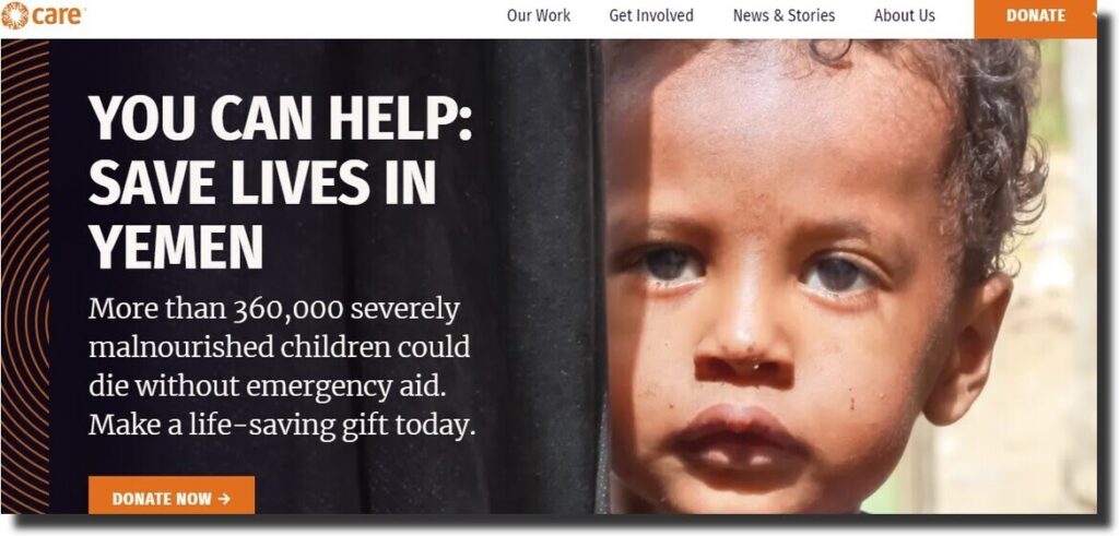
Care is an organization that helps eradicate poverty. Upon clicking on the website, there is a popup that asks visitors to donate to the cause.
The website guides new users on how to offer support to the organization. The white space and large fonts capture the readers’ attention, making it impossible to miss the details.
43. World Vision
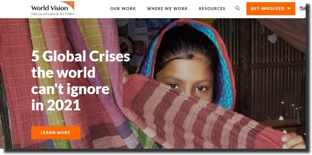
World Vision aims at helping children in vulnerable areas to overcome poverty. The website has images of happy children and a Youtube video showcasing the impact of the organization.
The blog section is split into different categories. The website has a map that indicates the staff from various countries. To capture the attention, the CTA’s change the background color when you hover the cursor over the buttons. The sticky menu makes it easy to access the menu items.
44. Conservation International
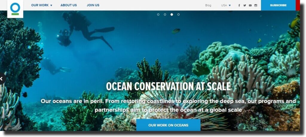
Everyone enjoys the beauty of nature and therefore, Conservation International protects the nature that everyone depends on. The website is attractive and has images and videos.
Volunteers can find out more from the news section and donate to be part of the environment. The nonprofit website has a sticky top menu bar with the subscribe and donate buttons. The website is beautiful and attractive with natural colors and images.
45. The MET
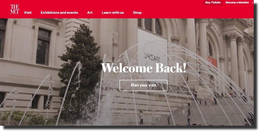
The MET is a museum with over 5,000 years of art from all over the world. The homepage of the website has an attractive background image and a button that users can click to plan a visit.
It showcases exhibitions, arts, artists, and paintings. The website captures the attention of the visitor to keep scrolling and learn more about the museum. You can create an account to become a member, give a donation or buy a ticket.
Reasons Why You Need a Nonprofit Website
For a nonprofit organization, having a website is one of the steps of creating awareness and attracting visitors. A nonprofit website is not as easy to create and therefore, working with an agency guarantees you quality and value for money.
A charity website design will prompt visitors to take an action like donating, volunteering, or fundraising towards a cause. The online presence contributes to the growth of a nonprofit organization, institution, or movement.
If you are planning to create a nonprofit website, you can borrow the ideas above. You may also consider using the themes above for a professional, nonprofit website. Your goals and objectives will guide you in designing a site that is specific to your needs.

