Creating a UX designer portfolio allows various individuals and potential clients to eyeball the masterpiece you created to showcase your competence and expertise. When you design something and confine it to yourself, you merely waste its usefulness. Maybe the designing world is away from achieving a milestone with that one less idea.
So, avoid being inside your cocoon and come out of it by creating your UX designer portfolio. We have some of the best 22 UX designer portfolio websites that can inspire you to showcase your design capabilities if you are still hesitant.

So, let’s begin!
What is UX Designer Portfolio?
Before heading to the portfolios, let’s quickly overview the UX designer portfolio.
A UX designer portfolio is either a web or social media profile for an online project portfolio of a UX designer. In this portfolio, the UX designer posts and shares their work to showcase their UX designing skills and techniques for generating more leads and inspiration.
Also, the more your UX designing page is clicked and used for inspiration, the more you will gain CTA (call to action) and CTR (click-through rate).
Top 22 UX Designer Portfolio Websites of 2022
UPQODE
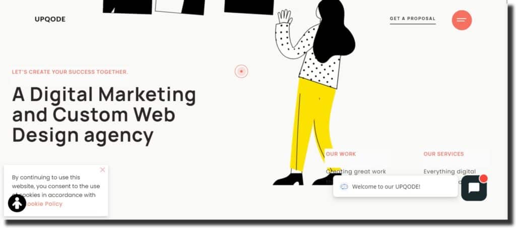
UPQODE is a web designing and digital marketing agency that upholds a simple and elegant UX design to showcase the potential customer. The creators have made their website UX design so that it alters and adjusts your cursor into a red paint shape with colorful and animated features. The digital agency is in Nashville and has a top-notch Global client base with award-winning projects.
You can see how the fonts and the main message loops give website visitors an experience of landing on the high-end professional-looking website. In short, we can say that UPQODE opts for an outstanding and creative website design than the same old dull web pages that merely have pictures and text and nothing more for an engaging user experience.
Robin Nogiuer
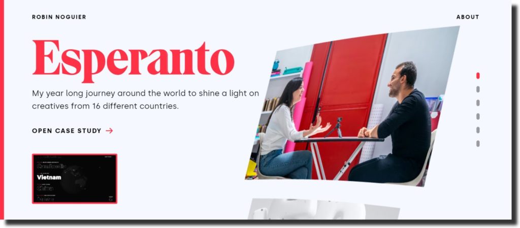
Robin Nogiuer is an incredibly talented and creative UX designer who set the UX designing benchmark to another level. By clicking on the site, you can see the exact impersonation of a digital billboard that you may have seen in the streets of cities like New York. The designs and portfolios slide automatically with merely one tap.
You will have various portfolios of case studies like Esperanto, Ueno, SnickSnack, Iv-Skaya, Google, and Eagle films when you open the web page. All these portfolios serve multiple purposes and work for top-notch brands.
Ozmo UX Portfolio
If you are looking for something simple, elegant, and to the point without a flashy and funky style of design, then you are in the right section. That’s because the Ozmo UX design portfolio endorses a simplistic white layout to another level.
We are sure that this portfolio will inspire creative individuals in an amateur group in designing a website UX because it shows and helps them create something that looks professional yet is easier to create.
You can open the page and see how the designers have managed to pull off the white layout and make it engaging. The online surfers will have the direct information they seek without passing through complicated features.
Austin Knight
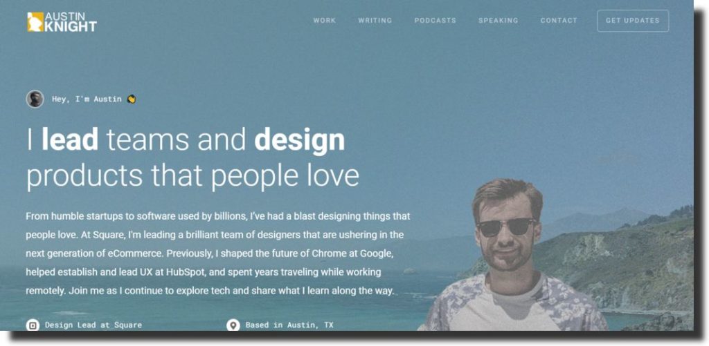
Looking for inspiration from a Google UX designer? Austin Knight is a UX product designing team leader who also works at Google. He showcases his projects, accomplishments, clients, and team members’ portfolios openly on his page.
Austin roots for a straightforward UX website as professional as possible. And that reflects in his web page. You can see how Austin has managed to put every detail on his design portfolio that it does not look vague but concise and straightforward. Otherwise, as we have seen, other UX designers tend to keep their websites with more design and fewer details and text to avoid ambiguity.
However, Austin designed his page the other way around. You can see that text, images, animation, slides, and graphics are parallel, and nothing seems out of context or unnecessary detail.
Jonathan Patterson
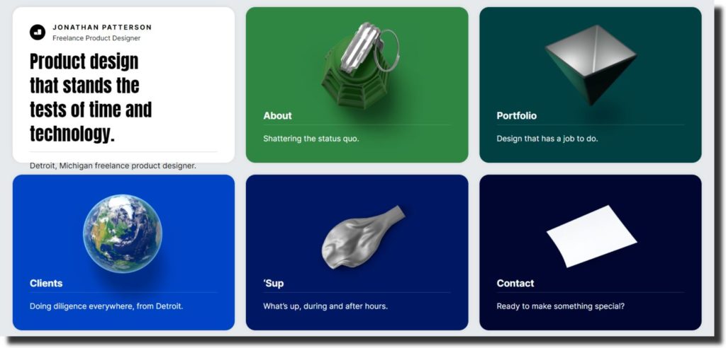
Jonathan Patterson is a UX designer that is experienced and known to have worked with leading brands like Ford, Postmades, and Sony. Jonathan has unusually created his website UX. A very few of the web pages opt for a one-page website UX design. And only highly pros can pull off this type of UX because it takes several techniques to put everything on one page.
However, Jonathan has created a section without scrolling options to go from one page to another. Also, this technique is a smart way of increasing each pages’ click-through rate. This UX design enables users to land on the pages easily who prefer without going through various options and pop-ups.
Humbleteam UX Design Portfolio
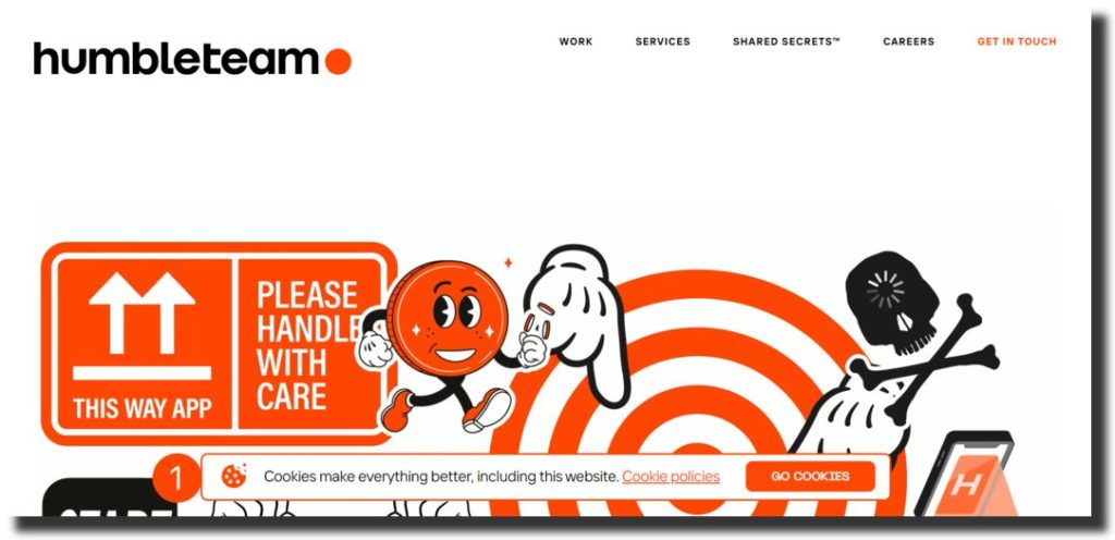
The Humbleteam website UX design will give you an attractive first look with an engaging and smart use of various animation techniques and features. When you land on the homepage of Humbleteam, the scroll works as a slide. The homepage will slide from left to right instead of scrolling up and down when you scroll through it.
Also, the UX designers have used a combination of red, white, and black colors to make it look more eye-catching. The designers are well aware that these color illustrations and graphics will catch the attention right away. Anyhow, the use of pictures for an incredible UX is excellent and fun-looking at the same time.
Fulcrum UX Portfolio
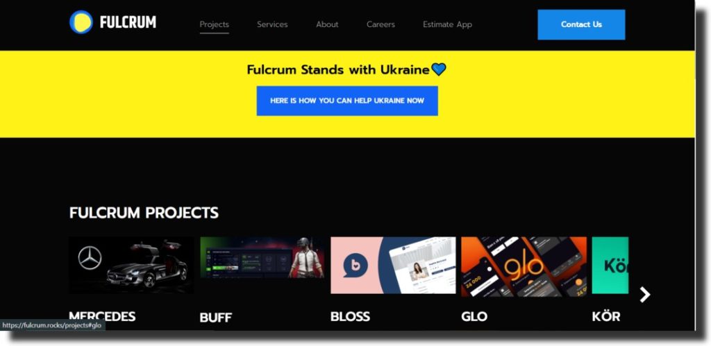
Fulcrum UX design portfolio is an engaging platform with professionals that invents and creates explosives products for global clients. They have summarized their process, which helps them create various moveable products. For example, Fulcrum UX designers initially discover the product’s feasibility, viability, and usability.
And once the research is finalized, the UI/UX designing process for the web pages or apps comes. After creating, the team swerves to the product development phase, where they put together all the necessary parts under a single roof. Next, the MVP development and coding take place.
This is only a brief overview of how Fulcrum designing works, but we are sure that once you land on their page, the dark-themed UX design will make you curious to discover more about their services.
Vandana Pai
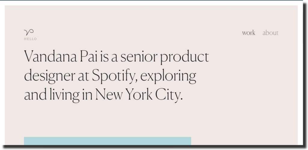
If you want to explore the UX designer portfolio that has elegant, classy, and top-notch touch to their web page, then Vandana Pai is the right option for you. The UX designer is a senior UX designer known to have worked for Spotify in New York City. And by mentioning Spotify, your mind may have automatically clicked the basic but aesthetic graphics.
Vandana has also altered her page, similar to Spotify. She chose dull but classy color pallets and fonts for typography and visual representations. So the users experience that they have landed on a professional page that endorses leading brands’ UX/UI designing.
Kyson Dana
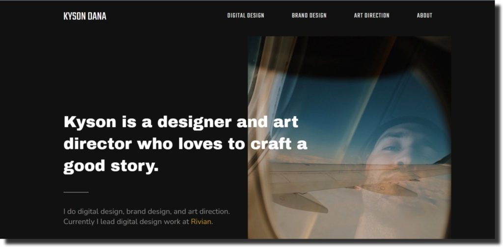
When the UX design is handled by a good story lover director, the graphics and illustrations become more exciting and compelling. Having said that, Kyson Dana is a UX designer, and his portfolio showcases his passion for visuals expressing various narratives. Kyson chose a dark and rusty color pallet to give an intense look to his UX portfolio.
Moreover, Kyson is a versatile designer who has expertise in designing digital and brand art with direction. The designer currently works and leads Rivian to handle its digital design. Kyson also put a video visual of one of his design campaigns, “Boosted,” as a testimonial template to show more precise and direct examples of his work.
Purrweb UI Design Portfolio
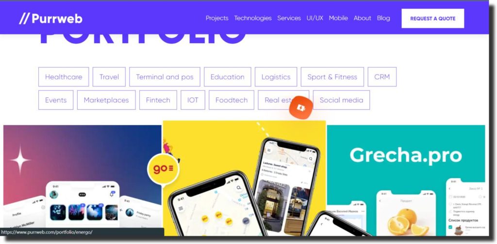
The colorful and animated digital design upholds the most engaging UX design portfolio of Purrweb. This portfolio does consider not only UX design but also UI. And Purrweb creates mobile, web development applications, and websites designs. Various UX/UI design portfolios with separate categories are available on this page. The portfolio includes designs for different niches like:
- Education
- Healthcare
- Travel
- Terminal & pos
- Logistics
- Sport & fitness
- CRM
- Events
- Market places
- Fintech
- IoT
- Food tech
- Real estate
- Social media
Purrweb creates UI/UX for all these niches with cross-platform techniques.
Tofu Design Portfolio
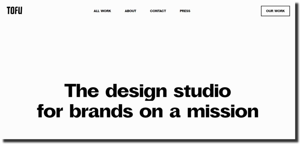
While various creative agencies hire several individuals to work as an innovative team and make the process effective, Tofu Design Studio only relies on two creatives keen on making the brands succeed together. Tofu’s design portfolio is direct as their message “Simple, Intimate, Human.” Having said that, you can have an idea that the team focuses on more work and brand collaboration while also maintaining their online portfolio.
However, unlike other UX designing teams, the Tofu design portfolio only showcases what the users seek. And they have still managed to pull off incredible visuals and graphics simultaneously with a white layout. Moreover, the UX designing team has created a timelapse as a GIF to greet users that land on their page. How mindful is that?
Justin Golt UX Designer
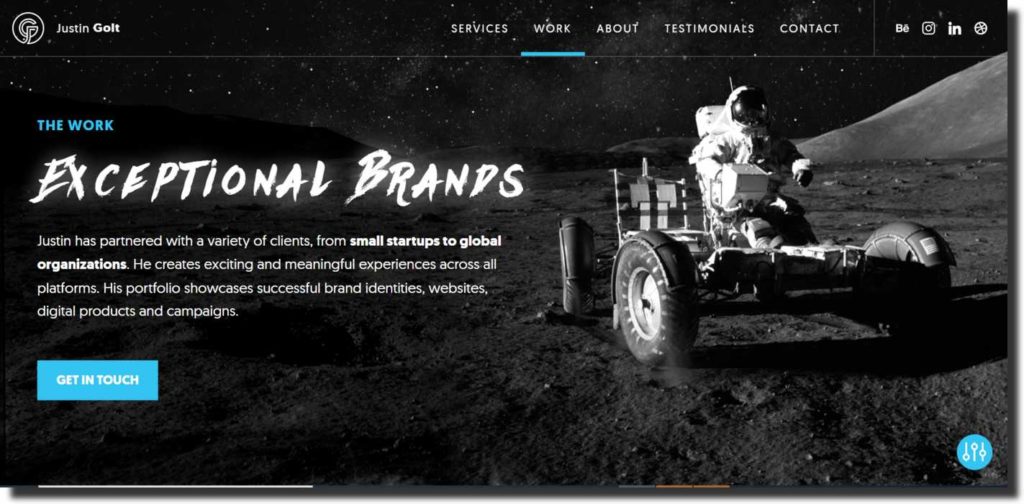
When you land on the homepage of Justin Golt’s UX portfolio, you will wonder if it’s a Nasa page or some kind of spacecraft online presence. Justin Gold is an award-winning UX designer with more than ten years of experience. Justin has created his portfolio website design to intimidate users with the powerful space theme.
The background showcases orbit with stars and various other things related to space. Justin Golt’s main objective is to connect and collaborate with multiple brands to help them succeed by reaching out to the right audience at the right time and through a suitable channel. Justin creates the UX design for brands that SEO based.
And not only that, the designer is known to be the brand catalyst who solves and creates various designing strategies for brands like art direction, brand guidelines, UX, UI, social media, and much more.
DFY UX Portfolio
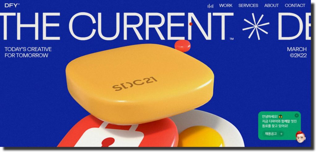
The digital agency DFY endorses marketing campaigns, designing UX/UI, creating brand strategies, and much more. However, when you land on their portfolio case, you might ponder that there is not much information or detail available to help you gauge what it is about. But the portfolio website design is authentic, as modern as it can be.
DFY even altered the cursor into a red brush, so when you land on their page, the cursor will automatically change and adjust according to the UI/UX design of the portfolio. Moreover, the homepage starts with a black-themed layout that loads itself by showing you the timeline from the year it began to the current year. And then, the portfolio opens up, showcasing various designs in a purple and white theme with video content.
In short, the portfolio is mindblowing with the perfect use of graphics and illustrations.
Hardy Branding UX Portfolio
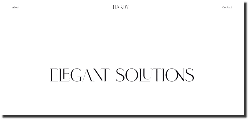
The award-winning Russian digital designing studio Hardy Branding is an exceptional Behance designing team that endorses elegance and simplicity in the portfolio. Even though, when you land on the Hardy portfolio, you might think that it’s some kind of top-notch clothing brands like Chanel or Versace. That’s because the sort of color palette and graphics Hardy chose to build their portfolio is different from other creatives.
But Hardy branding standouts with its unique choice of UX design. And it serves the purpose of collaborating with brands to plan out their UX strategies. Hardy Branding has handled several projects that you can see on their homepage. The designing studio also created his portfolio on Behance and stored all his projects, but you may find the case studies on the portfolio website.
Spaceberry UI Portfolio
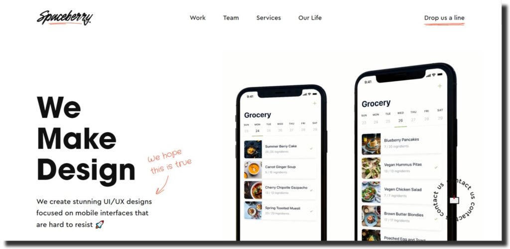
The engaging and interesting portfolio website design of Spaceberry keeps us hooked to explore more on the page. The award-winning UX/UI design studio helps brands collaborate with them and create digital content strategies.
The portfolio showcases how the creatives managed to pull off elegant designs with fun-looking GIFs to keep the users interested in finding out more about the studio. The designers used doodles on each page with a message for users like “Think Carefully” next to their call to action sign.
This way, they give users a chance to collaborate and decide by overviewing their work through the portfolio.
Matteo Della Chiesa UX
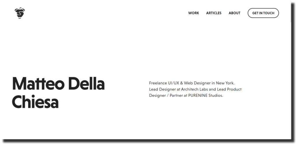
The digital and graphic designing New York-based freelancer Matteo Dellachiesa kept his portfolio straightforward with concise sections. Matteo is also a partner at Purenine Studios, and he categorized his portfolio on the website with various projects. The freelancer endorses minimum UX design and has only mentioned six exciting projects.
Moreover, Matteo’s portfolio website design outline only has three sections like “Work, Articles, and About Me,” He directly signals the call to action on the homepage. The simple, elegant, creative, short, and straightforward designs reflect a compelling UX and UI design.
Adrian Red UC Portfolio
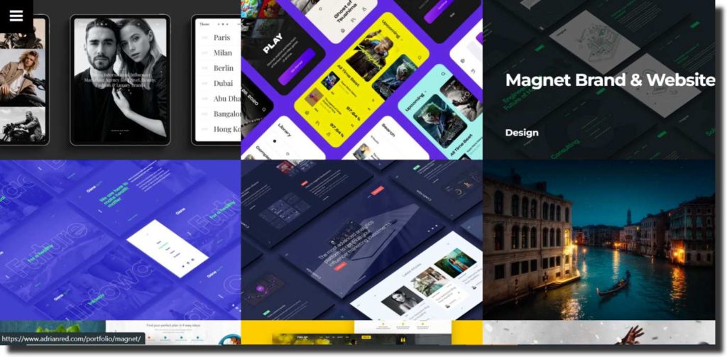
The freelance art designer and director Adrian Red have created his portfolio website design as it should be. The UX of his portfolio is modern and engaging, with all the projects present on one page. You don’t have to go into different sections to find the project portfolio, and it’s all there as you click the link.
And you can find out more by clicking on the projects. Currently, Adrian showcases thirteen project portfolios, including travel photography and campaigns. The call to action is also at the bottom of the project portfolio.
Nikitin Team UX Designer
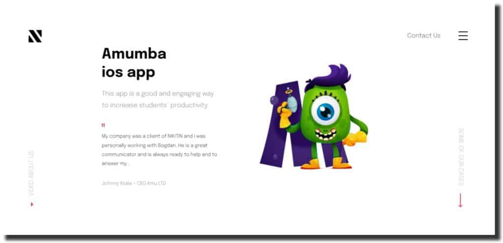
Nikitin team is a team of four talented UX designers and illustrators who showcase their UX project portfolio with a light-colored background and transition on the homepage. At the end of every project, the designers used testimonial templates as clients’ feedback to show relevancy and ensure transparency. Nikitin’s design team masters in developing various designing strategies for brands with collaboration, and it also solves the brand problems with their campaigns.
Moreover, the team prepares and produces application UI/UX to make it work on cross-platform bike applications operating in the cities of the United Kingdom. The Nikitin team keeps working to achieve its passion by creating unique UX/UI designs for every project.
Kommi Graphics UI Design
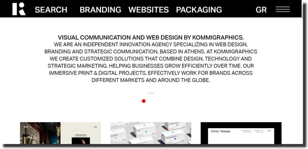
Kommi Graphics portfolio website design is similar to the other designer, but what makes it different is their strategy to be direct with their user with a bold introduction message. The Kommi graphics team is innovative creatives specializing in web UX and UI designing. The agency longs to create print and digital design strategies to grow productively and help them with their marketing campaigns. The Kommi graphics agency has worked with global brands throughout the years.
Big Horror Athens Interactive Designer
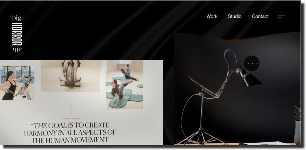
As the name suggests, the Big Horror Athens Interactive Designer endorses a spooky black theme layout for his UX design portfolio. The website design is engaging and keeps you hooked as you land on the homepage—the UX shows how the designer mainly focused on creativity to showcase the work for conversion. We can say that this UX design portfolio is not an average portfolio but the most creative.
And this way, the users get the idea of how much the designer wants them to look into his work for receiving recognition and more call to action for collaborating with brands.
Webshocker UX Portfolio
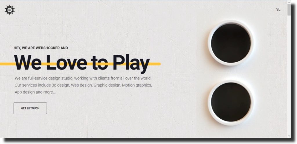
When we talk about creativity Webshocker’s UX portfolio ticks all the boxes to be a creative UX designer. The agency takes the simple yet innovative approach to showcase its work by combining various graphic techniques, including creating transitional videos on loop, boomerangs, GIFs, and animated text with an exceptional choice of color pallet. You will see a simple rustic design with a train animation aligning with the introduction message “We Love to Play” as you land on the homepage.
And as you will scroll down, you will see the line of successful project portfolios with different sections created uniquely in their own ways.
Cuberto Design Portfolio
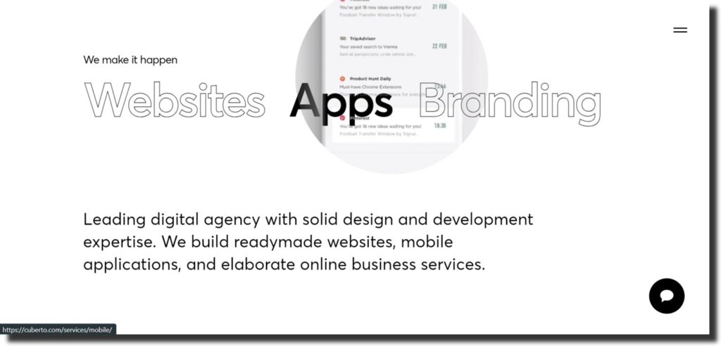
Cuberto Design is a digital agency known to collaborate with various brands for building their design strategies. The UX design portfolio imitates the previously mentioned portfolio Big Horror Athen but in a different color pallet and layout. The website uses a nude color palette for creating graphics and animation. Cuberto opts for frame-by-frame animation UX, and that’s why you will see different frames as you scroll down.
Overall, the digital agency does not have any unique features to stand out. So, we can say that it’s another portfolio out of thousands that create UX design for various brands.
Why Do You Need a UX Designer Portfolio?
UX designer portfolio is your business and calling card for potential clients, and having a robust online portfolio design will get you more conversions than without a UX design portfolio.
Take this for an example, when you need a services provider like a content marketer or social media marketer, you will ask for samples before going to hand over the project responsibility to see if they are competent enough or not.
Similarly, the UX designer portfolio showcases the competency of various designers to help you decide which one is suitable for handling your project. Having said that, there are other reasons why you should root for a UX designer portfolio, including these:
Sets the First Impression
The first impression is the last. This phrase is a precise reason why you need to have a UX designer portfolio. Clients lookup for several services through an online search, and when your website portfolio is optimized, it pops up first to the clients.
When you have designed your project portfolio with the UX that appeals to the eye of your potential clients, they are likely to press a call to action.
Get More Conversions
It might be a hefty task for you to create something for yourself when you are jumbled up with projects but little effort to showcase your prior experience will help you get direct conversions. You don’t have to spread the word or email your project samples to potential clients. The UX design portfolio will speak on your behalf.
Ensures Relevancy
When you get a project and then send a sample through email, the client realizes that your work is not relevant wastes your time and effort. A UX designer portfolio will help you have all your projects in one platform where users can land and click on the call to action if the portfolio shows relevancy.
Makes You Stand Out
There’s a never-ending competition in the digital world, and you need something that makes you stand out. UX designer portfolio helps you build a robust online presence that is different from others. And only showcase your projects and identify.
You Become Your Own Promoter
When you master digital art and SEO to create your UX design portfolio, you don’t need to hire a third-party marketing campaign to promote your work. You can create your profile on Behance and a robust website portfolio that will help you secure the edge.
Key Takeaway
You should use a UX designer portfolio to build your distinguished profile to be recognized for your own creation. And use the portfolio as an interface to connect with your potential clients.