Landing page conversion rates generally fall around (or slightly above) 4%. According to the most up-to-date data from Unbounce, the median landing page CR in 2021 (across all industries) was 4.89%. And, sure, this doesn’t sound too bad. But if you consider that a 4.89% conversion rate signifies that 95% of website visitors leave without converting, it’s clear that driving growth requires much more impressive results.

So, if you’re looking to boost conversions, you might want to explore the different design tweaks that will help you convince web visitors to give your solutions a chance.
Ultimately, the conversion rate on your landing pages will depend on several factors. These include how well you’ve defined your target audience, the efficacy and uniqueness of your solution, and the way your copy and value propositions present the benefits you can deliver. However, it’s also safe to say that investing in design can and will help you boost conversions.
So, if you’re ready to make some creative landing page design modifications, these are the tweaks that have the potential to deliver the best results in 2023.
Optimize Headline and Copy Appearance
One of the easiest ways for you to upgrade the design of your landing pages, which will, in turn, boost the overall user experience on your website, is to evaluate the appearance of your web copy.
Generally, web designers focus on the visual aspects of a website, while copy optimization is left to copywriters.
But here’s the deal. Well-written copy doesn’t just have to be effective at communicating the benefits of your solutions (via addressing your target audience’s pain points, proving your competence and authority, and inviting prospects to solve their needs by converting).
It also needs to be well presented, in a visual sense, so that it has the best possible chance of allowing web visitors to notice key product benefits and encourage prospects to engage with the text, all with the ultimate goal of boosting conversions.
Design Tweaks for Visually Improving Landing Page Copy
First of all, start with font and text size. Nailing these two elements will ensure that your headers and unique value propositions are easily readable. Plus, it will avoid frustration for your leads, as it will prevent them from squinting at their screens, trying to read text that’s either too elaborate or too small.
Generally, the recommendation is to choose a simple non-adorned font like Verdana, Lucida Sans, or Tahoma. Then, use a text size of at least 12pt for body text and 14pt for headings (18pt or larger is even better).
Secondly, to maximize readability and appearance, pay attention to the color and contrast between the text and the background. Black text on a white background (or the other way around) is always a safe bet. However, if you want to elevate the design of your landing pages with color, you can refer to professionals for advice on ensuring text readability through contrast.
Finally, don’t forget that text layout also plays a significantly impactful role in helping you get your message across. Research outlines how people read online, so following one of the proposed patterns makes optimizing landing page copy easier, at least from a design standpoint.
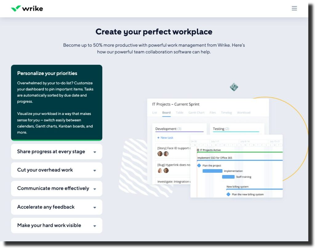
For example, the Wrike Team Collaboration Software landing page shows how effectively this SAAS brand website optimizes copy for readability without sacrificing design. The font is simple, legible, and large. And the text color provides sufficient contrast with the background. Plus, thanks to using a few element placement tricks (together with the liberal use of visuals), the site ensures that user attention is drawn to the software’s benefits, thus maximizing the chances of website visitors turning into free trial users.
Move the Social Proof Element Above the Fold
Web user behavior research shows that, when browsing websites, most people focus their attention on the elements above the fold. In fact, people spend 57% of their page-viewing time above the fold. So, if there’s any element that you want your prospects to see, the best chance of it being noticed is if it’s located in the hero section of your landing page.
Now, there are many elements that you might want to draw user attention to. In addition to your unique value proposition and your calls to action, however, you might want to enrich the above-the-fold section of your landing pages with social proof.
According to statistical data, consumers are paying more and more attention to ratings, reviews, and other trust-building elements:
- 88% of consumers consult online reviews when exploring local businesses.
- 49% of people trust reviews as much as they trust personal recommendations from friends and family. And;
- Product pages with reviews achieve 3.5x higher conversion rates and 4.5x higher revenue per visitor (RPV).
With this in mind, you should explore ways to include social proof in the first screenful of your landing pages.
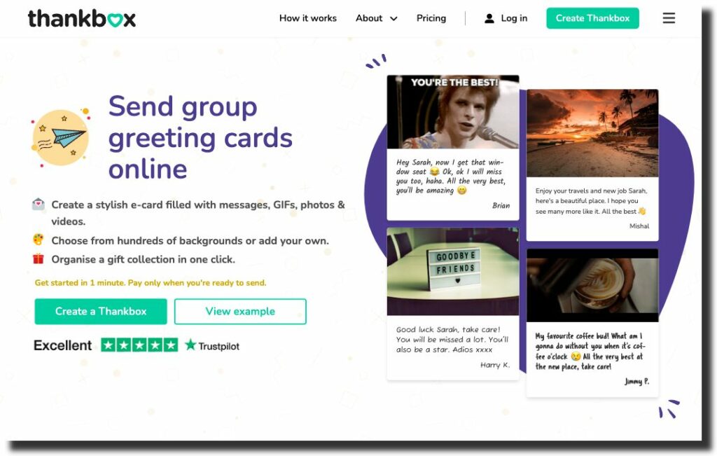
For instance, you can do something similar to Thankbox, a brand that shows off its “Excellent” Trustpilot rating right below the CTA buttons.
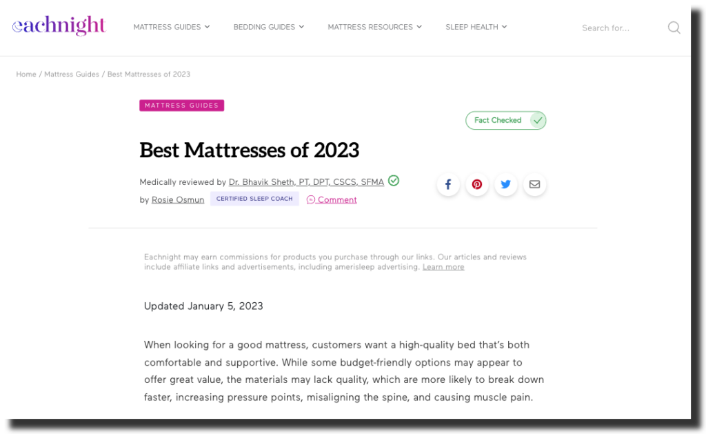
Or, if you’re looking for an advanced technique for enriching your landing pages with social proof, you could do something along the lines of Eachnight on their Best Mattresses page and point out that your content is written, fact-checked, and reviewed by certified professionals who are experts in your field.
Replace Your Header Images With Videos
Designing a stunning website header is crucial for ensuring your target audience gains a positive first impression when browsing your landing pages.
Investing in header design can help position your brand in the perfect light. And it can maximize the chances of web visitors converting into customers of your brand thanks to a combination of copy and visuals.
But here’s the deal. While visuals have been reigning website headers for the past decade, and with good reason — after all, images are more effective than text at engaging customers — in 2023, it’s time to rethink how you use visuals on your website.
More specifically, this year might be when you finally move on from using header images and replacing them with videos.
The reasons for using videos on your website are rather convincing. According to research data, 73% of people prefer watching explainer videos to reading about what a product does. Furthermore, 88% of consumers have been convinced to convert by watching a video. Now, combine this info with the fact that short-form videos have the highest ROI, according to HubSpot.
All things considered, it’s evident that using short explainer videos (preferably in the hero section of your landing pages) makes for an exceptionally effective conversion-boosting strategy. Video is far more likely to attract, engage, and convince prospects to convert than any other content format.
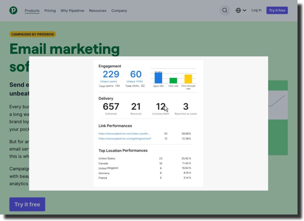
Of course, this doesn’t mean that the brand only relies on video to encourage conversions. But it shows that Pipedrive understands that, when exploring effective solutions, most consumers appreciate when a brand makes the research process at least a little bit less confusing and time-consuming.
Make It Clear What Value You Offer
Consumer priorities are changing rapidly, thanks to market unpredictability, supply chain issues, and a less-than-perfect economic outlook. In fact, Forrester predicts that, in 2023, buyers will start curating their spending, looking for value above else.
So, if you’re aiming to boost landing page conversion rates this year, it might be time to rethink how you explain the value your business offers to your prospects. There are multiple ways to highlight benefits when trying to convince people to invest in your solutions.
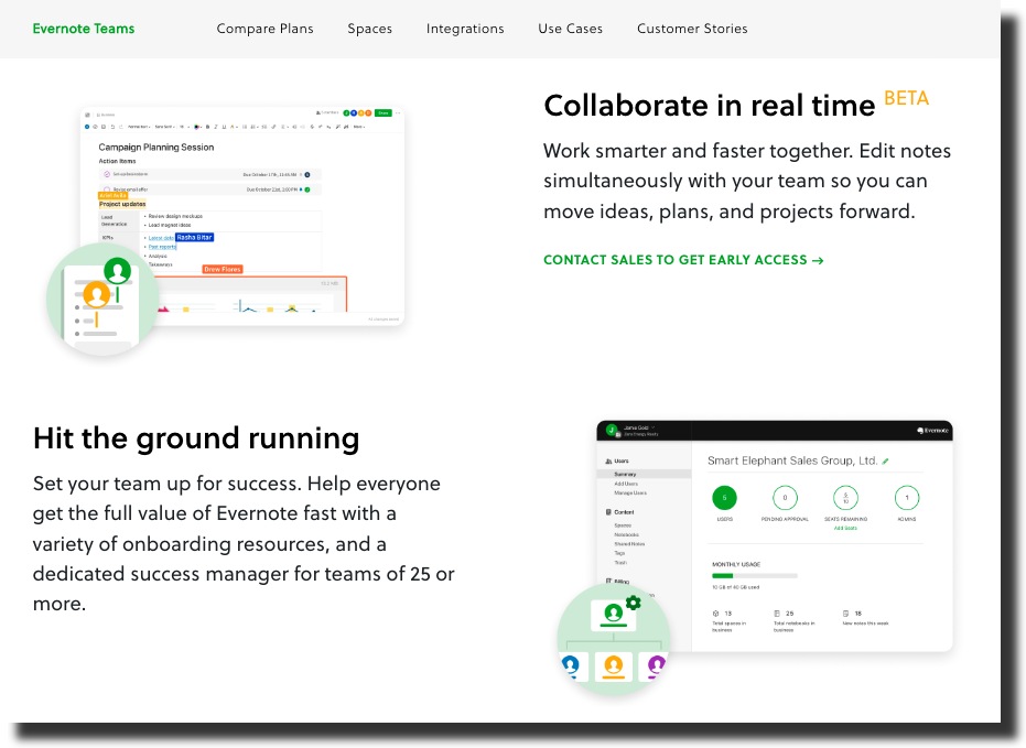
For example, you can adopt an approach similar to Evernote and try to present your solution’s benefits in an entirely user-oriented manner, describing each feature by saying what it does for the customer.
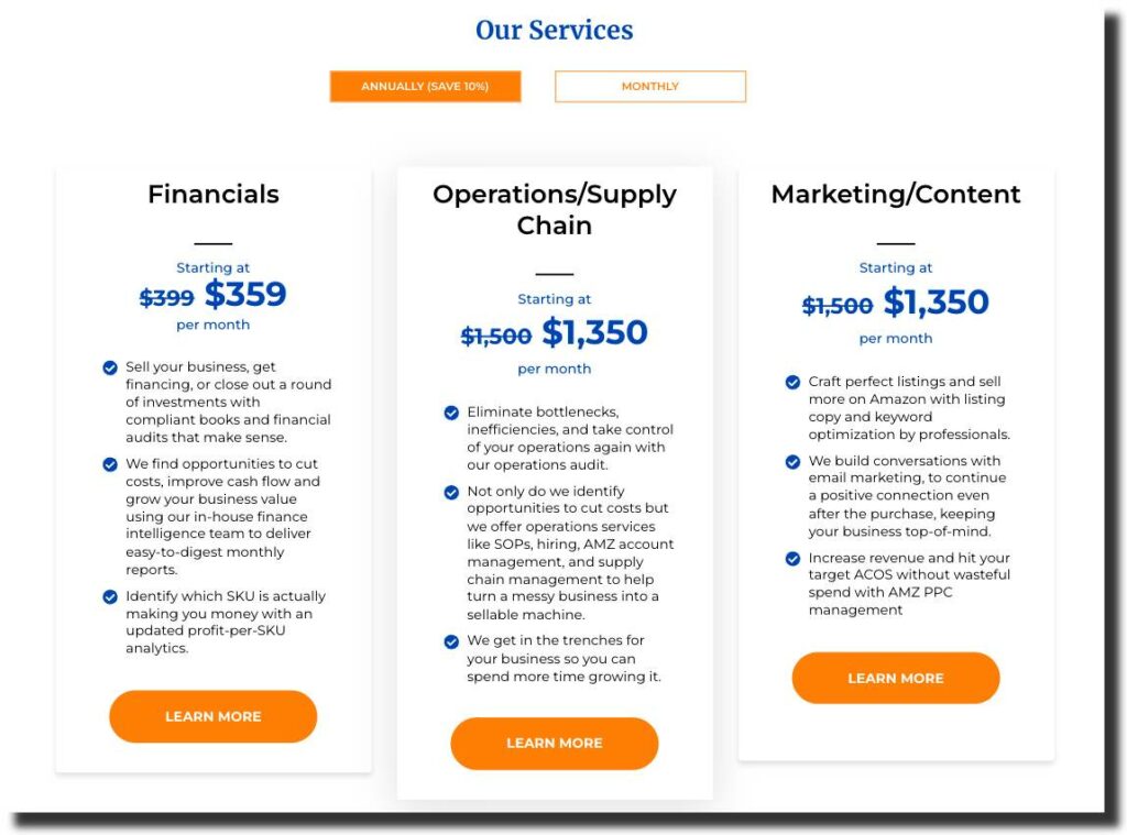
Or, if you’re targeting professionals with more specific pain points, you might want to take a more detail-oriented approach to highlight the value you offer. This is what SellerPlex does on its homepage, in the Our Services section, where it shows web visitors an easy-to-understand overview of what the business does, how that benefits users, and what the monthly/annual cost is for each service.
Boost Engagement With Interactive Content
If you’re looking for landing page strategies that will help you boost conversions in 2023, it might not be a bad idea to focus your energy on improving engagement rates.
Generally, there’s a direct line between the extent to which web users engage with webpage content and how likely they are to convert. And the great thing is that you can significantly improve engagement rates by investing in interactive content for your landing pages.
Of course, interactive content can come in many forms.
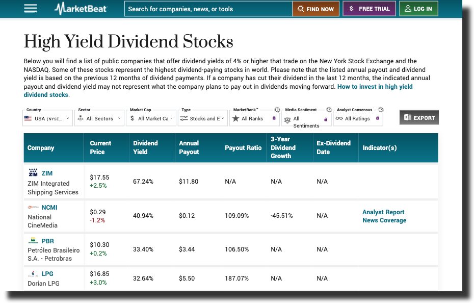
For example, you can create data tables with elaborate features, like the High Yield Dividend Stocks landing page on MarketBeat, which allows users to sort and refine results by their preferred filter. (Note how certain filters require a subscription to the brand’s services, which is an excellent tactic for boosting conversions).
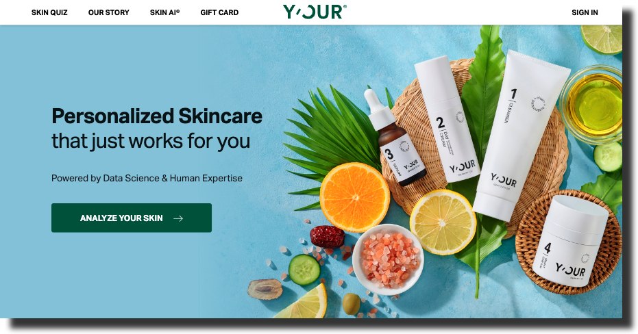
Or, if you’re looking for a slightly less resource-demanding way of investing in interactive content for your landing pages, you could design quizzes and calculators — like the one on Y’our. This approach will add a dose of personalization to your landing pages, guaranteeing that your prospects have an enjoyable and relevant experience browsing your site and products.
Declutter
Last but not least, if you’re looking for landing page design tweaks that have the potential to significantly boost conversion rates in 2023, don’t forget to do a bit of New Year’s decluttering.
You don’t have to go full-on minimalist with your web design to achieve the desired effect. But understand that a clutter-free design will allow high-value (conversion-boosting) elements to stand out. This will significantly improve their effectiveness at attracting and retaining web visitors’ attention. And it will ensure that your prospects don’t accidentally overlook information that could be key to convincing them to convert.
If you want to guarantee that you’re making the best design choices to support business growth in the upcoming year, leave the design tweaking to professionals. This will ensure that you get the best possible results without having to wander in the dark or deal with the consequences of having made a faux pas.