The website header is one of the most important elements of your website design. When someone views your website, what is the first thing they see? That’s right, your website header. And that is why your website header design must be outstanding and contain all the features that will grip the visitor and make it easier for them to navigate the website.
When you visit a website, your eyes are naturally drawn to the top of the page. It’s like reading a newspaper or an article; you want to start from the top and take everything in.
As a visitor, you see the website header design and get an overview of the brand. You see the header image and form an opinion of the company based on the overview of content present. If elements like the search bar and CTAs are present on the website header, it is even better for the visitor.
Depending on the website header size, it can take up a small amount of space on the page but still be one of the most important things on the website. This is why, as a designer, you should pay extra attention to the header design.
The world of website design is always evolving. Some new concepts and practices become more common every other day. Staying up-to-date with all the latest developments and design practices for website design can give you an edge over others in your field.
And we are here to help! This article will discuss what a website header is, the elements of excellent website header design, and the best design practices for this year. Let’s dive right in.
What Is A Header?
A website header can be a great opportunity to distinguish yourself from your competitors. The header is the top part of a website that appears on every page. It appears above the website’s menus and below the website’s title. It can take the form of a logo, a title, a slogan, etc.
It is also an opportunity to highlight your brand’s personality; after all, your website header is the first thing visitors see when they land on your website. The most common practice for designing website headers is using a logo.
However, there are more ways to approach this task. You can use a header that is just a title, a header that is just a slogan, or a header that is a combination of all three. The header is important because it sets the tone for your brand, and it inspires trust in your customers.
Before you start worrying about the design of your website, you must think about the design of your website header. It is the part of your website that attracts more visitors than your page content. The design of your website header is also responsible for user impressions.
A website header design that is attractive to your users will make them visit your website frequently. But a website header design that is less attractive to your users will make them visit your website less frequently.
What Is The Purpose Of A Website Header?
The website header design is the most visible section of your website. It is often mistakenly neglected, but it is an important part of your website that should be given the same importance as any other design element. Your web header should provide your visitors with the first impression of your website and reflect your brand.
Designing the right web header design is a challenging and tricky task. The web header is often one of the most dynamic parts of a website, and it can also be one of the most rewarding. But what is the purpose of a website header design?
Most website header designs are meant to accomplish one or more of the following:
- Brand recognition
- Creating an emotional connection
- Displaying information that is interesting and important to your company or organization
- Summarizing the purpose of your website
- Creating consistency throughout your website
- Creating a unified experience for your website visitors
- Delivering a message that is clear and simple
- Visually engaging your visitors
- Creating a meaningful first impression of your website
The Elements Of Website Header Design
1. Logo
The logo is one of the most important elements of a website header design. This is where you introduce your branding to the website visitors and set the tone for your brand. Your logo should be placed at the top so people can recognize your website in one glance, even if they have multiple tabs open.
For example, if you go to the Apple website, you will see that the logo is on every page, in the same place. The logo/brand identity is also used as a home button. You are taken back to the homepage if you click on the logo.
2. Page Title
The page title is usually found beneath the logo and navigation on your website header. The design for the page title is often different from the rest of the header. This is because the page title has to match the rest of the page design.
For example, if you go to the “About” page of a website, you see the word “About” in big, bold text at the top of the page. The page title is mostly considered a part of the header.
3. Navigation
Navigation is also the main menu of your website. You must include it in the website header design. You can consist of all the sections or pages in this navigation menu, making it easier for visitors to find what they are looking for.
For example, if you are a news website, the navigation menu in your website header should show all the topics you cover. It is the main user interface for your website. You can have a dropdown menu or a single link menu depending on the website design.
4. Search
Having a search bar in your website header design is an excellent idea. It is a crucial element when it comes to the user experience. A search bar makes the experience more efficient for visitors, and they can look up anything they want on your website.
You can permanently have the search bar in your website’s header, or you can include it as an expanding button in the top corner of your website. The choice you make depends entirely on the header design and layout of the website.
5. Sign-up/Log-in
The sign-up or log-in option is not necessary for all websites. However, if the website is for a brand or service provider that includes membership, it is important to make it part of the header design.
If you look at Google, you can see how the log-in/member profile button is a picture of the user connected to a drop-down menu. From the drop-down menu, you can access various features and profile settings. Some websites also include this in the navigation menu.
6. Shopping Cart
When designing an eCommerce website, not having a shopping cart access point in the header is not an option. The shopping cart is usually found in the same place on all websites. It is an element that must be accessible to visitors at all times.
It is an element that is key to creating a fantastic user experience. Once visitors on your website are done with browsing all products and are ready to check out, the shopping cart should be visible so they can access it quickly.
7. Notifications
If you are creating a website that provides users with notifications, they should be visible and accessible. The user should know when they have unchecked notifications, and they should be able to view them right away.
Making notifications a part of the website header design is the best way to go about it. If they are a part of the header design, visitors can spot them and address them more efficiently, improving the user experience.
Types Of Website Header Design
Brand-Focused Website Header
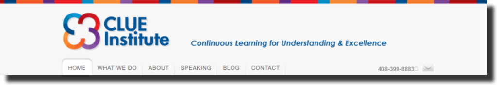
The website header for clue institute shows us what a brand-focused header looks like. The website header size is not that large and does not take up much space on the page. However, the elements of the header design show us the brand identity clearly.
The Clue Institute website header has the logo and brand name larger than any other header elements. The attention of visitors is immediately dragged to the logo. It is also brilliant how the brand colors are used in the strip at the top of the header. The slogan for the brand is also one of the main elements of the design, making it more brand-focused.
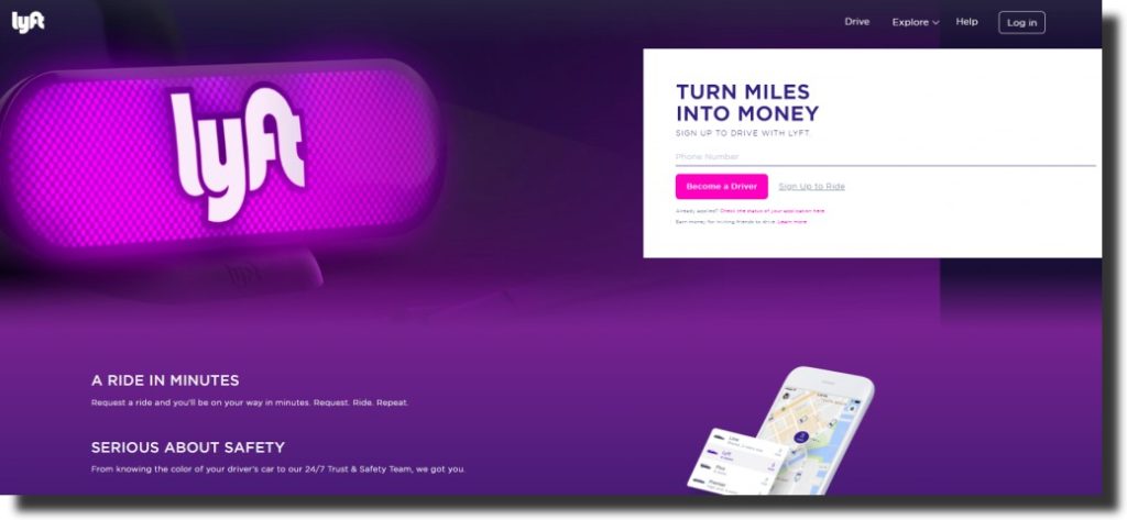
CTA-Focused Website Header Header
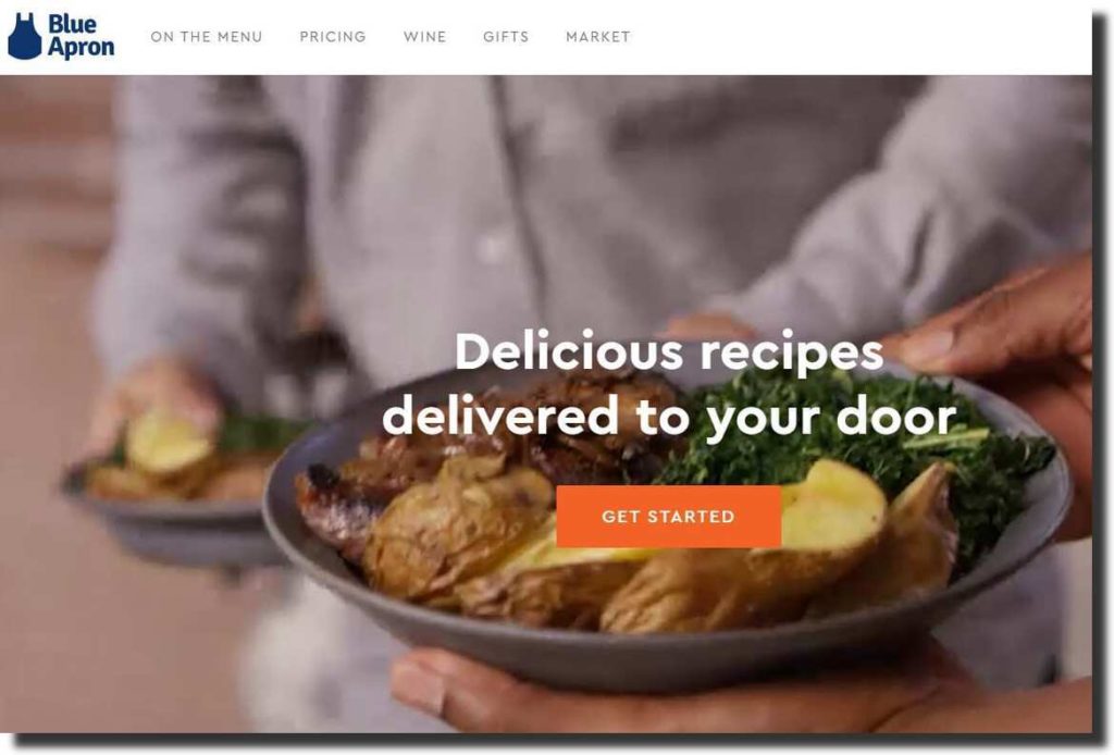
Including a call-to-action (CTA) in your website header design can be an excellent choice. As you can see, the Blue Apron website header has two unique elements: the header includes a video instead of a hero image, and the CTA is front and center.
The video in the header design is warm and provides visitors with a sense of comfort and being home, which is a fantastic thing. The video shows how visitors can have a relaxing and delicious experience, and the CTA urges visitors to take action right away.
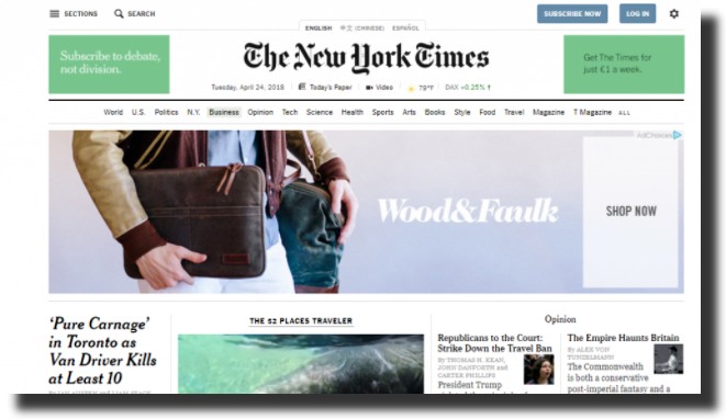
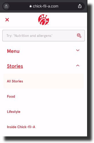
Content-Focused Website Header
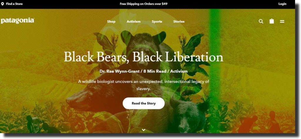
Content-focused website header design can be the ideal choice for websites for magazines and blogs. Patagonia, however, is an exception to that. These headers promote the articles and stories, giving visitors an idea about what to expect from the website.
It is not a magazine or a blog, but the brand still uses content-focused header design to let people know their values and beliefs. For example, as you can see in the image, Patagonia is pushing stories and articles that show visitors how committed they are to making a change in the world.
Product-Focused Website Header
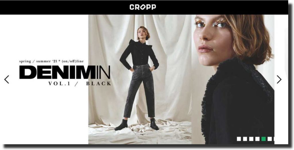
If you are designing the header for an online store or eCommerce website, choosing a product-focused design can be excellent. Using your website header to showcase the latest products your brand offers is a fantastic way of getting visitors’ attention.
The website for Cropp does the product-focused header design brilliantly. You can see how they use the large website header size to showcase their latest collection. When visitors see the newest collection, they can click on it and start shopping right away. It can also act as a CTA.
Background Video-Focused Website Header
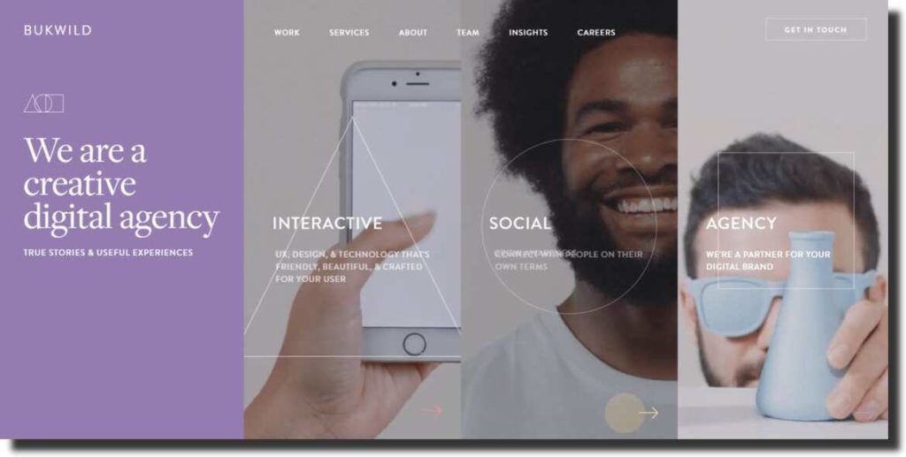
BUKWILD uses the video-focused website header design brilliantly. Incorporating video in the website header design is another way to grab attention and make visitors want to explore your website. The video you use can also provide a quick overview of the brand and the products and services.
This creative agency has three different videos integrated with its header design. The videos start playing depending on where your mouse is hovering on the screen. The videos give you an overview of the brand straight away, and visitors know that they are indeed a creative digital agency.
Personal Brand-Focused Website Header
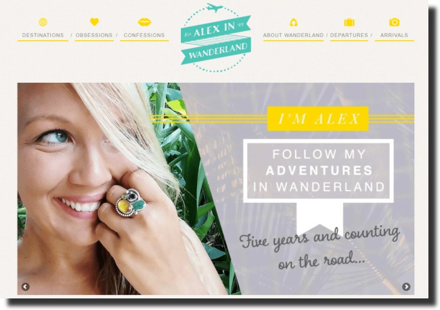
The header design should be personal brand-focused when designing a personal blog or website. It can help create a better and stronger connection with the website visitors and people who follow the blog. The travel blog, Alex In Wanderland, is an excellent example of using the header to create a personal bond with readers.
Not only is the use of a selfie as the hero image a fantastic choice, but the text on the header is also intriguing and will want the reader to explore the website and read more blog posts. The website header design shows Alex’s personality and brand, and visitors know what to expect from the blog.
Best Website Header Design Practices
Website Header Size
Every website designer needs to understand and keep in mind that there is no set rule when it comes to the website header size. You should never fixate on the dimensions because people can be using a variety of devices to view your website, and not every screen is the same in size.
You should know that everyone will not have the same viewing experience. Even if the size of the screen is the same, the resolution of the screen can be different. Some resources try to provide a set of correct figures for website header size, but you should not limit yourself to these figures.
You can choose a small website header size for informational websites and a larger size for landing pages. The best way to figure out the website header size is by looking at the layout and design for the entire website and using your common sense. The height of the header should not interfere with the rest of the page and content.
Fixed Header
When designing a website in 2022, you must know that fixed or sticky headers have become standard practice. A fixed or sticky header is a persistent navigation bar that follows you even when you scroll down a website page. It is a practice used to improve the overall user experience of a website.
You can use sticky headers or fixed headers as a designer if you know they will not disrupt the rest of your design. Incorporating them can give the website a more modern and up-to-date feel if it does not violate your concept.
Fixed headers are an excellent choice for desktop and mobile sites and should be incorporated in both designs. The sticky header for an eCommerce website should always include the shopping cart. Similarly, service websites should always have their contact information or CTA on display.
Visual Hierarchy
Any person visiting a website for the first time will always start reading the page from the upper-left corner. If there is no information, you have most likely already lost the visitor. Nielson Gorman Group first formulated the theory of the F-shaped pattern of reading on the web in 2006, and it is still relevant to this day.
If your website does not adhere to the F-shaped pattern of reading, your website will be considered tricky to read, and it can lower the user experience. If the page requires too much effort to understand, visitors will not spend much time trying to navigate the website. Instead, they will move on to some other web page.
Your logo should always be at the upper-left corner of your header, making it the first thing visitors see. It is also essential that you keep your website’s navigation simple and include it in the header design seamlessly. Lastly, use the visual hierarchy rules to make your CTA stand out in the website header.
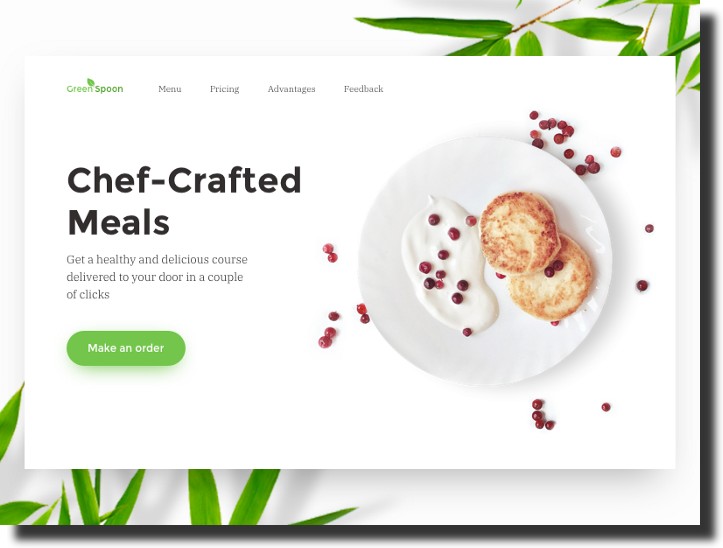
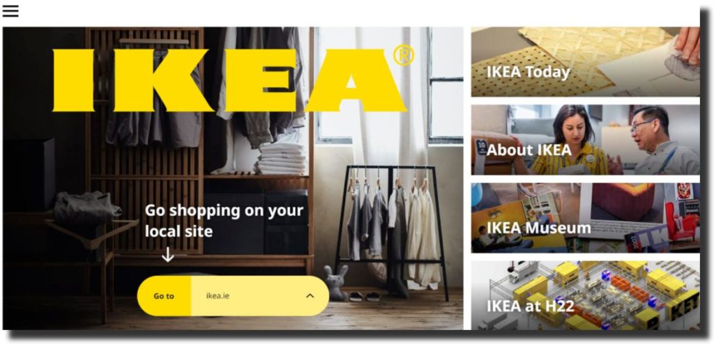
Relevant Header Image
When designing a website header, you have to keep in mind what the brand or business provides for its audience. Choosing a header image that depicts the services or products helps give an overview for the website visitors. It tells them what the website and the business have to offer.
For example, if you design a website for a food delivery service, using food or a courier graphic in the header image can be the right choice. It lets visitors know what the business is about and encourages them to choose the company, almost acting as a call to action.
Using high-quality header images will ensure that the header design looks outstanding. You can also incorporate different elements like sliding images or illustrations in the header design. Never underestimate the power of good imagery. It can help convey a message and invoke emotions in the website visitors.
Message Conveyed By The Header Design
There are various messages that a website header design can convey. For example:
- Work on trust-building
- Urge customers to make a purchase
- Encourage visitors to find out more
Before you design a website header, you have to think about the website’s main message. What are you trying to convey to the audience? What do you want visitors to know when they look at the header design? There are various types of websites, and the header design depends on the kind of website you are designing.
The main purpose of this website is to present the product in the best way possible, and the header design should focus on that. If your website design is promotional, you need to focus on the header containing links to the most significant sections of the website. You can also include a hero image of the product or service the website is trying to promote.
For an eCommerce website, the header design might be completely different than promotional websites. You want the customer to navigate the website with ease so that you can give more importance to the navigation menu, search bar, shopping cart, etc.
Simple Header Design
One design practice that has gained immense popularity in recent years is simplicity. You are doing it right if you can convey your message and get your audience’s attention without making them feel overburdened with information and content. Keeping it simple is key when it comes to header design.
People often have this misconception that using numerous visual elements will make the website design look creative; that is not true. When visitors view your website, they should not be bombarded with offers, content, and various visual elements. You can show your creativity with intelligent, minimalistic design.
Using visual elements for navigation, search, shopping cart, etc. However, you should not use uncommon or difficult icons to interpret. Your website header design mustn’t confuse visitors and make the experience challenging for them. If the user experience is not smooth, you will lose visitors.
Hidden Navigation
Hidden navigation, also known as the hamburger menu, has recently gained popularity with website designers. It is used frequently, especially in header designs that want the audience to focus on the hero image or message of the header. The hamburger menu is an icon with three stripes on it. It expands when the user clicks on it.
When it comes to creating an excellent user experience, hidden navigation is one of the best techniques. It ensures that the user’s focus is not on anything else, like the navigation menu. As a website designer, you can use this technique if you want the visitors to focus on the main image and header.
It was a design technique that was mostly used for mobile website header designs at first but slowly became popular with desktop website headers. The hamburger menu is the best option for product promotional websites, where you want the attention to be drawn to the product images. However, it should be avoided for eCommerce websites as you want the search bar and shopping cart to be accessible to the user.
Well-Designed Call-To-Action
As a website designer, you need to realize the importance of adding call-to-action elements to the website header design. These elements should encourage the visitors to click on them and take action. The CTAs you include in the website header design can be along the lines of “sign-up,” “log-in,” “contact us now,” “get in touch,” etc.
The design of the CTA matters a lot. It should be noticeable and get the user’s attention right away. The text used for the CTA should also be simple and easy to understand. The font you use for the CTA design should be readable. These elements help ensure that the CTA works and gets noticed by the website visitors.
The placement for the call-to-action is a strategic decision. When the CTA is one of the first things a user notices, they are bound to click it, and it can help increase the conversion rates. As a website designer, you should know where to place it to get the most clicks.
Video In Header Design
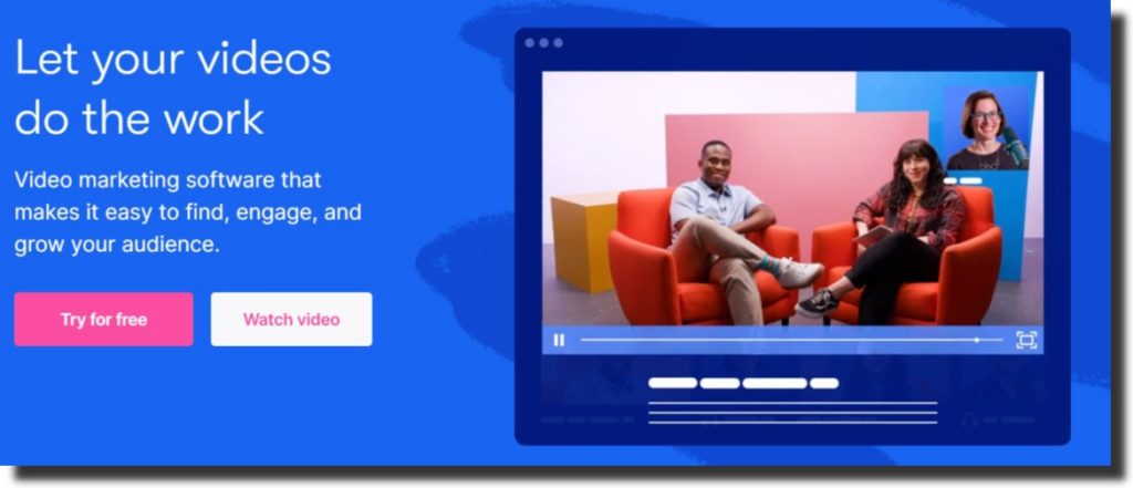
When it comes to website header design practices, you need to shift your focus from static images to videos. Website designers are using videos in header designs more and more. These videos are more captivating than regular images and immediately grab the user’s attention as they open the website.
Having videos in the header design can also help convey a clear message about the brand or business. Video has more to offer than images, and it can let the visitors know what the brand stands for. Adding video to the header is one of the most efficient design practices as it does an excellent job of presenting the products and brand in the best way possible.
You can also incorporate animation in the website header design to try something fun and creative. Using vivid colors and interesting designs for the animation is also an excellent way of engaging the audience and grabbing their attention.
Use Of White Space
The use of white space to improve the layout and design of the page has been in the spotlight for quite some time. However, it has become a design practice to make the correct use of white space for header design.
Using space to make the various elements of the header design shine is an excellent technique. You can use white space to put a distance between the logo and the rest of the website’s navigation, creating more emphasis on the logo and making it catch everyone’s attention.
As a website designer, you should decide the margins and padding for each element on the header. You can see how much white space you can incorporate into the design. Using white space to enhance the header design is a practice that has recently gained popularity.
Create Custom Header Designs For Mobile Version Of Websites
When designing a website header, you cannot ignore that countless people will be using their mobiles to visit the website. People prefer browsing the internet with their mobiles more than their laptops or desktops, making it crucial for website designers to keep the design of the mobile website in mind.
When it comes to the mobile website header design, you don’t have to change the content and elements of the header. However, you should consider the layout of the header. Will the header fit on mobile screens? Do you need to adjust the placements of the elements? You must keep in mind various things when designing mobile sites.
You can include hidden navigation in the mobile website header even if you haven’t used it for the desktop version. You need to make many changes to the header layout to ensure the best user experience possible.
Choose Easy To Read Fonts
One design practice that has become very common these days is sticking to simple, basic fonts. There is an increasing amount of importance given to the user experience of a website in today’s day and age, and to ensure that the visitor is not confused, you must use fonts that are easy to read and understand.
It is also unnecessary that you use the same font for the header text present in the brand logo. The logo is the brand identity, and companies often use fonts that are not very common. However, you should not choose uncommon fonts for the header text, menu, etc.
The best website header design practice is for a serif or sans-serif font instead of a script. They are simpler and easier to understand. You should also adjust the size and color of the font based on the requirements of the header design.
Final Takeaway
The website header design matters a lot. It is the first thing a person sees when they visit your website, and if it is not excellent, people are more likely to leave the website. The header design should contain all the essential elements and look interesting. Including images, videos, CTAs, etc., is a fantastic way of encouraging visitors to explore the website more.