When it comes to web design, selecting the right typography is a crucial element that can make or break the overall look and feel of a website. A well-chosen font has the power to convey a brand’s personality, enhance readability, and create a captivating visual experience for visitors. This is where Google Fonts steps in, offering a vast and ever-expanding library of free and open-source web fonts that can transform the typography game.
In this article, we embark on an exciting journey through the world of Google Fonts, uncovering some of the best typefaces that will unleash your creativity and elevate your web design projects. Whether you’re a seasoned designer or a curious beginner, these fonts will inspire you to experiment, play, and find the perfect match for your next website or project.
What is Google Fonts?
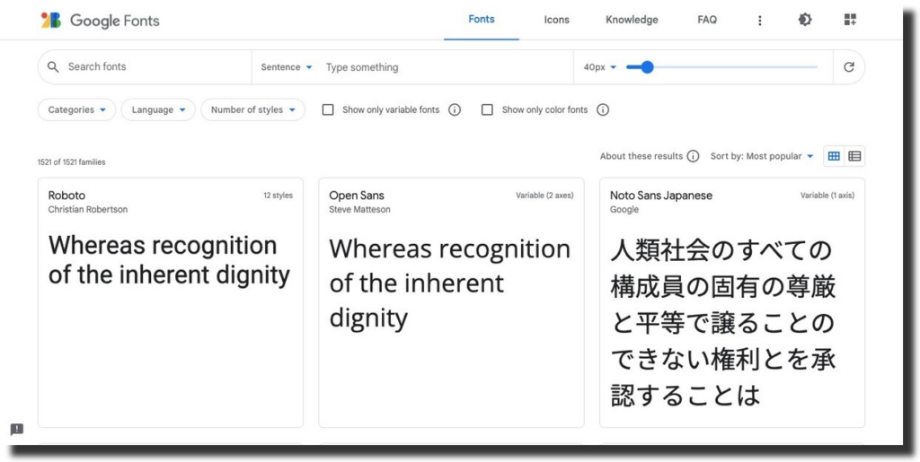
Google Fonts is a free and open-source library of web fonts provided by Google. It allows website developers and designers to easily access a wide variety of fonts and use them in their web projects. Google Fonts offers a vast collection of typefaces from various designers, ranging from classic to modern, and supports multiple languages and writing systems.
The primary purpose of Google Fonts is to improve the typographic appearance and readability of websites. By integrating Google Fonts into a website, developers can enhance the design and aesthetic appeal of text content, making it more visually engaging and accessible to visitors. This helps to create a consistent and pleasing user experience across different devices and platforms.
Why Consider Google Fonts?
One of the key advantages of Google Fonts is its ease of use. Developers can easily embed the desired fonts into their websites by adding a simple code snippet provided by Google. The fonts are hosted on Google’s servers, ensuring fast and reliable delivery to users. Additionally, Google Fonts employs techniques like browser caching and content delivery networks (CDNs) to optimize performance.
Another notable feature of Google Fonts is its open-source nature. The fonts are licensed under open-source licenses, such as the SIL Open Font License or the Apache License. This means that developers can freely use, modify, and distribute the fonts, even for commercial purposes, without any licensing restrictions.
In summary, Google Fonts is a valuable resource for web developers and designers, providing a wide range of high-quality fonts that can be easily integrated into websites to enhance their visual appeal and readability.
Best Google Fonts
1. Open Sans
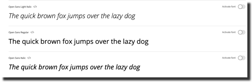
Open Sans is a versatile and widely popular font that has become a staple choice for countless websites and digital projects. Designed by Steve Matteson, Open Sans is known for its clean and modern aesthetic, making it a perfect option for a wide range of applications.
A standout feature of Open Sans is its exceptional readability. With a well-balanced letter spacing and proportions, this sans-serif font ensures legibility even at small sizes, making it ideal for body text in paragraphs and long-form content. The clarity and simplicity of Open Sans allow users to effortlessly absorb information without any visual distractions.
2. Roboto
Roboto is a highly acclaimed and widely used font designed by Christian Robertson. Developed specifically for the Android operating system, Roboto has gained popularity beyond mobile interfaces and has become a beloved choice for web and print design projects.
The defining characteristic of Roboto is its clean and modern appearance. This sans-serif typeface strikes a balance between geometric precision and humanist warmth, resulting in a font that is both contemporary and approachable. The letterforms are streamlined and have consistent stroke weights, contributing to its overall legibility and readability across various sizes and resolutions.
3. Montserrat
Montserrat is a captivating and dynamic font designed by Julieta Ulanovsky. Inspired by the signage and lettering found in the Montserrat neighborhood of Buenos Aires, this font exudes a sense of urban energy and timeless elegance. Its unique combination of geometric shapes and humanist influences sets it apart and makes it a versatile choice for various design projects.
The most striking aspect of Montserrat is its distinctive uppercase letterforms. The characters are bold, clean, and exhibit subtle variations in stroke width, giving the font a sense of character and personality. The uppercase letters are ideal for eye-catching headlines, logos, and prominent display text that demand attention and make a strong visual impact.
4. Lato
Lato is a versatile and elegant font designed by Łukasz Dziedzic. Derived from the Polish word for “summer,” Lato encapsulates the essence of warmth, openness, and friendliness in its letterforms. This sans-serif typeface has gained popularity for its exceptional readability, contemporary style, and extensive range of weights and styles.
At first glance, Lato captivates with its clean and well-balanced design. The letterforms exhibit a harmonious blend of geometric precision and humanist influences. Its moderate proportions and slightly curved strokes create a sense of fluidity and approachability, making it a visually pleasing font suitable for a variety of design projects.
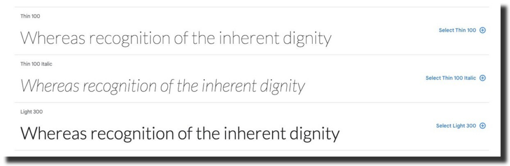
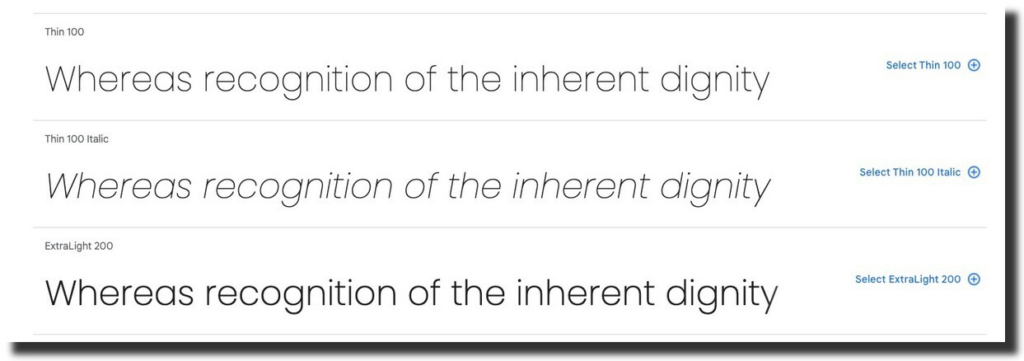
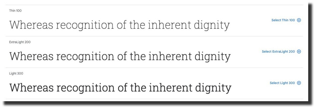
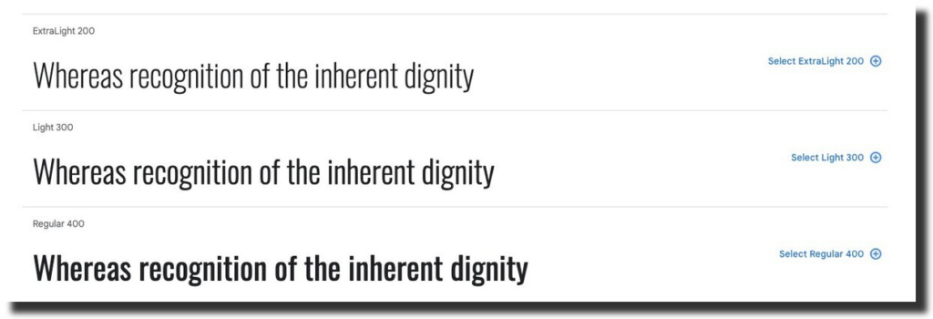
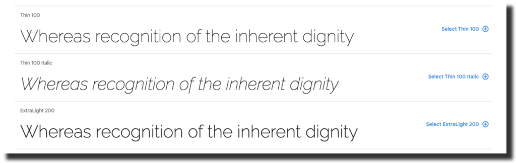
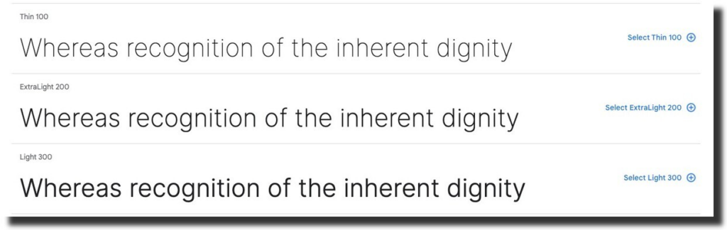
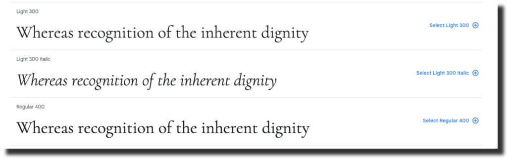
Lato’s versatility lies in its extensive weight variations, ranging from thin and light to regular, bold, and black. This wide range of weights allows designers to establish clear typographic hierarchies, from delicate headlines to bold subheadings and body text. The different weights offer flexibility, enabling the font to adapt effortlessly to various design aesthetics and convey desired visual emphasis.
5. Poppins
Poppins is a contemporary and versatile font designed by Indian Type Foundry. Inspired by the geometric sans-serif style, Poppins features clean lines, rounded terminals, and a modern aesthetic that exudes simplicity and sophistication. This font has gained popularity for its excellent legibility, diverse range of weights, and its ability to add a touch of elegance to any design project.
The notable feature of Poppins is its exceptional readability. The carefully crafted letterforms and ample spacing between characters contribute to its clarity, making it highly suitable for both display and body text. Whether used in headlines, paragraphs, or user interfaces, Poppins ensures that the text remains easily readable, even at smaller sizes or on high-resolution screens.
6. Playfair Display

Playfair Display is an elegant and sophisticated font designed by Claus Eggers Sørensen. Inspired by the timeless typography of the 18th-century, Playfair Display combines traditional aesthetics with modern sensibilities, resulting in a font that exudes a sense of classic beauty and refinement.
One of the great features of Playfair Display is its high contrast between thick and thin strokes. This contrast gives the font a distinctive and elegant look, reminiscent of traditional calligraphy and letterpress printing. The refined serifs and gracefully curved letterforms add to its overall sense of grace and visual appeal.
7. Roboto Slab
Roboto Slab is a captivating and versatile font that builds upon the original Roboto font family. Designed by Christian Robertson, Roboto Slab combines the clean and modern aesthetic of Roboto with the added warmth and character of slab serifs. This combination results in a typeface that offers a balance between professionalism and approachability, making it an excellent choice for a wide range of design projects.
Roboto Slab stands from the rest with its sturdy and well-defined slab serifs. These serifs provide the font with a touch of personality and elegance, giving it a distinct visual presence. The serifs are carefully balanced, creating a harmonious interplay between the thick and thin strokes, enhancing the overall legibility and readability of the font.
8. Oswald
Oswald is a bold and contemporary font designed by Vernon Adams. Inspired by the classic gothic and sans-serif styles, Oswald exudes a sense of strength, versatility, and modernity. This font is characterized by its geometric shapes, strong vertical emphasis, and distinctive letterforms, making it a popular choice for impactful headlines and display text.
The most striking feature of Oswald is its bold and commanding presence. The thick and uniform strokes, coupled with its condensed letterforms, create a sense of visual weight and power. This makes Oswald ideal for grabbing attention and making a bold statement in design compositions, whether it’s on posters, banners, or digital displays.
9. Raleway
Raleway is a modern and elegant font designed by Matt McInerney. With its clean lines, graceful curves, and a touch of sophistication, Raleway has gained popularity for its versatility and contemporary appeal. This sans-serif typeface strikes a balance between minimalism and personality, making it suitable for a wide range of design projects.
Raleway offers a range of weights and styles, including thin, light, regular, medium, semi-bold, bold, and black, providing designers with a variety of options for creating visual hierarchies and conveying emphasis. From delicate and subtle to bold and impactful, the font allows for effective typographic communication and adds depth to design compositions.
10. Inter
Inter is a versatile and highly legible font designed by Rasmus Andersson. Known for its exceptional clarity and extensive language support, Inter has become a popular choice for both digital and print design projects. This contemporary sans-serif typeface strikes a perfect balance between functionality, aesthetics, and readability, making it suitable for a wide range of applications.
One of the key strengths of Inter is its exceptional legibility, particularly in small sizes and on screens. The font’s balanced letterforms and ample spacing between characters ensure clear and easy reading, even in challenging digital environments. This makes Inter an excellent choice for user interfaces, websites, mobile apps, and other digital platforms where readability is crucial.
11. Lobster
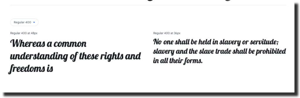
Lobster is a distinctive and visually captivating font that offers a unique feature: multiple versions of each letter. This remarkable characteristic allows designers to select the most suitable character based on the context, providing greater flexibility and creative possibilities. What makes it even more convenient is that this feature is automatically enabled in any web browser that supports ligatures.
Lobster’s charm lies in its hand-drawn appearance, which exudes a sense of creativity and playfulness. The letters have a whimsical flair with fluid strokes and decorative elements, giving the font a distinct personality. Whether it’s used for logos, headings, or creative typography, Lobster adds a touch of character and individuality to any design.
12. Cormorant
Cormorant is an elegant and versatile serif font designed by Christian Thalmann. This sophisticated typeface draws inspiration from classic calligraphy and traditional serif styles, resulting in a harmonious blend of timeless beauty and contemporary usability. With its graceful letterforms and balanced proportions, Cormorant offers designers a wide range of creative possibilities.
One of the notable features of Cormorant is its exquisite detailing and delicate curves. The font exudes a sense of refinement and craftsmanship, with its graceful and flowing strokes. The subtle contrast between thick and thin lines adds to its overall elegance, creating a visual rhythm that captures attention.
13. Rubik
Rubik is a modern and geometric sans-serif font designed by Philipp Hubert and Sebastian Fischer. This versatile typeface is characterized by its clean lines, balanced proportions, and friendly appearance. With its contemporary design and extensive range of weights, Rubik offers designers a flexible and functional choice for a wide range of design applications.
A great feature of Rubik is its geometric construction, which gives the font a sense of order and structure. The letterforms are precise and well-defined, with consistent stroke widths and minimal variation. This geometric simplicity contributes to the font’s overall readability and visual clarity, making it suitable for both display and body text.
Final Thoughts
In conclusion, the world of Google Fonts offers a rich and diverse selection of typefaces that can elevate any design project. From the clean and versatile Open Sans to the modern and geometric Rubik, each font brings its own unique style and personality to the table.
The best Google Fonts are carefully crafted to balance aesthetics, readability, and versatility. They provide designers with a wide range of options to choose from, allowing for creative expression and effective communication. Whether you’re designing a website, creating a logo, or working on a print project, these fonts offer endless possibilities for typography that captures attention and conveys your message.
As a designer or business owner, it’s essential to recognize the impact that typography has on your overall brand identity and user experience. Choosing the right font can make a significant difference in how your audience perceives and engages with your designs. It sets the tone, enhances readability, and creates visual harmony within your compositions.
A design agency can provide invaluable assistance in selecting and implementing the ideal Google Font for your project. The team of professional designers understands the nuances of typography and can guide you towards the best font choices that align with your design goals.