When designing any website or developing it, one must pay a lot of attention to the details. One must know what is required of the website and how it’s going to help them achieve their goals. In the case of school web design, it plays a crucial role.
Not only does it have to look professional, thorough, and sleek but it also has to perfectly represent what the school is all about. The school’s ambiance and characteristics must be reflected well through their website.
Whether it’s a music school web design or the best driving school web designs, we’ve got you covered and you can create something fantastic for your school after reading this guide.
So, before getting into the tips and specific elements to help you make your school site look professional in 2020, here’s a list of some of the most creative school web designs, along with the features we liked:
1. Little Sprouts
Little Sprouts is a preschool that is spread over five locations (Poway, Mission Valley, Rancho San Diego, Mission Gorge, Adams Avenue) and their “mission is to provide a unique and enriching preschool experience through quality care, organic healthy foods, and attention to detail.”
The lovely thing about their web design is the fact that all the images are well-shot and well placed, all over the website. Their focus on highlighting the visual elements and atmosphere of the school works in a wonderful way due to their aesthetic placement.
Moreover, they keep it simple. They don’t waste your time by throwing a plethora of unnecessary information towards you. Instead, they offer the right amount of relevant information, right on their homepage in order for you to witness all the important stuff without having to look around too much.
The use of light, nature, and greenery in their pictures perfectly encompasses their values and mission statement and provides a nice look into the workings of the school itself.
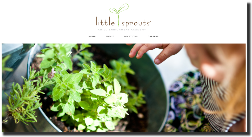
As I mentioned, they have a glimpse of most of the relevant information on their homepage, all you have to do is to keep scrolling downwards. If you’d like more information, though, they’ve got a ‘Learn More’ button throughout, which will lead you towards a more detailed description of your query.
Furthermore, they have a drop-down bar for Home, About, and Locations section, which will take you right away to a more detailed section about the respective categories.
It’s a very easy-to-use, light-on-the-eyes, sleek, minimal, yet effective website that looks just as lovely on mobile devices.
2. Abbotsleigh
Abbotsleigh is an all-girls school in Wahroonga, along Sydney’s North Shore, in Australia. Not only are they a boarding school, but also a pre-kindergarten to Year 12 Anglican day school. They have a long, distinguished history, having been around for more than 133 years.
What goes perfectly well for a school with such history and stature is the design and look of their website. The first thing one notices is how they’ve used the colors of their emblem or logo in their web design – yellow and black. That is a wonderful nod to subliminal marketing, dare I say.
The site is extremely easy to use and has all of their relevant information right on the homepage. Whether it’s their Preschool, Junior School, Middle School, Senior College, or Boarding sections – you can find them all quite conveniently as you scroll along and click on any that catch your attention, instantly.
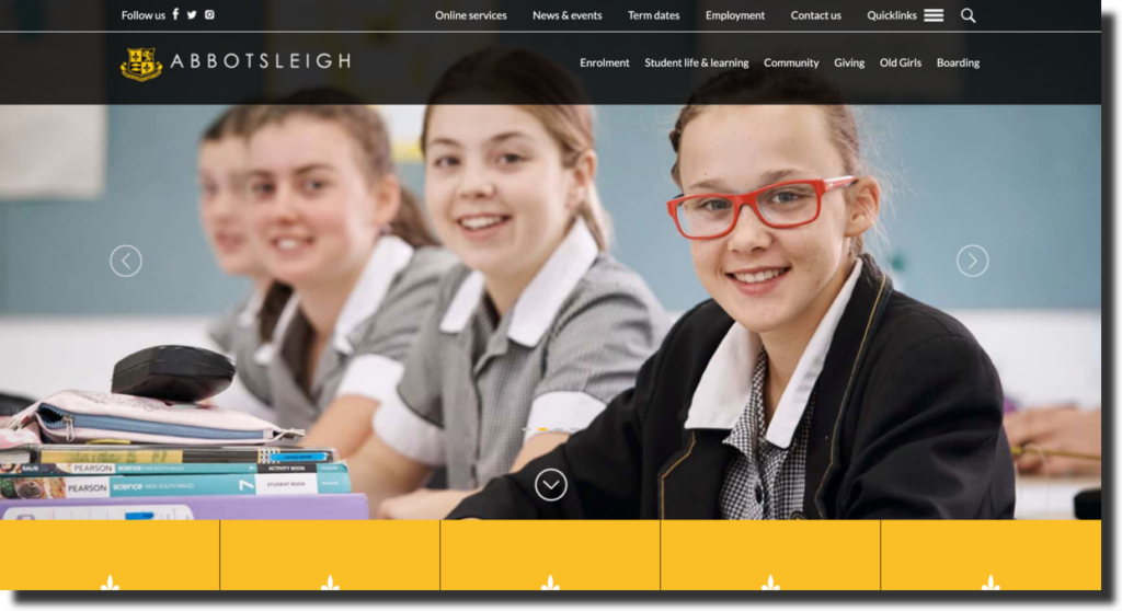
The website also has an intuitive navigation bar along with a hamburger menu and to cater to all queries, they’ve also positioned a Search box at the top right corner, in case you need to look for something specific.
They’ve highlighted their activities and school ambience quite effectively through welcoming and eye-pleasing visuals.
Moreover, the helpful display of options such as visuals of campus, extra-curricular activities, tour options, requests for prospectus. Colorful visuals increase visitor’s attention and engagement, like blog post on best bank for college students by MOS as an example to know how beautiful visuals connecting with the content.
Lastly, the site’s fabulous design works seamlessly across mobile devices as well.
3. Pipster Prep
Pipster Prep is a school that is “committed to providing rich experiences to promote cognitive, social, and emotional development and ensure students have a solid foundation needed for lifelong learning. With a student-centered approach, students are active participants in their own learning. Activities are designed to allow students to explore and discover.”
The aforementioned paragraph is taken from Pipster Prep’s website which clearly states how they follows a different approach than other schools.
Their website follows the same thought process. It has some interesting live animation going on with different elements on their homepage, which are done very aesthetically. Moreover, the font, design, and visual look of the website is also quite encouraging and interesting.
They’ve kept minimal colors on their homepage — white and a very light variant of blue.
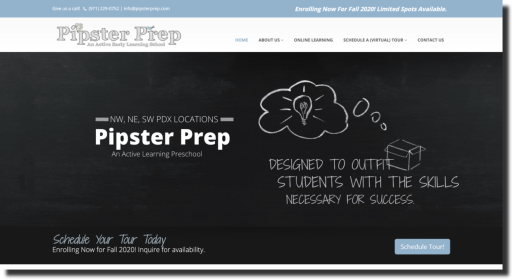
All the relevant information regarding who they are, what they offer, scheduling of tours, tuition fees information, and FAQ sections are available right on the home page – making good use of the space.
The testimonials at the bottom of the page are also an interesting element on their website and all of it looks equally wonderful on mobile devices as well.
4. Little Dolphins
Little Dolphins by The Sea is located in Santa Monica, and is a non-profit, independent school. Over their 24 years of existence, they have served Brentwood, Westwood, Venice, Palisades, Marina del Rey, Malibu, Mar Vista, and the surrounding Westside communities, apart from Santa Monica.
Their focus is on promoting “imaginative thinking through rich, immersive experiences in art, theater, music, and literature.”
Just like their name, their website promotes the same imaginative and creative values. The web design is colorful, creative, and focused on showcasing their values in all its splendor. Whether it’s their use of colors with images of their students or other elements – they shine through and captivate the viewer’s attention instantly.
Not only do they do a wonderful job at showcasing the various interesting activities that children or “little dolphins” indulge themselves in at their school, but they also represent the vibe and ambiance of the interactive teaching that they promote.
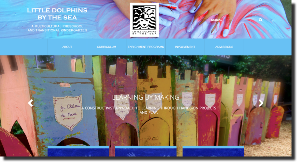
The homepage has all the necessary material and gives you little information about certain important sections such as admissions, “enrichment programs”, and events that you can learn more about by clicking the “More” button below them. A tasteful display of call-to-action buttons, I must say.
The site features a navigation bar that consists of drop-down menus and is quite intuitive and the website functions similarly on mobile devices as well.
5. Trinity Grammar School
Trinity Grammar School is an early learning, primary, and secondary school which offers day schooling and boarding options. It is a boys-only multi-campus school, located in Sydney, Australia. Having been founded in 1913, it has a rich history, culture, and traditions. Their values are to provide “boys with thoroughly Christian education in mind, body, and spirit.”
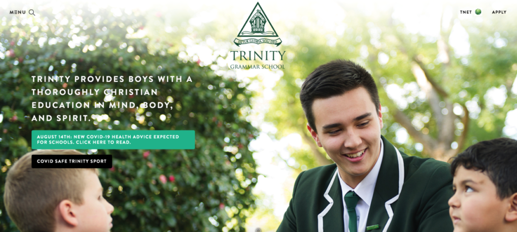
With schools that have such an incredible legacy, it is imperative to uphold that in all spheres of its representation. That is precisely what you’ll see happening on their website.
They’ve kept the website very clean, minimal, classy, and devoid of any useless shenanigans. They have a certain image and that is what they’re trying to convey even through their website.
They’ve got pictures of children from their early learning programs and secondary schools, engaging in various activities on campus. Not only do they do a good job of representing their facilities but also of children being thoroughly engrossed in whatever they are doing.
The website follows the colors of their emblem which is green and they’ve kept it simple with white to go with it. It’s pleasing to the eyes and the aesthetics are brilliantly managed.
They’ve also got parents’ testimonials on their front page, right at the top which is quite different from the other websites which usually have them at the bottom of their homepage. Nonetheless, it certainly achieves the desired effect.
The navigation bar presents a detailed Menu which proves to be quite helpful and the rest of the site can be navigated through without a hitch.
Needless to say, the mobile variant of the site is just as classy and seamless.
6. Lausanne Collegiate School
Lausanne Collegiate School believes in empowering individuals by being caring and attentive towards children’s lives, through all levels of their learning along with various enrichment programs and academic challenges.
The first thing that you’ll notice when you log onto their website is how much attention they have given to making a lasting impression on the visitors’ minds. Unlike other schools, their homepage is filled with an assortment of charming, short videos that keep changing every few seconds, showing glimpses of students’ lives in their schools.
Whether it’s relevant updates, campus visuals, athletics, classrooms, art displays, or other extra-curricular activities – they’ve got it all on display in the most interactive way possible. Moreover, you can ‘Learn More’ about each of these variants of the school by clicking below headlines on these videos and it’ll provide you with even more elaborate details.
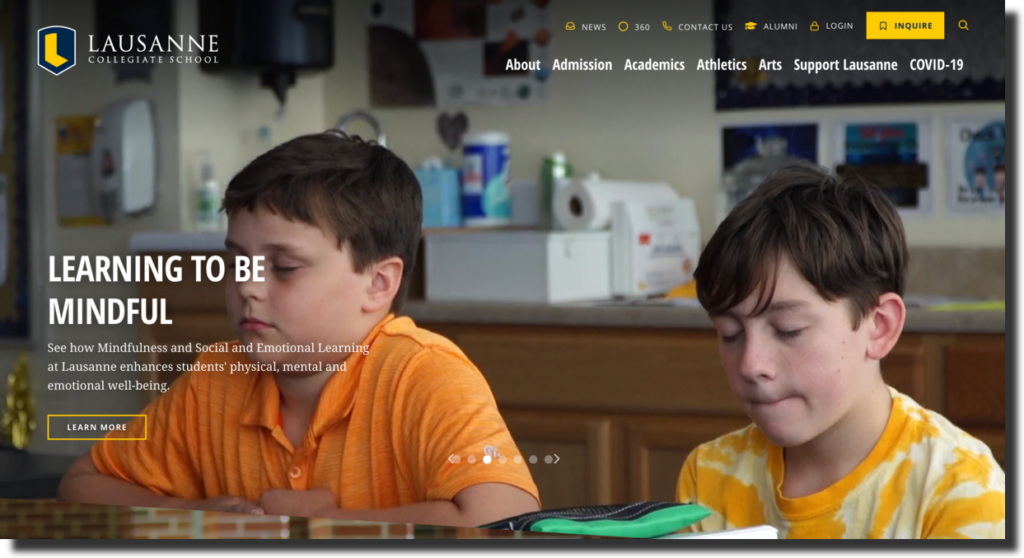
When you scroll down, the website provides delightful outlooks at their student body, their history, and campus updates along with relevant event details at the bottom.
Their website follows their emblem’s colors – Yellow and navy blue. It’s all really professional and aesthetically pleasing, giving you a sense of immediate attractiveness towards their offerings.
Their navigation bar has the option of a drop-down list that gives you access to many other features of their website, loaded with more information.
The website is neat, classy, and extremely well designed for both, web screens and mobile devices.
7. Stuartholme School
Stuartholme School is based in the Western Suburbs of Brisbane, Australia. It is a catholic boarding school for girls that focuses on fostering their creativity, identity, and confidence. It is the only girls’ day and boarding Catholic school in Brisbane.
The first thing you’ll notice on Stuartholme’s website is how they, just like Lausanne, have used live videos as a slideshow to showcase their school’s features. It showcases their building from every angle, the facilities they provide, and a general look at how life for children is there.
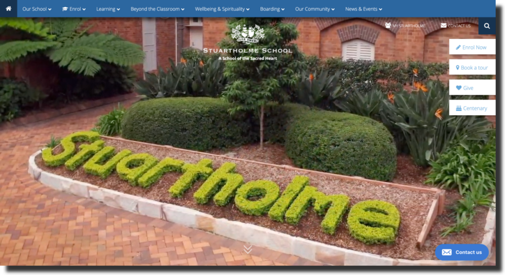
Their website is incredibly neat and minimal and keeps to two colors primarily – White and Blue. They have various call-to-action buttons right below all the important subheadings like ‘Book a tour’, ‘Request a prospectus’, ‘Fees & Payments’, etc.
A ‘Contact us’ option stays omnipresent on the website at the bottom left, to facilitate parents instantly.
Their social media links are also given and the overall display of the website is quite professional and smooth, fully compatible on mobile screens, as well.
Final Tips
Through all of these aforementioned examples, we’ve seen how many fantastic schools all around the world use their websites to encourage more and more parents to visit them and perhaps enroll their children with them. Whether it’s a primary school web design template, secondary school web design, or an elementary school’s website design – all of these apply.
Here are the key take-aways from these examples:
1. Keep It simple
Don’t go overboard with displaying a plethora of information on one page. Spread it out. Keep it simple. It’s a school web design, you need to focus on the important aspects.
2. The Homepage Is Everything
As you must have seen through all of these examples, a good school web design post all the relevant and important information on their homepage. Just like on eCommerce websites, people have very short attention spans; therefore, you need to make the information very accessible for them.
3. Keep It Neat
You don’t need to make a 10-page long homepage. Write little bits of information and have a call-to-action button below them in case visitors want more information about something.
4. Stay True to Your Image
If you’re an arts and craft school, you can’t possibly focus on the athletics of your school on the frontpage. Moreover, you need to represent the vibe and ambience of your school and the image that you have as accurately as possible.
5. Be as Creative as Possible
Your creativity shouldn’t limit you at all. You need to stand out. You can do so much with a website as long as you have a trusted web designer or web design agency.
Implement all of these tips to come up with an attractive website for your school. You could also use the help of a professional school web design agency to help you with this process if you’re looking for something specific.