We are already in the digital transformation process. Staying up to date with different inventions and advancements is essential for the business’s success and can help find various challenges.
Similarly, having data from data sources useful and can help you make useful business decisions is important. But skimming through tonnes of information in black and white can be quite boring and irritating. This is the point where you wonder if you could make the entire data present with you a little more attractive and interesting.. One more color and the report might look better than before and may attract the reader’s attention.
Not just this, but using the right analytics tools is also important to get the best understanding of the datasets, which can be used at a place of need to improve a company’s work.
This is exactly where Google Data Studio steps in and does the job for you.
What is Google Data Studio?
Google data studio helps to transform your boring data into useful, readable, and shareable reports where you have the complete power to customize your reports and dashboards. You can also make them more interactive by using various tools and using data range controls and viewer filters.
Google data studio is a free data visualization tool provided by Google to its users. It is a service that people can use to create reports that are interactive and visually appealing.
The best part is that it can easily import data from various sources that include AdWords, Attribution 360, BigQuery, Google Analytics, Google Ads, Google spreadsheets, YouTube Analytics, and many more. You can easily import all the data from various sources, including third-party connectors, and present them in the form of tables, charts, diagrams, and even view them in real-time along with the relevant changes.
Gogle Data Studio Pricing Plans
There are a paid version and an unpaid version of Data Studio. In the free version, you can easily share the reports you create with various people. And they can only make changes if given permission. Also, you can notice the changes as they happen as well. Moreover, you can also copy a completed report and later fill it with the required information. There is also a gallery where ready-made templates of the reports can be accessed, and you can try any one of the templates.
The paid version obviously a lot more services than these. But most of the features mentioned above are free to use, with easy sharing and reports. The user can use Data Studio’s features for tracking KPIs, analyzing trends and performances over a certain period of time. The user can use Data Studio’s features for tracking KPIs, analyzing trends and performances over a certain period of time.
In more simple terms, Google Data Studio is just an upgraded version of Google Analytics which is limited in functionality as compared to Data Studio.
Benefits of using Google Data Studio
There are a lot of benefits of using Google Data Studio. If we pay attention to the free features, they can also help us get a lit of benefits and are impressive to make you choose to go for the paid version of the tool.
Import Data from different data sources
A noticeable benefit of using Google data studio is that you can access over 200 data sources, including Bigquery, a data warehouse present on the cloud, and import your data very easily. There are very few tools like these that would be present, and the ones present would want you to do many things. This could include buying different packages and getting subscriptions to different software and tool to import your data. Well, this surely does not happen in Google Data Studio. You can also use third-party connectors to add data from other sources with their own charges, unlike tools like BigQuery.
It has a live data connection
Live data connection to over 200 sources eliminates the need to schedule continuous data updates for your reports. Live data connection removes your limitation of a certain date range that you can look into. It allows you to back as much as you want, to see a particular set of values important for making business decisions.
Complete customization control
Google data studio provides you with full customization control, and this means that you can make various useful additions to your content. This includes adding more pages, charts like a bar chart, and even tables. You can also customize the dashboard the way you want, which means you can change the dashboard colors.
There are several themes present that you can choose from, or you can create your own custom-based theme where everything is included of your choice. It also gives you the option to extract them from images.
More customization options include editing the layouts, page sizes, alignment as well. You can also add charts of various sorts and then edit them according to your data and colors and the looks that you like.
There are options for conditional formatting as well, where you can easily show the targets and goals that have been achieved and achieved by the company.
It provides dynamic controls
This is one of the most important and loved benefits of the users of Google data Studio. The dynamic controls allow you to slice and dice through the data without updating the report itself. By adding the dynamic controls, viewers can easily get through the entire content using date range selectors. You can also add and delete content from the page and as much as you want without deleting and entering all the data again.
Included tricks in this are optional metrics and custom bookmarks.
Optional Metrics
Optional metrics are optional features where the user can easily customize the report without editing the original content.
Custom Bookmarks
You might be using the report frequently and want to save your changes. This is where the custom bookmark option comes in handy and helps you do exactly what you want without causing you any trouble.
It has the option of advanced formulas
This benefit of google data studio makes it different from all the other tools used for data visualizations. It helps you convert your databases into interactive dashboards and create a successful way to reach your customers by responding to their queries and needs timely. Advanced formulas include calculated fields.
Calculated fields help you create new and customized formulas metrics and dimensions in Google data studio using the exiting data taken from a data source. You can very easily perform different calculations and even create categories. A notable use of the calculated fields can be in the form of case statements.
Case statements mean creating return dimensions and metrics that can be based on conditional expressions. CASE statements are mostly used to create new data groups, and it allows you to create new fields using conditional logic.
There may be various data visualization tools present, but not all are free and offer such amazing tricks even on the free version.
Situations where one can use Google Data Studio
Now that you have understood what Google Data Studio is all about and how one can use it for creating interactive dashboards for clients and for keeping an eye on the insights received from a particular data source, and for finding better solutions to improve the business metrics; let’s have a look at the different situations of how Google data studio can be further used.
Have a look at the website traffic.
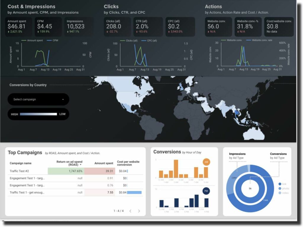
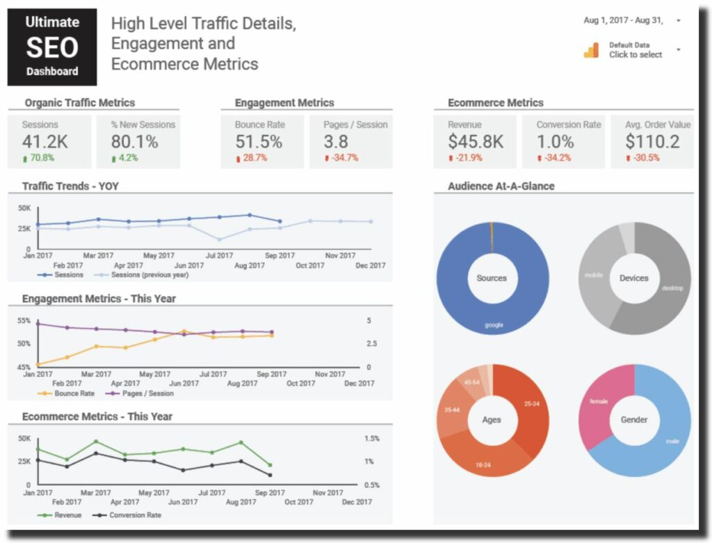
One of the most common reporting that can be done through Data studio is to keep an eye on the website traffic. For a business, it is essential to make sure that their professional website is getting the optimum traffic at all times. The website traffic can be used to increase the conversion rates and see the current trends and the audience’s preferred choices so you can make informed decisions about it.
The website traffic overview can help the marketers who are working on generating traffic through SEO practices or google ads or Pay per click. The dashboard can help get useful insights like the amount of traffic that the website is receiving which can be more or less. The device is used, the conversion rates, and even the behavior of the users.
This way, the client can make useful website design changes as needed to get more traffic. If this does not work, they will find new and proven solutions to improve the website traffic.
Digital marketing
A lot of google tools help in digital marketing. Whether we are talking about google ads, google analytics, google search console, or any other service, google always facilitates its user. The introduction of google data studio can only be counted as an addition to the list.
Digital marketing comprises many things, including social media platforms like Facebook, Twitter, and ads. It also includes SEO practices that can help improve the rankings. It also includes web development and maintenance and placing google ads to ensure that the customer receives the brand’s message. They get interested in buying your product.
It should be an active practice to use google data studio to understand better how the business works. According to this, it must be improved to get better ROI (Return on investment). It can also help understand the clients’ media to run a better and effective advertising campaign.
Pay per click campaigns performance
The google data studio can understand the data received from various data sources and how it can be interpreted to better plan future projects.
Further helping the clients realize what product needs to be highlighted.
Creating Search Terms Report
To understand the user’s behavior, it is important to use analytics and see the changes caused in various areas. The most effective way to do this is the search term report. The search term report has many benefits. It helps a client understand the behavior of people towards the ads and identify the gaps and work towards ending the gaps.
Making a search term report is very time-consuming, but the results are beneficial and insightful.
Creating a custom report can help you customize the dashboard and add another page. It makes it more attractive and impressive for your client.
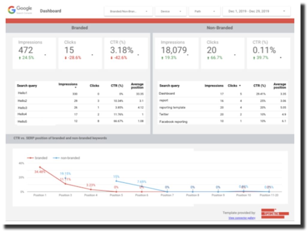
SEO reporting
This tool is handy and can also be used for extra analysis and insights. Using an already existing template, you can get more time to analyze where every solution can be used at a different level. This kind of reporting is beneficial.
You can even break down the Google search console queries in the brand and nonbrand and closely monitor the brand’s working with your teams. Non-brand keyword opportunities can also be discovered based on clicks. Moreover, you can use this tool to quickly analyze the various data channels in mere seconds. It allows you to find the best opportunities for your brand. Also, pay attention to the web design to ensure that it is up to the mark and SEO practices.
For best results use supermetrics in your reports. You can get data from any of your favorite platforms. Supermetrics has free versions and paid versions as well, consisting of different additions to its packages and from which you can easily benefit. But because supermetrics is a connector, it will obviously charge you for utilizing it.
Steps to create a Report
Now that we are all aware of what Data Studio is and the benefits of using analytics google ads, let’s learn how it can be used to create a report?
Login In and Selecting a Template
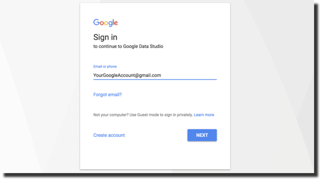
The first step is to log in to your Google account and select a relevant template. Several built-in templates are present, but you can also create one for your datasets. Remember to use the login and password you have been using on analytics and other cloud services. If you use any other email address, you will have to use that address on all the other platforms to make sure that you can easily get all the data. Using a new or a different email address is completely useless.
This is what the login window looks like:
You can check out various tutorials to help you get started with it. Whatever template you chose, you have the full authority to customize the different aspects of the template. It include the fonts and the other report elements. All the businesses have different needs, so the reporting also needs to be different for them. You can create analytics, PPC, social media-specific reports as well.
Adding your Data Sources
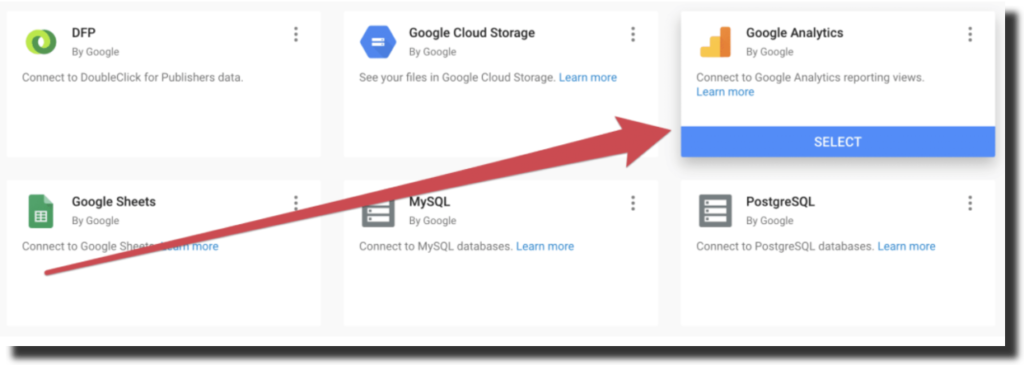
The next step to using the tool is data integration which means adding your data source. It can be one like BigQuery, a data warehouse present on the cloud and can be accessed from anywhere, or you choose more than one data source to get all your data on a single platform.
You can choose the connectors, and all the data will be synced for you in one place. You can choose the “add data” option to insert all the data.
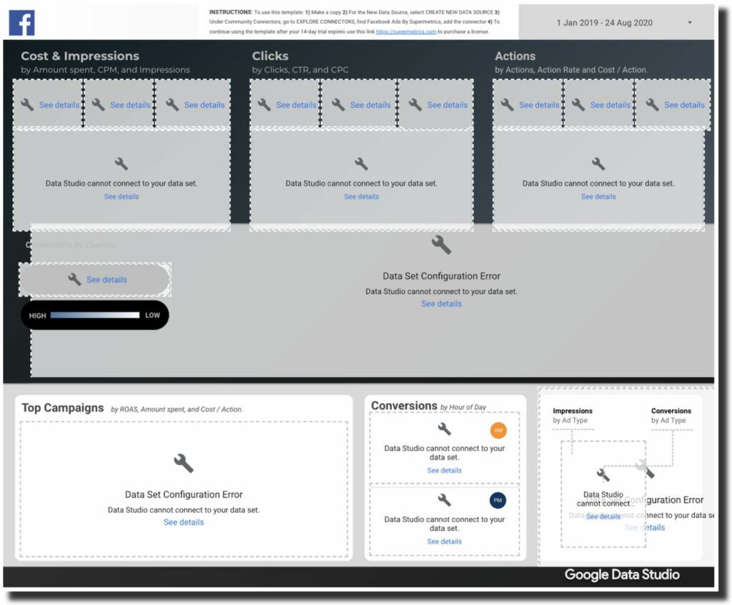
Some connectors are third-party and can help you add the entire data, including CRM data and marketing data. You can use supermetrics add-on as well to help you in this regard. Supermetrics helps extract all the data related to advertising, SEO, and social media into the sheets in mere seconds. The best part is that now Supermetrics add-on can be used in Data Studio as well.
However, there are some disadvantages of using third-party connectors, including additional costs, slowing down reports, and the need to stay on top of all the metrics added and any change that might be happening.
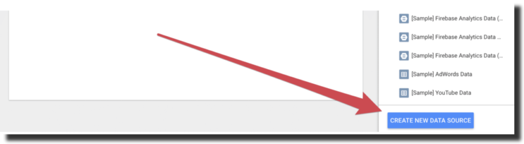
You can choose the data source that you want to import the data from
Adding the necessary elements
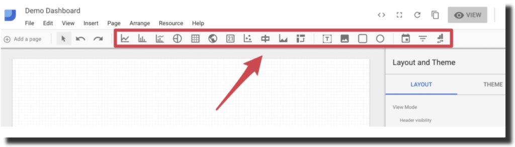
After you are done importing the data from BigQuery or any other source, the next step is adding the required and necessary elements that can help create interactive and useful dashboards. Always remember to add the elements that are required and are necessary for the report.
Add the ad groups that are in question and being talked about at the moment. Adding old data and choosing metrics that are not required can be useless and waste a lot of time. This can include adding charts; adding the right elements can help you get to the best solutions timely and fastly. There is a separate icon for the elements separately. You go and select the particular icon to add the relevant element.
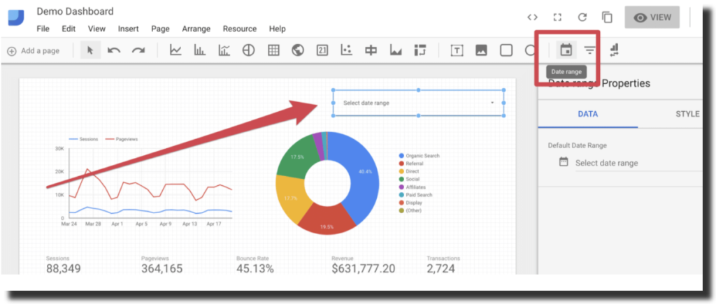
Add a Date range Filter
Now you add a date range filter. Go and select the data range icon present on the top and select the date range filter. Basically, the elements present are in an “auto” mode. You need to change the date as you want to view the analytics data for your understanding. Changing the date can help you look at the precise set of data and help you make comparisons.
The data range filter icon looks like a small calendar on the top bar, and you can choose dates as you want.
You can also compare elements over a set period of time and see the comparison to make future decisions.
Add Images and Text Headers
Moving forward, you now add relevant images to make sure that they can visually represent the data, and you also add text headers. Adding headings can make the analytics data look more organized and assembled. Click on the “text” icon to add appropriate headings and then the “image” icon to add the images where you want them to be.
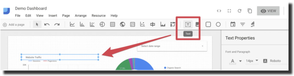
Now your report will look more appealing and interactive than before.
Styling the Dashboard
The second last step in this is styling the elements that have been added. You have imported your data from sources like BigQuery and many others, and your web analytics data is arranged and prepared. You have also added the relevant elements; now the only thing left to do is “Styling.”
After you are done with the work, check out the “Layout and Theme” sidebar, which has many options for you to choose from. You can also look at the top bar and click on any icon to update the looks or if you want to add anything new to the dashboard.
Share the final report
The last but not the least step is that you share the report that you have created. Even in sharing the reports, there are a lot of options that you can use. You can change the report settings and restrict the editing rights to yourself or give others the editing rights.
After making the necessary changes, you can then share the report link. But pay attention, other people will only be able to access it to the particular limit that you have provided them.
Key Takeaway
It is important to understand and learn everything. Technology and cloud are only for technologists is a misconception. New tools like these are being introduced to create a platform for the teams to work with easy analytics on a dashboard. The increased use of these cloud data services has made work simple for a team like Supermetrics, BigQuery, and Data Studio.
If you can’t understand how to use Google Data Studio, you can visit google analytics. Google Analytics has a simple course designed with videos to help you better understand the platform. It allows to import data from a data source like BigQuery, create one dashboard or multiple dashboards, apply a ready-made template and spreadsheets. Moreover, it helps to analyze a variety of metrics and improve the reporting to get better results. This could easily turn into stories of how one tool can create meaningful actions to impact positively.