Business Intelligence (BI) is the use of software and other technological strategies for the analysis and visualizations of past and current data that relate to a business. BI is used to predict the future outcomes of a business project from the past and present performance on the corporate website. The data used includes graphs, reports and dashboards, maps, summaries, and charts. In other words, Business Intelligence can be referred to as a set of Data Visualization Tools that provide a quick and easy way to view and analyze an organization’s project data by evaluating past information.
Why you should consider using a data visualization tool
For example, an enterprise could use data visualization to discover what areas in the organization are pulling it back. This could be in the supply sector, BI lets the enterprise identify some problem areas in their productivity.
Since there are a lot of data sets available, visualization of data using charts lets you pick up and use the relevant information by disregarding the unnecessary data.
Also, data visualization tools make work easier especially if you’re dealing with big data. Even then, there are numerous Data Visualization Tools in the market today.
But in this post, we’ll be analyzing and highlighting the top 10 tools for BI. Firstly, let us look at:
The types of data visualization software
- On-premise data visualization software: this type of software is located and installed on the user’s computer. It provides access to a resource within the computer. This type of software is user friendly and can easily be customized according to user preferences.
- Cloud-based data visualization software: this software is mostly hosted by a third party and is accessed through the internet. Unlike premise-based software, cloud-based does not use or have access to the user’s computer resources or data. They work based on subscription.
Common Types Of Data Visualizations
You can use data visualization tools to easily convey messages on the company website using charts. That’s because these tools help make the patterns and trends in your data come alive.
What’s more, it also allows for fast and easy decision-making thanks to the easy-to-understand infogram charts.
As such all types of visuals precisely correspond to the type of data it helps interpret, or even the type of connection (composition, relationship, distribution, or comparison) it illustrates better depending on the project.
Next, let’s look at some of the most popular types of visualizations you’ll come across in data analytics and business intelligence tool.
#1. Funnel Chart
The funnel chart types are perfect for illustrating narrow connections between different clusters. Oftentimes, the funnel chart uses both color coding and geometric form to show a wide variety of items.
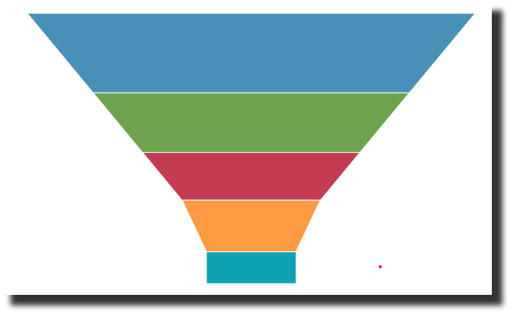
Also, funnel charts are data-driven chart blocks that are perfect for displaying multiple stages in a process. These types of charts can help you identify possible problem areas in a company’s sales processes.
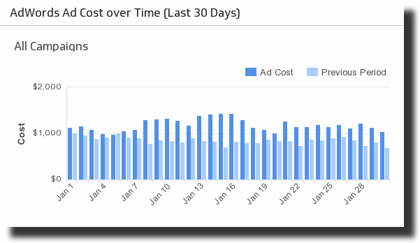
#2. Line Chart
The line charts help visualize data as a progression of informational points that are connected via straight lines. These are often used to illustrate trends over time. Line charts are useful when you have to explain the trend of multiple elements over time.
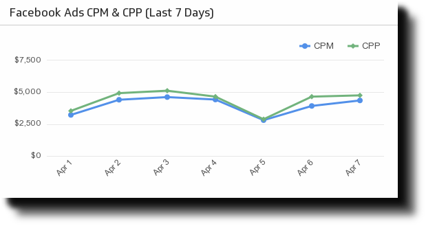
Line charts use a horizontal and vertical axis to represent the value of one unit over time. Also, if displaying data on your company website, you can combine line graphs with bar charts to illustrate data from several dimensions.
#3. Pie Charts
These chart types are useful if you want to illustrate numerical proportions – that is parts of the whole. This type of visual infogram chart can also be used as a database solution when comparing different parts of an object.
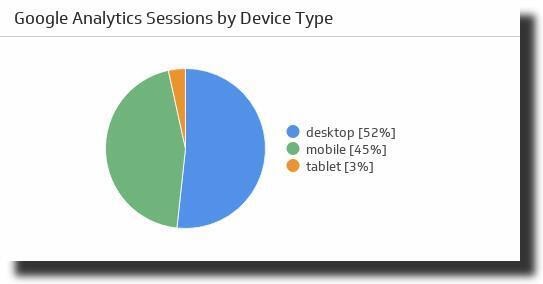
Pie charts are used in the marketing and sales department since they can easily display a wide variety of compositions of objects and even unit-to-unit comparisons.
#4. Bubble Chart
This is a variant of scatter charts where data points get replaced with bubbles. And each size of a bubble indicates the volume of data.
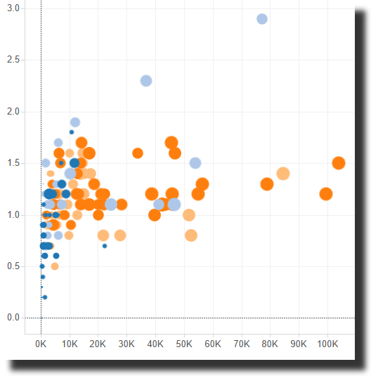
Also, other measures may be displayed using color to allow for deeper comparison.
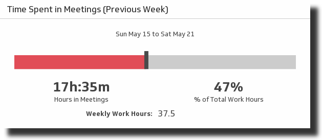
#5. Numeric Indicator
These types of charts are used for illustrating important business data or KPIs (Key Performance Indicators).
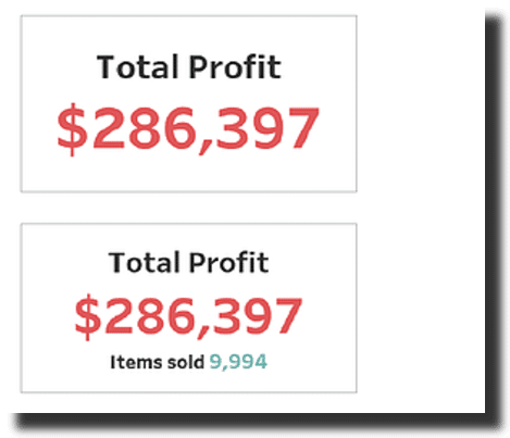
All rights reserved, they can be used as a single value or two values to add some context.
#6. Bullet Chart
The bullet chart types are a variant of bar charts created by Stephen Few aimed at replacing dashboard meters and gauges.
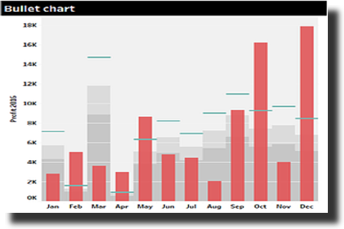
Bullet charts are generally used to demonstrate progress towards a specific goal. One good example is illustrating the progress and actual sales towards reaching the target sales.
#7. Gauge Chart
The gauge Charts are used to illustrate progressive values. They use a scale to represent a metric, whereby the pointer angle stands for the value of the dimension that the pointer represents.
The gauge may be displayed as a half ring, a ring, and even a tube bar to indicate the progress. The gauge may be used when making comparisons between intervals or achieved value vs. targeted value.
#8. Histogram Graph
This type of visual is used to display the distribution of data. The histogram resembles a column chart – however, unlike column charts, the histogram is developed by bringing together values into bins or ranges.
Also, the height of each bar indicates the number of values that fall within a given range.
#9. Box Plot
The box plot may at first look pretty complicated. However, when you look closer, it’ll be easy to pick out from the charts that it portrays quarters in horizontal trend.
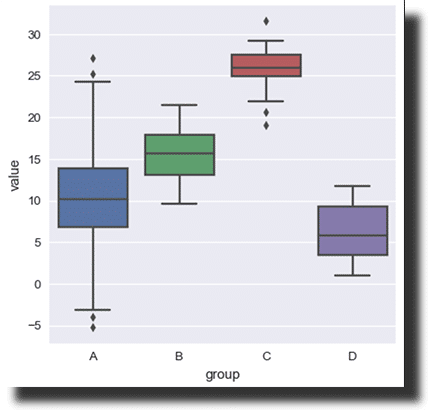
The main element is maximum, minimum, and the median put between the third and first quartile. A box shows the allotment of objects, as well as their deviation from a given median. Box plots can be used to display distributions of complex objects or deviations from a median value.
#10. Bar Chart
This type of visual is among the most basic ways of comparing data units against each other. Due to its simple graphic appearance, a bar chart is frequently used for infogram in BI to present interactive page elements.
Also, bar charts are adaptable which allows you to modify them and illustrate more multifaceted data models. This type of visuals can be prearranged in clusters or stacked, to portray allocation across market segments, and subcategories of items.
The bar can be used when comparing objects or numeric information. Also, you can employ horizontal chart blocks to demonstrate long data labels. Be sure to put stacks in bars to help break different objects into segments to allow for a deeper and detailed comparison.
#11. Tables
These types of visuals are great since you can use them to visualize data in both graphics and data points. Also, this visualization type organizes data into rows and columns, which works perfectly for reporting.
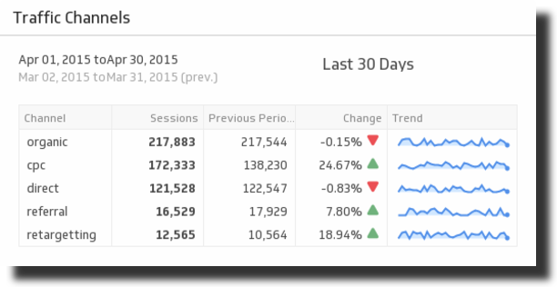
Note that tables can, in some instances, be overwhelming when you use a dashboard containing many metrics that you’d like to display. Remember that, it’s important that you find a medium that allows you to show large confusing amounts of data and very little data.
#12. Radar or Spider Chart
This data visualization type is useful as it helps your audience understand the comparative differences between elements in your data. The Radar chart makes it easy for you to compare several items and observe if they have many differences that are worth investigating further.
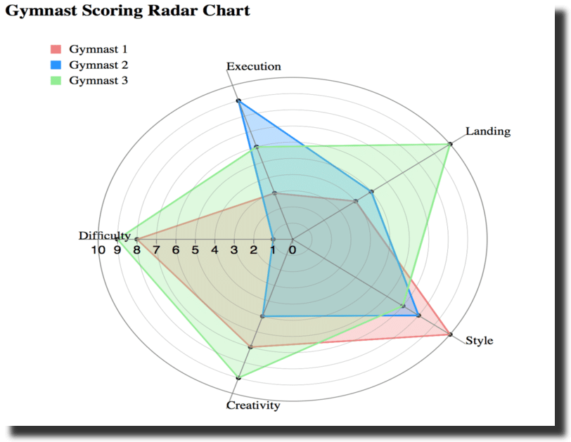
The spider chart is in essence a line chart that’s drawn radially. This interactive data visualization includes a spider web infogram that’s created by several variables and axes.
Why use Spider charts for Big Data
Its use is similar to a line chart. However, due to the number of its axes, it allows you to compare elements from different angles and demonstrate the inclinations graphically.
With the spider-generated chart blocks, it’s now easy for you to share complex data with your employees or on the organization’s website. Also, you can prepare these data sets on different tools like D3 js, Power BI, Microsoft Excel, Tableau public, etc.
While these are among the most essential charts and most complex charts, they’re created by combining some of these charts. Even then, while you might opt for a simple chart, make sure that the data you choose to show is easy to understand.
It should also provide your audience with the right insight and information. Above all make sure you use the right library for your organizational and even data science study projects. This ensures development is much easier and faster.
Top 10 Business Intelligence Tools
There are mostly 3 types of data visualization software; open-source, free data, and proprietary data software. With proprietary, the software version is fully paid for and is accessible via cloud or installed in the standalone client-server. Some of the top proprietary tools include:
1. Domo
DOMO is a cloud-based data visualization platform that allows you to integrate and analyze data from any source; it gives quick access and ease-of-use. It is designed for enterprises such as healthcare, manufacturing, and financial service providers.
The intended users of this dashboard include CEOs, IT Personnel, and BI experts. It has a mobile interface and it allows you to conveniently check your day-to-day data collection using one of the best Online Data Visualizations Tools.
Rewards of using Domo
It lets you conduct BI and business Analytics for clear visualization and analysis of data. With Domo, you can take advantage of the intelligent Apps to build other Apps for data experiences.
It also comes with embedded and extended Analytics for easy sharing of data outside the business enterprise. Just like other tools, it’s ideal for actionable insights. It also falls under the Data Visualization Tools Excel category.
On the downside, you might find it hard to learn and use this data visualization tool. When compared to other tools, Domo is expensive with a pricing of about $2,000 per year.
2. Board
Board takes care of your data analysis tasks. It is a 3-in-1 tool that combines performance management, Business intelligence, and predictive analytics. This is designed for financial enterprises for planning.
In marketing, it’s used for tasks such as social media analysis. It also targets HR operatives for skills mapping and aids in the supply chain for management of the supplier(s). In IT, Board is used at different service levels.
What you can do with Board BI
Board allows users to access data from almost any source and mobile device. It generates self-service reprints that can be exported in formats such as HTML. This visualization solution allows midsized business and enterprises to analyze their present data for efficient decision-making.
This tool is user-friendly and easily customizable and offers a wide language support system with over 6 available languages such as English, German, Chinese, Italian, and Spanish among others.
The latest version is an upgrade that comes with an in-memory calculation engine and a shallow learning curve. These make the Board BI among the Best Data Visualization Tools.
As for the pricing, it may vary depending on the user level.
3. Dundas BI
Dundas BI is a product of one of Dundas Data Visualization. It provides a platform with a combo of data visualization capabilities and browser-based BI. It offers comprehensive reports and dashboards, and data analytics tools.
The software is designed for HR, Finance enterprises, C-suite, customer service, sales, and marketing across different platforms including social media. The serviceability is however not limited as this tool can be used by enterprises of all sizes across 19 industries.
The customization capabilities on offer
It represents high flexibility with its customizable interface that lets the users create desired dashboards to analyze and drill down their data and conduct ad-hoc reporting. What’s more, its HTML5 interface works on any device.
This interface is highly responsive and is touch-based meaning it works effectively whether on mobile devices or desktops. Like other Online Data Visualization Tools, the Dundas Data visualization tool lets the user access and integrate data from any source in a short round-time.
The newest upgrade comes with an in-memory engine, adds point-and-click trend analysis, language query, and supports Linux. The pricing is based on concurrent users.
4. Microsoft Power BI
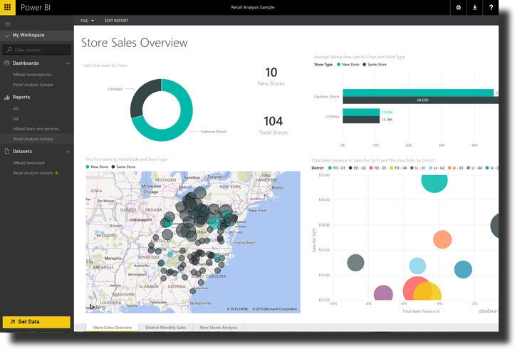
Microsoft Power BI is one of the popular data visualizations tools. Its popularity can be attributed to its ease of use. It comes in two models; Power BI Desktop and Power BI Mobile both of which are cloud-based software.
It offers visual-based discovery, augmented analytics, data preparation, and interactive dashboards. This tool is designed for Microsoft shops.
What Power brings you
This tool offers various data visualization capabilities and features such as visualization through natural languages and custom visualization. It offers access to cloud-based and on-premise data sources like Google charts or Google analytics.
Some of these data sources include; IBM, Google analytics, Oracle, Excel, JSON, and others. The tool also has a web service connection that lets the user round-up integration with big data sources.
What Power BI offers you
There are different versions of the Power visualization tool, the desktop free version is ideal for isolated users, for the pro-version, it works perfectly in making easy collaborative analysis by leveraging Microsoft Office365, Teams for controlled access to raw data.
SharePoint, the premium version is for enterprises that want a self-service data preparation tool that can incorporate data from Azure SQL Data Warehouse and Microsoft Dynamics 365.
It is also one of the Data Visualization Tools Excel that can be used to represent data in spreadsheet form or another Microsoft excel forms.
The pricing also depends on the number of users, the amount of data, and storage. On average, the desktop version is free, the pro-paid version is $9.99 per use, per month and the premium is $4,996 per storage resource and dedicated cloud computing.
5. MicroStrategy
MicroStrategy software is an on-premise and cloud-based platform that is self-serving. It works on both data mining and visualization, it can be customized on an as-needed basis.
This way, the user can explore its use from an entry-level basis and scale father into enterprise-level. This tool is designed for use in enterprises across different industries in the on-premise, cloud, and hybrid deployment levels.
It supports dashboards by combining the functionality of various apps such as those that conduct risk analysis, monitor market portfolios, and driving information from social media through the analysis of real-time data.
The user can leverage data from other Data Visualization Tools like Tableau, Zoho analytics, Power BI, and Qlik and merge the data to create insights and reports.
Why choose MicroStrategy
The user can present their data as ad-hoc-reports, statements, operational reports, and invoices. With the drag-and-drop features, users can design receptive statements and operational reports.
MicroStrategy supports a wide variety of reporting styles and adapts to different device types to allow your company to generate data as needed.
The pricing is determined based on numbered users. For the mobile interface version, pricing is determined by a named-user and CPU basis.
6. Chartio
Chartio is one of the fast-growing Online Data Visualization Tool, software is a cloud-based visualization solutions that let the user access data analysis, founders, products terms, and business terms as per the organizational tool.
It manages the day-to-day business activities. It is designed for businesses and enterprises that are on a budget and need a tool that will meet all their business needs.
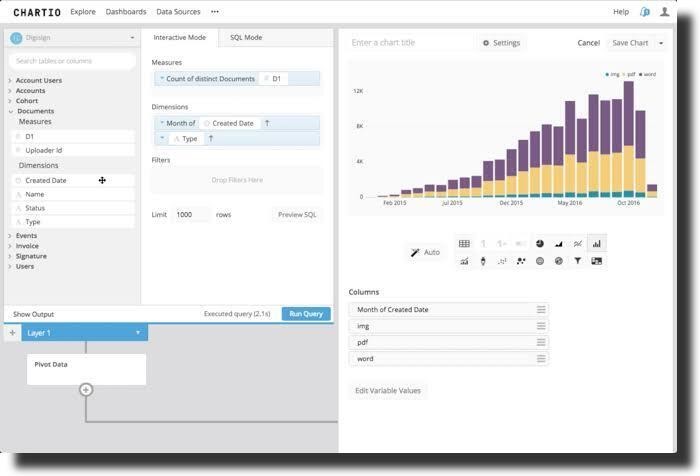
Who can use Chartio
It is also designed for businesses that need a tool that is easy to use for all employees. And with the shallow learning curve, you’ll require little or no training. These enterprises can easily track corporate metrics through the snapshot feature.
The organization can also control the data and connection of the users as the tool uses SSL encryption that is transferred through the SSH tunnel.
Why choose Chartio?
With Chartio, there is a dashboard for displaying specific data to the user and lets them explore data and present them in chart forms. The user can easily connect to Amazon Redshift and CSV files as they explore different data.
There is a data pipeline that allows the user to blend and transform several data sets through outlined steps.
This tool also lets the users share information and dashboards through reports and scheduled emails or the organization’s website. For references, you can easily view historical data. For the paid plans, it is a monthly subscription that comes with on-phone and email customer support.
Free And Open Source Data Business Intelligence Tools

AS mentioned, there are different types of BI software. In the open-source category, these are mostly BI software whose source coding is available and they require little or no fee.
These tools come in handy since proprietary tools can be expensive. However, open-source BI tools allow you to work within their budget. There are multiple Data Visualization Tools Open Source for BI and the top four include.
7. Metabase
Metabase is an open-source bi tool. Just like other large BI solutions, Metabase has large-scale data ingestion, a flexible user interface, and data visualization software.
It focuses on conducting analysis and answering day-to-day questions that relate to a business enterprise. It’s designed for enterprises that need an affordable and high-functioning tool that will meet their daily business needs. When well utilized, teams can easily achieve what they are looking for.
Metabase is easy to use. So, its shallow learning curve means all employees would be able to manage it. As one of the top Data Visualization Tool, it presents the fastest way to share analytics and data inside an organization’s website. It only requires a few clicks to get the answers needed from the software.
What more Metabase offers you?
For advanced queries, you can use SQL and an in-built editor. With SQL, you can make interactive visualizations like infogram that are easy to explore. It holds no limit in terms of the data sources as it works with data warehouses like Azure and Amazon Redshift.
For the hosting, you can host it yourself or use a third-party cloud provider. There is also the option of paying a monthly subscription fee if you choose to have it hosted by Metabase. Since it’s open-source, it may have little or no customer support.
It comes with a free plan for self-hosting and the paid plans go for $100-$200 per 30 users when hosted by Metabase.
8. Google Data Studio
Data Studio is one of Google’s Data Visualizations Tools that are designed with ease of use. It is free and open-source that lets you integrate data set to the Google ecosystem from ember charts on Google, Google Sheets to Google charts for analytics, and BigQuery.

It’s designed for enterprises that wish to integrate their Google data quickly. It may not be fit for businesses that need a high-functioning Data visualization tool as it may lack formatting and visualization.
Why consider using data studio?
It turns information into informative, fully customized dashboards and reports that are easy to read and share on your company website. Data Studio uses Google applications such as YouTube, BigQuery, and Google ads to fill up empty spaces.
It has a partnership with over 300 connection partners and the user can virtually connect to MySQL and Postgre Database, and TikTok App.
Generate easy-to-share data
With Google Sheets and Docs, a business can easily share real-time data on your website. On the downside, this free plan tool can limit you in the download sector as it only allows PDF downloads.
For the Google charts, the range is not as vast as compared to other tools. Also, this interactive visualizations tool is completely free.
9. Tableau Public
Tableau is a free Data Visualization Tools Open Source that allows creatives to easily get used to the tool with little investment. It creates a platform for sharing data visualization and insights. Tableau Public is designed for customers who need to evaluate Server and Desktop applications.
Tableau is a good tool for businesses that do not need vast features and want software that is easy to use and affordable. On the downside, the information and data used in the tableau desktop tool are public and can be accessed by anyone hence they aren’t secured.
You might have to frequently update the published workbooks and other data sources when there’re changes in the tableau desktop data. Tableau comes as an open-source with a free plan.
10. Birt
Lastly on our Data Visualization Tools list is Birt. Birt is an open-source data visualization tool. It’s an Eclipse-based BI tool that offers a platform form for small-scale businesses. It offers bi-reporting features that are handy for most businesses.
It’s composed of two parts; a run time component that can be added to a server and an Eclipse-based report designer. It focuses on creating easy-to-embed reports.
Also, the Birt BI is completely free to use.
Other Visualization Tools worth considering for your business
Google Charts
Google Charts operates on HTML5 and SVG and aims for iOS and Android, and complete cross-browser compatibility. This includes older versions of your Internet Explorer. Also, each of the Google charts that you create can be interactive visualizations.
What’s more, you can even zoom in on a few of them. The website offers you a comprehensive gallery where you’ll find different interactions and types of visualizations to choose from. Also, there’s no charge when using Google Charts.
Chartblocks
This is an easy-to-use tool for building and publishing charts. It lets you create charts from data derived from databases and spreadsheets. Charts are built in HTML5 using JavaScript library D3.js.
Also, your data visualizations will be compatible and responsive with any device and screen size. This visualizations solution even allows you to embed the charts on a web page or even share it on social media like Facebook and Twitter.
For the personal plan, Chartblocks is free and its professional plans start at $20/month.
Ember Charts
The Ember Charts include pie, bar, time series, and scatter charts that you can easily modify and extend. It’s based on Ember.js frameworks and utilizes D3.js. There’s no pricing information on Ember Charts.
ChartExpo
ChartExpo is the easiest and most accessible data visualization tool available.
With ChartExpo, anyone can make beautiful, compelling, and insight-rich charts. You don’t need coding experience or a background in data science. There are no confusing settings or hoops to jump through.
How to choose the best BI tool for your business

As mentioned earlier, there are various data visualizations tools in the market, and choosing the right one can be cumbersome. Generally, most of the tools have free trials and you can easily try them to figure out which one works best for your company. However, before making the final call, it’s best to consider things like;
1. Why do you need a BI tool?
In every business, there are different needs to meet and problems to solve. Before choosing your preferred BI tool, it’s best to first outline the problems you’d like to solve in your business. For instance, data visualizations charts can be used to identify and resolve points of delay in the supply chain.
Do not choose based on the latest and cool visualizations features; first, seek to understand the point in your enterprise that needs analytics and data visualization.
2. What are your data sources?
Most Data Visualization Tools can access data from various sources. However, it is good to remember that not every tool can access data from any or all sources, with that in mind, first check the sources in which your data lives, is it premise or cloud-based?
If you choose to work with a data warehouse tool, then you will end up using historical data. With individual data sources, then you have real-time analysis but first, ensure your data visualizations tool is integrated with this source.
3. What is your employee’s skill level?
When choosing a tool, it is best to ensure that your employee can easily handle the technicalities required to manage it. With a robust tool, you may need to train your employees for effective use. Also, choose a tool that is easy to use and will not present a hard time for you and your team.
4. What’s your budget?
The payment for most tools works on a per-user, per-month basis, and others use the storage source, data size, and cloud-based computing to determine the pay. Either way, you might want to consider your budget. Ensure you work within it and you do not over or underspend.
The tool you choose should answer your business questions. Ensure you do not choose a tool with numerous features that you may not use and do not choose a tool that limits you in terms of its features. You might also choose to work with an open-source tool such as Metabase.
Which is the Best Data Visualization Tools For Your Business?
BI tools allow businesses to easily find answers to their questions. The ease of access to data makes sharing, analyzing, and representation of the data easy.
Choosing the right tool and best Data Visualization Tools is pretty easy. Start by analyzing the features they offer such as language support and cross-browser testing. Regardless of whichever tool you pick from Domo, Board, Dundas BI, Microsoft Power BI, D3 js, and MicroStrategy, you should also ensure that the tool meets their business needs.
For Open-source data visualization tools, Metabase, Birt, Tableau Public, Google charts, and Google Cloud Base are good sources.
But before using any of these data visualization tools, you must understand each tool you’ll be using. Therefore, be sure to start by learning more about the popular visualization tools as well as how you can use them.
We hope that the above Data Visualization tools will help improve your efforts for visualizing data. By identifying the right data visualization tools, you’ll boost your projects. However, start by investigating the online information and cutting-edge business visualization tools available today.