We live in a world where people almost always resort to online platforms for information. I like to call it “the learning spree.”
The first thing anyone ever does when they want to increase their knowledge or learn about something totally new is to ‘google it.’
From a popular perspective, this has increased positive access to authentic information. It has also given product and service providers a direct opportunity to market themselves among their targeted audience. It helps maintain open communication with people based on facts and eliminates the possibility of misinterpretation.
Websites play a crucial role throughout this journey of finding the perfect fit. Everyone on the internet is looking for authenticity.
So coming up is a surge of information and tips to ensure your customers don’t get lost on your website.
We want to help you do it the right way. Here’s everything you need to know about implementing a clean website design.
What Is a Clean Website Design?
A clean website design is one where the website pages have adequate whitespaces. This means that the pages are manageable with design and text. The purpose is to ensure the visitor can maintain focus from the actual point of the website.
For example, if the website is of a digital marketing agency, but the designs and layout show otherwise with no relevant information, it removes the purpose of having a website. The potential customer will no longer be interested in learning more about the service or the product.
Hence, the emerging trend of having a clean website design focuses on developing websites that present the ideas most efficiently.
It’s all about finding the right aesthetic to match the nature of the business and then putting it to effect using a modern approach.
What Do Statistics Tell Us About Having A Clean Website Design?
Work standards and lifestyles have changed drastically by 2022, with the “less is more” philosophy behind modern website design. According to popular statistics, there are over a billion websites on the internet.
Only some sites can rank on the first page, and only some websites get the right recognition. It comes down to how you market and promote your website. Tools that you use for marketing are the driving factor.
While the emerging trend of relying on social media for promoting businesses and sales has proven somewhat successful, having a website is still an essential marketing tactic.
Almost 30% of individuals do not prefer brands that only have a social media presence and do not have a website. This shows the importance of developing a website with complete information that any individual needs before hiring a service or buying a product.
Many businesses have this common misconception that having a good social media presence is all you need. However, this works because, for instance, an individual comes across a sponsored ad on Instagram.
Now, they want to learn more about the product or the service. Common practice is that the individual will want to look at the website. So if a business does not have a website that’s been properly developed, it will be noted down as a red flag. Most likely, the next thing is the person closes the tab for good, unsatisfied.
According to common statistical work, it takes 10 to 15 seconds for a person to develop a perception of the whole business after a few glances at the website.
Additionally, 38% of individuals become uninterested in a business that needs an aesthetically pleasing website layout and design. This means you are losing an audience that could become potential customers by not putting effort into your website. You want to make a good first impression because there’s no guarantee that you’re getting a second chance.
Having a clean website design in the modern world is the most crucial thing for your business.
What Makes A Good Clean Website?
The popular narrative that has been flowing throughout the internet mentions a clean website. However, there aren’t a lot of platforms that one could refer to for an “all-in-one” experience.
So here is what you need to know about a good clean website:
| #1 Free from Unnecessary Clutter and Drama | A good clean website delivers the message without going off track. This means that your website is supposed to incorporate only the useful information which results in helping your customers and clients. Anything that does not add overall value to your website should not be up there. Make every glance worthwhile. |
| #2 Clean and Intelligent Choices | Do you want to ensure that your website ranks and gets the likes it deserves? Well, it depends on the choices you make while developing it. A clean website has a meticulous layout, a proper color palette, and a pleasing font selection. Essentially, a nice flow. That’s the goal. |
| #3 Usefulness | Websites are about giving out information. Statistically proven, people check out the product or service page to see if they are getting what they want. This is the part where you want to make sure that you are adding only a little on the homepage so that it drives away the focus. The right amount is close to perfection. |
| #4 Adequate White Space | There needs to be a balance between the text and the design that you add to your website. A smart approach would be to distribute text throughout the website’s pages. Most importantly, add only a few tight-knit paragraphs. Moreover, the design board of the whole website should not be too flashy and happening. White spaces are the breathable area on the website page. They are the pillar of this emerging trend of clean website designs. Don’t want to overwhelm the eyes of the visitor, you know. |
| #5 Demand an Outcome | Your website should have enough information to convince the individual to reach out to you. This is the real success. For this reason, you should ensure that you have a portal for open communication to cater to queries. A call for action is going to get you sales, though. |
Examples Of Best Clean Website Designs
#1 UPQODE
This is an example from a web design company itself. This is what their main web page or homepage looks like.
The key takeaways of this page are:
- There is no unnecessary surge of design or text. Perfect delivery of what the company is about. Hence, it will become easier for the visitor to gauge what the rest of the website is about.
- The design is pretty flashy. The balance between the use of color palettes and incorporation in the design is perfect.
- White spaces are blank areas with no text or design; hence, this is a perfect example of what it should be like.
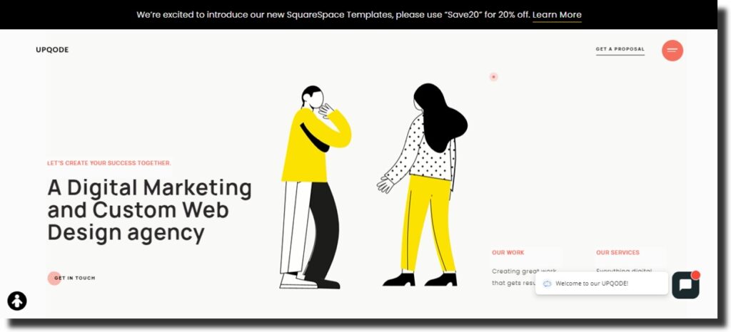
This is a perfect checklist for developing the most striking homepage.
#2 TrueThemes
This is another example of a company’s service landing page. It is a perfect example of minimalist website design.
The key takeaways of this page are:
- This page has an ideal design when it comes to displaying the services. The size of the service logos is minimalistic with a touch of color but are not taking up negative space.
- The colors and the fonts are mutually balanced. The overall aesthetic is stable and quite pleasing, catching the eye exactly how it should.
- The description of the services is of an adequate length. It is giving the right amount of information; this is how you push the visitor to get the rest of the details by reaching out.
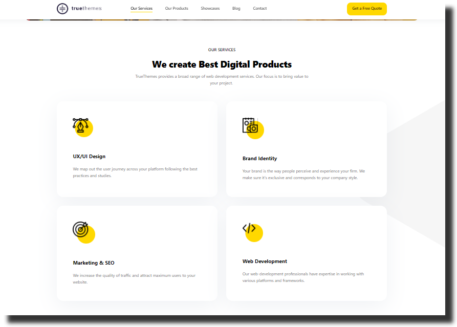
This is the right way to throw the call for action in the customer’s court.
#3 128 Digital
Another massively creative example of a landing page is to introduce the people in your company. It is a perfect example of a modern website design. A personalized experience is what you want. Legitimacy and authenticity win the trust, and what’s better than showing off your team?
The key takeaways of this page are:
- The monochrome color palette is a bold choice. However, this combination is saved with the use of a hybrid font.
- Shapes and figures are utilized smartly in the layout. You want to stay moderate with the design layout. The size of the pictures added is perfect.
- The incorporation of content in this landing page wasn’t too necessary anyway. This means that the nature of every landing page is different. Hence, for this page, the use of words is perfect.
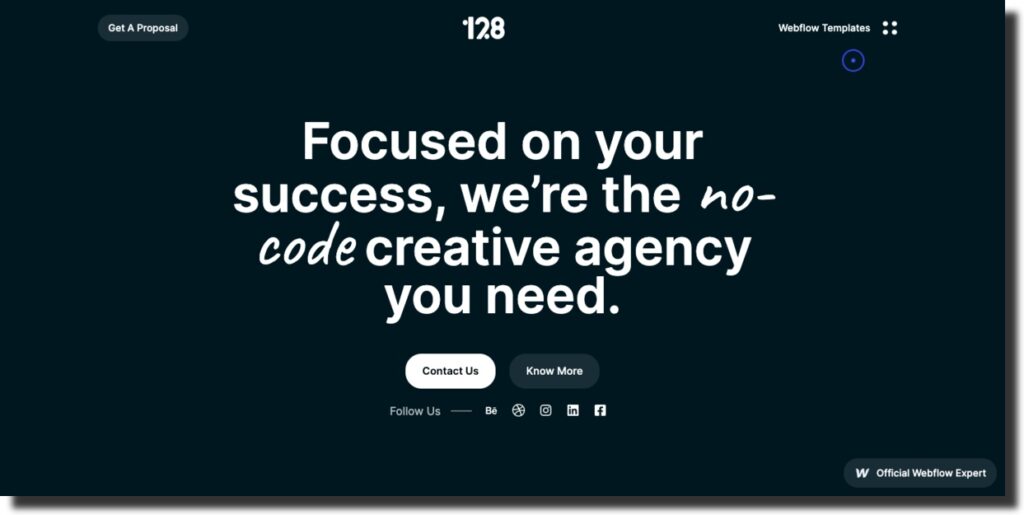
No room for gray areas; if you know, you know.
#4 Eigth25media
This is a landing page of a company showing off its client portfolio. Diversity plays a pivotal role in the design industry.
The key takeaways of this page are:
- This page focuses precisely on the company’s work, so there is no unnecessary design. Knowing when not to overdo the design is also an important thing to keep under consideration.
- The animation effects and dimensions in the design itself show the diverse work dynamic. Hence, it is perfect for displaying the vast capabilities of your work.
- Sometimes adding no text also works fine, as depicted on this page.
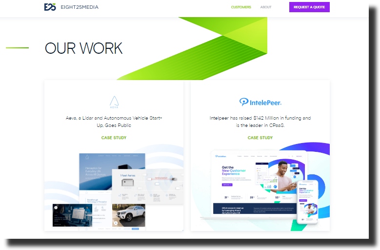
Let your work speak for itself, works perfectly.
#5 Web Dev Studios
There is a common misconception that the company’s blog landing page has no use. The real reason it might get neglected is that the design is too boring.
The key takeaways of this page are:
- The color palette combination of this page is balanced. Monochrome, multicolored and warm tones; almost reflects different vibes. Hence, it makes this a very eye-catching page. People are driven by their likable color palettes. Since this page has many options, it increases the chance of retaining a person or two.
- The amount of text is adequate because it is a blog landing page. Having a short preview of what each blog about makes it easier for the individual to open the one they are interested in.
- Since the page images cover the colors, there is no definite need to have too much design as depicted in the picture.
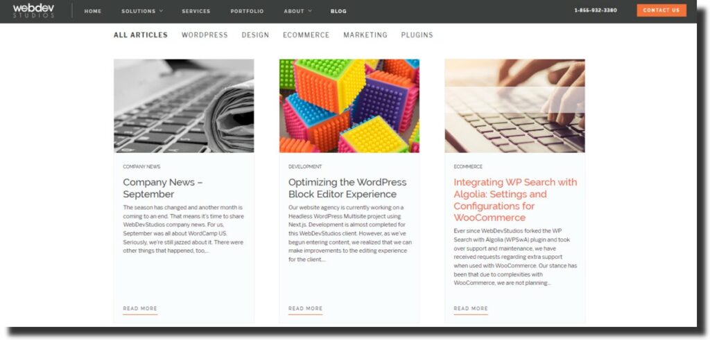
Giving away information like it’s confetti makes it less nerdy, so Gen-Z.
Evaluate Your Website: An Elaborate Checklist
The trends change drastically with each day on the internet. Every day that you wake up, the story has already changed. The truth is, it is hard to keep up in this race sometimes. However, the smartest thing is to analyze what changes suit the nature of your business and then make those accordingly.
The best clean website designs on the internet do not go overboard. So if you want to make it to the top of the list, you need smart work more than anything.
Here is a list of things that are key factors in clean website designs you should check before finalizing your website:
- Design;
- Layout;
- Font;
- Color;
- White Spaces;
- Animations;
- Content Quality;
- Similar Desktop/Mobile View.
Design
The aesthetic look of the website matters the most. The importance of deriving the perfect design look matching the nature of your work is high.
Make sure your design does not deliver a different story than your business.
For instance, as mentioned above, a creative digital agency like UPQODE has a greater space to play with the design spectrum. Their use of white spaces is, hands down, one of the best examples of clean design.
The goal is to please all eyes ever laid on your website.
Layout
Make sure the layout you choose for the website is user-friendly and gives you the proper space to incorporate everything you want to add.
If you are going for already developed layouts, you have to be super careful in finding that one perfect arrangement. The alignment of your design in an existing layout might be challenging, but it is a safe option.
But, go crazy if you want, if you know what you are doing.
Font
The typography of the website is the most crucial thing next to clean website designs. It would help if you made sure that the font and the design have a balance. Moreover, as per the design’s dynamic, you can also opt for combining two or more fonts.
Just don’t be too basic. That’s not equal to being safe.
Color
Knowing the basic psychology behind the human relationship with color is important. It is essential to make sure that the color selection goes with the kind of design you have created. It should reflect the brand story.
The choice of colors can be anything, bold or not. Make sure the theory sells.
Monochrome or rainbow, be smart.
White Spaces
Extra points to mention this part separately because ensuring your website looks clean and clutter-free is very important.
Be a hot mess, even if one.
Animations
Transitioning the design on the page adds to the website’s aesthetic. Make sure that the animations are smooth. Most importantly, do not make all the animations rain on just one page.
Balance is beautiful.
Content Quality
It is highly important to ensure that the content’s readability is perfect. Ensuring your customer understands your website’s services requires you to present the right words. The right approach is to keep the content accurate, to the point, and concise.
Choose the words wisely.
Similar Desktop/Mobile View
This is very important factor for clean website designs. The interface should stay mostly the same when opened on mobile. Almost 85% of individuals love this user-friendly experience. Make sure to give them one.
Conclusion
Clean website designs are essential for any business that wants to remain competitive in 2023 and beyond. We hope these examples will inspire you to take advantage of all the great opportunities a clean design can offer and create an attractive website that provides users with the experience they deserve.
Whether you’re looking for some inspiration or just want to stay on the cutting edge of web design trends, these clean website designs should provide plenty of ideas and serve as an excellent starting point for your own projects in 2023.