Having a unique bank web design increases the chances of hooking visitors. That’s because people are often looking for diversity and custom experiences.
Today’s digital world has seen users increasingly glued to connected devices. For that reason, banks need to target consumers through different online channels, and that includes websites. It’s not enough for banks to create websites that have simple designs and resemble each other.
That’s why, today, it’s becoming a priority for banking websites to use a design that’s both functional and unique. Keep reading about some of the best bank web designs that are available today.
15 Best Banking Website Designs to Promote Your Business
I’ve picked out 15 best professional bank web design inspirations that serve as great examples of functional and beautiful designs for banking websites.
1 – Community Sector Banking
This banking website design has amazing navigation with well-crafted sections that come with proper elements. The purple and blue overlaid gradient gives this website an impressive look.
The thing that makes this banking website stand out is that it showcases many human images. By including the friendly people images helps the Community Sector Banking website better communicate with visitors and even gain their trust.
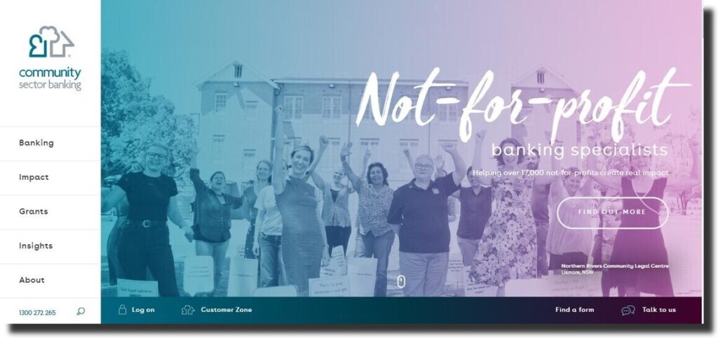
The designers of this theme gave many considerations to each small detail included on this banking website. From the color combinations to typography, hover effects, and visuals, the designers have done each aspect of this website with perfection. This makes these banking websites design a great resource for inspiration.
2 – Nobel Bank
While this design from Poland makes use of three colors the designer managed to keep it exceptional. Its background is completely covered with animating pictures. Also, the credentials, features, and unique benefits are displayed using text over the images.
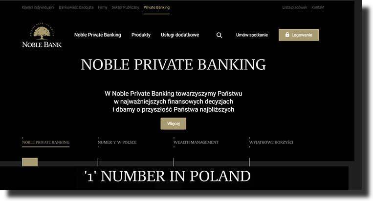
At the right corner of this website’s header, there’s a vividly clear login button and a meeting arrangement button next to it.
At the top of this website, you’ll see more buttons that land visitors on different sections of this website. The Nobel Bank design doesn’t try to display everything on one page but it divides each section beautifully.
3 – P&N Bank
P & N Bank design is a beautiful banking web design from Australia. This website design has a stunning blend of red and white colors. Its slider uses a high-quality image that portrays harmony through a bold and clear call-to-action button inserted over it.
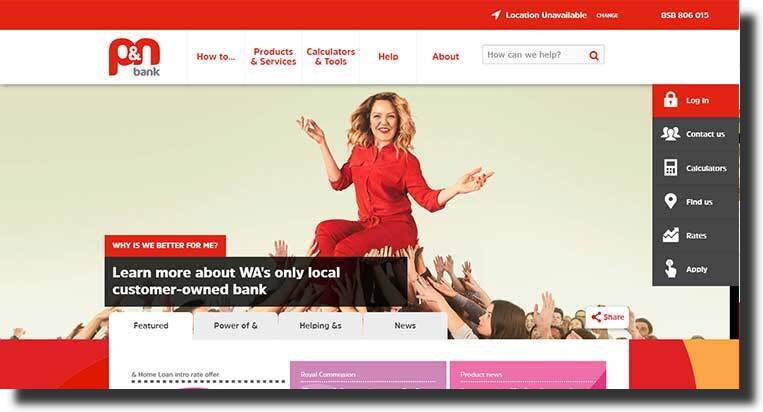
This web design comes with one short page design that contains all the buttons for accessing inner pages carefully inserted on the header. Even then, its features, news, and several call-to-action buttons can be seen clearly under the slider.
The one feature that makes this design stand out is a sidebar that’s on the right side of its homepage and includes everything from rates and login buttons.
4 – Byline Bank
The Byline banking web design uses many color combinations like white, blue, and orange. It’s expertly crafted color combination makes this simple website look eye-catching and amazing.
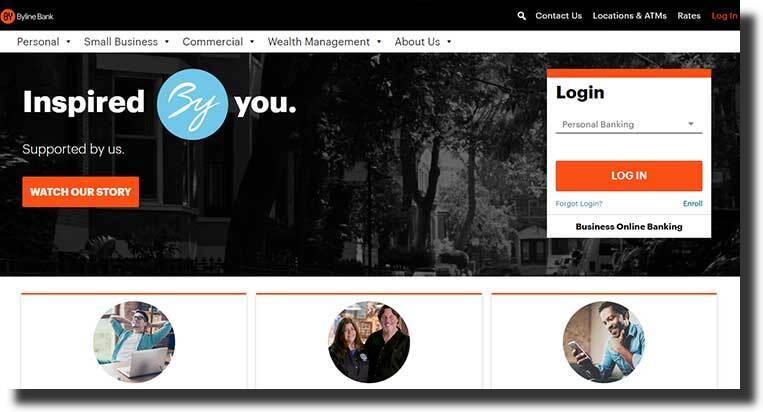
Plus, it has call-to-action buttons sprinkled throughout the website. What’s more, its ending section contains a large eye-catching welcome button that helps draw in visitors.
Byline’s footer section is packed with useful links that help visitors easily access any page they want.
5 – Moven
This banking web theme is stylish and uses a visual design. Its slider contains a video that shows the workings and functions of the different features provided by Moven.
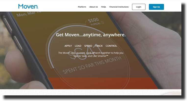
Immediately under the slider, you’ll notice a standstill mobile phone that slides along with images inserted on both the right and left of this design’s body. Once the phone slides next to the picture it triggers some features to pop up.
The footer the Moven design showcases the bank credentials and call-to-action buttons where visitors are prompted to download the app at no cost.
6 – Vista Bank
It is the most popular web page design with a slider that contains a high-quality image that has attention-grabbing content arranged over it. The color combination of Vista Bank‘s upper section is breathtaking and it is topped with a stunning navigation bar.
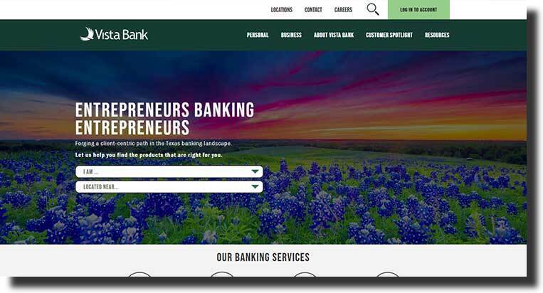
What’s more, this web design includes another top bar for displaying the other necessary call-to-action buttons with the last button being a login button.
Right below the slider, you’ll notice attractive icons that are used to help make the whole design look more appealing.
Vista Bank’s body section has been used to display the credentials and a mobile application. It also contains the location plus a map placed at the end of this site.
7 – Heritage
Heritage is an Australian banking website design that chooses to showcase the credentials on a slider. The first impression a visitor will see when they land on this website is how authoritative the banking company is.
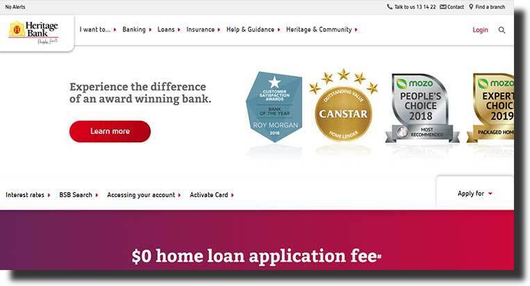
This technique works perfectly and it helps convert your visitors into customers. Immediately after the slider, this design displays its unique home loan offer of 0 fees in large bold letters.
Its header is packed with the most important information with the contact number and the find branch buttons visible.
8 – VTB
The VTB website design showcases simple images of water and bridges and the different colors blend beautifully with the colors used for this website design. In the body section of this bank, web page design displays about us, news, research, etc.
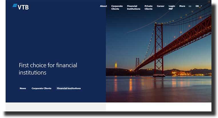
The header of this design has been used to display all relevant sections buttons. Also, a language change button can be found on the site’s right corner of its menu. The footer section of the website vertically displays all the sections of the website which makes it look clean and complete.
9 – Express Bank
Express Bank‘s simple black and white header menu work perfectly with a shadowed image used in the slider. The thing that makes this web design for banks is its cost calculator button that is visible on its slider.
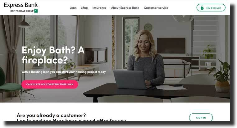
What’s more, its body is completely covered by the cost that gives users a great experience. Also, the last segment of this banking web design showcases high-quality images and catchy text that share the features offered by the company.
10 – Capitol Bank
This banking website design has included a high-quality image of their staff in the slider. This technique serves to give off a message of trust to visitors once they land on the page. The left corner of Capitol Bank’s website header has a logo and to the right is the search.
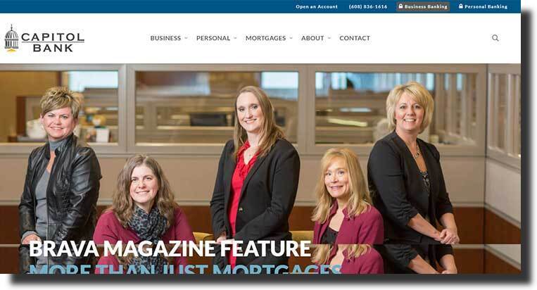
This web design uses a short navigation bar but it displays all the key information that visitors are searching for. The additional information like contact number has been inserted on the top bar.
The body of this banking site is packed with moving images along with detailed text that makes it visually appealing to visitors.
11- Afrasia
Afrasia banking web design uses a slider that has a video that showcases a luxurious life. In addition, its header has been completed by carefully pasting all the key information over it. Immediately under the slider, the design displays news and the latest features.
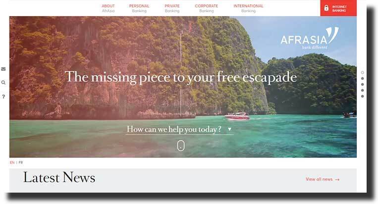
Next is the menu segment with all the additional information like the blog and careers. Then the last segment of this bank website ends skilfully with displayed credentials content in bold letters.
12 – Baltic International Bank
This is a classical design that uses the slider to showcase dynamic images with the company motto at the top of it. Baltic International web design’s unique feature is it’s about us button that is found in the center of the slider. The use of this technique compels visitors to learn more about this company.
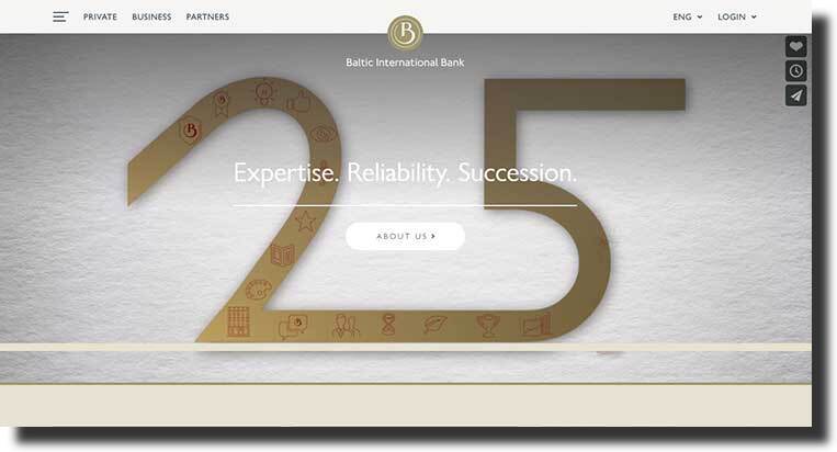
This site’s body covers complete highlights displayed in vertical alignment with detailed content and high-quality images. Right after is the footer that displays a few social share icons along with some call-to-action buttons.
13 – The Florist
The Florist banking website design has a slider that has a vibrant video of flowers and a large call-to-action button is pasted over it.
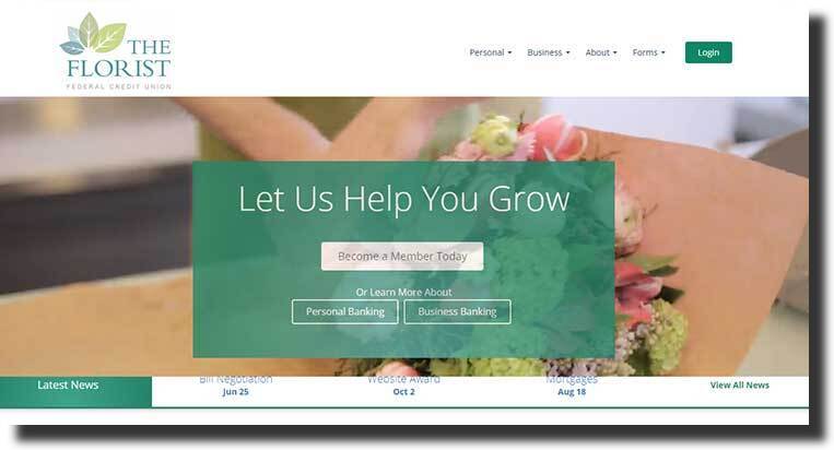
This banking web design body section is packed with detailed content and this includes colorful statistics and ends with a video. Its ending section has been used to display two account opening buttons and at the end is the company contact information.
14 – Charity Bank
Charity Bank website design slider uses a photo of a running crippled man. Likewise, it also includes other images that reflect harmony and there’s content on the side of colorful backgrounds.
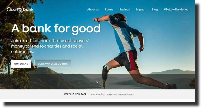
Since this web design is for charity it has a different approach compared to the corporate look. What’s more, the images and color combinations used on this site are more frank-looking than professional.
This website’s ending section turns orange plus its footer is completed with detailed content.
15 – Capital Credit Union
Capital Credit Union website design includes a slider with an attractive yet classy-looking image which helps draw in visitors once they land on the homepage. The left of this image is filled up with a red eye-catching box with attractive content that closes off with an offer to help.

This site’s body section has different buttons like join and a product listing. At the end of the website is a footer pasted with a subscribe button.
Creating a Website Design for Banks
Building a website for a bank is a rather sensitive matter. This is because banks ask their clientele to invest their money with them and sometimes that’s all they have.
Therefore, a bank web page design template should not reflect an unprofessional gesture. The foundation of banks is based on trust and a banking website design should reflect authority.
Again, if the entire process seems overwhelming, working with a professional website design company can help take the load off you. Besides, they have all the experience necessary to build a bank web design that will attract more clients to your business.
Next, I’ll briefly go over 6 steps to building a banking website and its functionality for your business.
1. Identify Your Assets, Needs, and Budget
Before building a banking website, you must consider what you actually need, what website resources you own, and what your budget is.
It’s important that you at least consider your employees and how a banking website will impact them and your business before you read template sales features.
Needs
When it concerns the site needs, what functionality will your website need? Is the website a “brochure site” – or will it have to be interactive? Does your site need to include online banking capabilities? Which security requirements should you meet? Do you plan to handle online customer service inquiries?
Budget
As for the budget, the pricing is powerful. Consider the physical location of the bank. What are you spending money on and where can you cut back?
How much are you planning to grow? How much will having the right banking website save your time? Can a good website help save your staff’s time?
At the very least it’s important that you think about your staff before you shop for an online banking web design/template.
Assets
Although premade banking templates can make the web development process go smoothly, the site should however be yours.
To achieve this, consider the photography you have. Is your company logo digitized? Do you have a description of your company’s history, policies, location, etc? Do you have reviews and established social media profiles?
It is important to think about these features before you get swayed by the nice mock-ups available out there.
2. Select and Setup Your Banking Website Platform
Today, you’re likely to come across many excellent website platforms. Even then, there are endless ways you can mix & match different design pieces that you need to create a modern website.
So when choosing a platform for your bank website you have two main options to choose from – WordPress.com and the “self-hosted” WordPress.
First off, WordPress is community-supported free open-source software. It can be downloaded, installed, and used however a user likes.
With the self-hosted WordPress, you’ll have complete freedom plus you’ll have complete responsibility for the smooth running of your website
3. Pick and Setup Your Bank Web Theme
So far you know what you need and what you have – next, you can start looking for the right bank template for your company website.
Therefore, when shopping for a bank website template, keep the following things in mind.
1. Pay attention to the layout of each template.
2. Explore beyond the homepage. Focus on how the subpages or other unique pages have been presented.
3. Note that all templates can be replicated as WordPress Themes or templates. So, if you come across a Wix, Squarespace, Weebly, etc template, it’s possible to convert it to a WordPress theme. This means you don’t have to use a platform simply because you like the design.
4. Setup Functionality for Your Bank Website
Many themes and template makers tend to package functionality with design. Although this can work great it also has its downsides.
If your chosen theme has different built-in functionality, then you’ll be limited to that template. However, if you separate the functionality and design, then it’s easy to edit both to either suit everyday or specialized functionality.
When it comes to specialized functionality, I would recommend you write down your needs. In doing so, you will avoid randomly adding things to your website that both you and your visitors don’t need.
Then again, the banking industry is very specialized and it necessitates extensive security measures. This is crucial if you’re considering having online banking capabilities.
Some great resources where you can find amazing banking websites functionality include WordPress.org Repository, ThemeForest or Banking Software Providers
5. Refine Your Design and Content
The thing is, when it comes to content and design for your bank web page, knowing whether the website is an informational site or brochure is crucial. Also, deciding on whether it’s an interactive site or a constantly updated site that needs maintaining, editing, and revising is never done.
Either way, web design and content creation for your bank website don’t have to be time-consuming, however, a good website is edited and updated regularly.
Editing Your Design
As you plan and edit your site, make sure you include features that your clientele needs. Even if you find a certain look appealing for you – it could be frustrating for the visitors.
For banks, online banking capabilities and location pages should be a top priority. Also, it’s possible that your visitors will be on mobile devices. This means easy login, scannable content, and app functionality (or minimal navigation) is important.
6. Marketing Your Bank Website
Here’s the thing, without a website, you will not be able to do long-term brand building. While social networks will come and go, however, a good website is something ‘you’ own.
Once you identify your perfect customers and categorize how they’ll find you, you can position your site for success.
Which Banking Web Theme Is Best For Your Company?
Today a bank website that uses great functionality can be a useful marketing tool for online practitioners. Also, Banks can benefit from this trend through the use of custom designs for their sites.
Again, first impressions matter, thus a well-designed banking website can help you stay ahead of your competition. Thus be sure to take time to read through each one of the above-mentioned templates for the best one for your company.


